
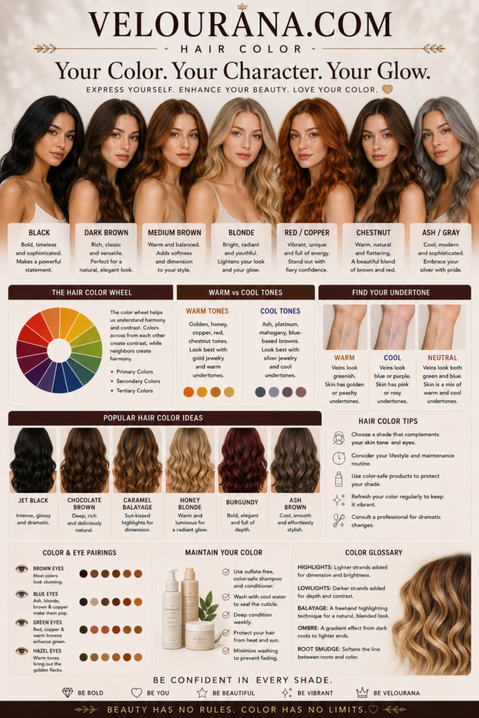
CATEGORY: Warm Undertones
Warm undertones are often described through a familiar vocabulary of gold, peach, yellow, honey, and bronze. Those words are useful, but they can also make the subject appear much simpler than it really is. Warmth in skin is not merely a visible wash of yellow or a tendency to tan. It is part of the underlying color structure that influences how the complexion interacts with foundation, blush, lipstick, hair color, clothing, jewelry, and even surrounding light.
This distinction matters because surface skin color and undertone are not the same thing. Two people can have similarly fair complexions while responding very differently to the same beige foundation. Two people with deep skin can both appear richly brown, yet one may be illuminated by copper and warm burgundy while the other becomes more vivid beside blue-red and silver. The difference is often found beneath the immediately visible depth of the complexion, in the quieter balance of warm, cool, neutral, and olive influences that gives skin its particular chromatic character.
Warm undertones occur across the entire spectrum of skin depth. They can exist in very fair ivory skin, light beige complexions, medium golden skin, tan and caramel tones, and deep brown complexions. Warmth therefore should never be treated as a synonym for tan skin, nor should pale skin automatically be assumed to be cool. Understanding warm undertones begins with separating depth from temperature and learning to see the complexion as a layered color composition rather than a single shade.
The Color Structure Beneath a Warm Complexion
The most useful way to understand a warm undertone is to think about the skin's overall color balance. A warm complexion contains an underlying tendency toward golden, yellow, peach, amber, or related warm hues. That tendency may be obvious or extremely subtle. In some people it creates a distinctly golden appearance. In others it appears more peach than yellow. In deeper complexions it may emerge as honey, caramel, amber, copper, or red-gold rather than the lighter golden language commonly used to describe fair and medium skin.
This underlying warmth remains comparatively stable even when the surface appearance of the skin changes. Sun exposure may deepen the complexion. Winter may make it considerably lighter. Redness can appear after exercise, irritation, heat, or skincare treatments. Pigmentation, freckles, acne marks, and tanning can alter what is immediately visible. None of these temporary or localized changes necessarily alter the fundamental undertone.
That is why judging warmth from one isolated feature can be misleading. A person may have facial redness while still possessing a warm undertone. Another may have yellow-looking skin because of lighting or a particular foundation even though the natural complexion is neutral. Undertone analysis becomes more reliable when the face, neck, chest, and surrounding color relationships are considered together.
Warm skin also varies enormously in intensity. Some complexions are strongly golden and immediately harmonious with saturated warm colors. Others are only gently warm and sit close to neutral. A person in this softer range may look excellent in cream, camel, warm rose, muted coral, and antique gold but overwhelmed by intensely orange cosmetics or very yellow foundation. Warmth is therefore not an instruction to maximize yellow, orange, or gold. It is a direction within the color spectrum, and the degree of that direction matters.
The visual effect is often best understood relationally. A flattering warm shade can make the complexion appear clearer and more dimensional because the surrounding color echoes rather than fights the skin's natural temperature. A poorly balanced cool shade may introduce a grey, bluish, overly pink, or disconnected quality. This does not mean people with warm undertones are forbidden from wearing cool colors. It means that color temperature changes the relationship between the skin and everything placed beside it.
Warm Undertones Across Fair, Medium, Tan, and Deep Skin
Warm undertones do not belong to one complexion depth, and their appearance changes substantially as skin becomes lighter or deeper. In fair skin, warmth may be delicate enough to resemble ivory, cream, pale peach, or soft golden beige. Because fair skin can show vascular redness easily, the cheeks and nose may appear pink even when the underlying complexion is warm. This is one reason simplistic rules based on visible facial redness frequently fail.
Light and light-medium warm skin often reveals more recognizable golden or peach qualities. Beige foundations with a balanced golden component may integrate naturally, while distinctly rosy bases can appear separated from the neck. Yet even here, the amount of warmth varies. Some light warm complexions need only a restrained golden beige rather than an intensely yellow base.
Medium skin can express warmth through golden beige, honey, warm sand, peach-brown, or softly caramel tones. At this depth, warm color relationships often become especially visible because earthy and sunlit shades can echo the complexion beautifully. Terracotta, warm rose, bronze, caramel, olive, cream, and many warm reds can create a sense of continuity between the skin and the surrounding palette.
Tan warm complexions may carry honey, amber, caramel, bronze, or red-golden characteristics. The skin can appear particularly luminous beside colors with enough depth and richness to match its own visual weight. Pale warm shades may still work, but stronger colors often create greater balance. Burnished metallics, deep coral, cinnamon, warm berry, brick red, rich teal, and earthy greens can interact with the complexion without reducing it to the stereotypical palette of beige and brown.
Deep warm skin introduces another range entirely. Warmth may appear as mahogany, copper, amber, red-brown, golden brown, or deep bronze. Here, the common description of a warm undertone as simply "yellow" becomes particularly inadequate. Rich skin contains multiple visible color influences, and the warmth may be expressed through red-gold or copper rather than an obvious yellow cast.
This diversity explains why a foundation labeled "warm" cannot automatically suit every warm complexion. Cosmetic shade systems use the term inconsistently, and warmth itself is multidimensional. A foundation may be excessively yellow for peach-warm skin, too orange for golden skin, or too light and muted for a deep copper complexion. The undertone label is only the beginning; depth, saturation, and the precise character of warmth must also align.
Reading Warmth Without Relying on a Single Test
Traditional undertone advice often depends on quick tests: look at the veins, decide whether gold or silver jewelry looks better, examine whether the skin burns or tans, or hold white fabric beside the face. These observations can contribute useful information, but none should be treated as definitive by itself.
Veins are particularly unreliable when interpreted literally. Their visible color depends on skin depth, translucency, lighting, vein depth, and surrounding pigmentation. Blue-looking veins do not automatically establish a cool undertone, just as green-looking veins do not conclusively prove warmth. On many complexions the veins are difficult to categorize at all.
Jewelry comparison can be more informative because it examines color interaction rather than attempting to diagnose the skin from a single physical feature. Warm complexions frequently develop a richer, more integrated appearance beside yellow gold, bronze, copper, and warm rose gold. The metal may appear to belong naturally against the skin rather than sitting starkly on top of it. Yet personal preference, metal finish, jewelry size, and the strength of the undertone all affect the result. Someone with gently warm skin may wear both gold and silver beautifully while still looking marginally more harmonious in gold.
Fabric comparison is often more revealing when performed carefully. Optic white can create a sharper contrast against warm skin, whereas ivory, cream, or warm off-white may appear more integrated. Cool grey may flatten some warm complexions while camel, warm taupe, or golden beige creates greater vitality. A blue-red may look severe where tomato red or warm brick appears connected to the face.
The important question is not whether a color is attractive in isolation. It is what happens to the complexion when that color is nearby. Does the skin appear clearer? Does the face gain definition? Do shadows become less prominent? Does the mouth look naturally alive? Do the eyes appear more distinct? Or does the color seem to sit separately from the person, drawing attention to unevenness or creating an inexplicable dullness?
Natural daylight is particularly useful for this comparison because strongly warm indoor bulbs can artificially yellow everything, while some cool LED lighting can suppress warmth. Looking at several color relationships in indirect daylight provides a much more coherent picture than relying on one test performed under artificial light.
Foundation can also function as a practical diagnostic tool. When a correctly matched warm or golden foundation disappears naturally into the jaw and neck while a comparable cool or rosy shade remains visibly pink, the contrast provides meaningful evidence. The test is strongest when depth is kept consistent. Comparing a light warm foundation with a darker cool one reveals little because both depth and temperature have changed simultaneously.
Foundation and the Importance of Precision
Foundation is where undertone understanding becomes especially practical. A shade can match the apparent lightness or darkness of the face and still look wrong because its temperature does not correspond with the skin. This mismatch may appear as excessive pinkness, greyness, yellowness, orange, or a mask-like boundary around the jaw.
Warm skin generally benefits from foundations containing golden, yellow, peach, amber, or warm brown components appropriate to the individual's depth. The word "appropriate" is crucial. The goal is not to place a conspicuously yellow product over warm skin. A successful foundation recreates the complexion closely enough that it becomes visually unobtrusive.
Peach-warm skin may require a foundation in which yellow is moderated by a soft red component. Golden skin may need a clearer yellow-gold balance. Warm tan skin can require caramel or amber dimensions, while deep warm complexions may need complex mixtures of golden brown, red-brown, copper, and neutral pigments. Foundation formulation becomes increasingly nuanced as depth increases because simplistic undertone categories cannot capture the full chromatic range of human skin.
Oxidation adds another complication. Some foundations deepen or shift warmer after application as the formula dries and interacts with skin oils and air. A shade that appears perfect during the first minute can become orange or noticeably darker later. Allowing a test swatch to settle before judging it helps distinguish genuine undertone compatibility from an initially promising match.
The neck and upper chest also deserve attention. Facial skin is frequently affected by sun exposure, redness, skincare, pigmentation, and makeup history. Matching only the center of the face can therefore produce a foundation that reinforces temporary surface color rather than harmonizing the face with the body. A jawline comparison that considers both neck and face generally gives a more useful result.
Correct foundation matching can transform the rest of the makeup palette. When the base is too pink or too orange, blush and lipstick choices may seem inexplicably difficult because every additional color is being judged against an inaccurate foundation. Once the complexion base is aligned properly, warm blushes, bronzers, lip colors, and eye shades tend to integrate much more predictably.
How Warm Undertones Shape the Makeup Palette
Warm undertones have an extensive makeup vocabulary, far beyond obvious orange and bronze. The most successful colors usually contain enough warmth to converse with the complexion while maintaining appropriate depth and saturation.
Blush can be particularly revealing. Peach, apricot, warm rose, coral, terracotta, cinnamon, and brick families can reproduce the natural warmth that appears when the complexion flushes. On fair warm skin, a translucent peach or warm pink can create freshness without dominating the face. Medium warm skin may carry richer coral, warm rose, and terracotta beautifully. Tan and deep warm complexions can support burnt coral, cinnamon, coppery rose, brick, and saturated warm berry shades that might appear very strong in the pan but become remarkably natural once diffused over deeper skin.
Bronzer should reinforce dimension rather than simply add orange. Warm skin does not automatically need the warmest bronzer available. If the product is substantially more orange than the natural complexion, it can look artificial even on strongly golden skin. A bronzer with golden brown, caramel, reddish brown, or softly warm neutral qualities often creates a more believable sun-touched effect.
Highlighter behaves similarly. Champagne, soft gold, warm pearl, bronze-gold, and coppered metallics can merge attractively with warm complexions when their depth corresponds with the skin. A highlighter that is too pale may leave an ashy stripe, especially on deep skin, while one that is excessively yellow can appear metallic rather than luminous. The best highlight seems to emerge from the complexion rather than sitting as a separate reflective layer.
Eye makeup opens an even broader field. Bronze, copper, antique gold, warm taupe, chocolate, caramel, olive, khaki, rust, cinnamon, peach, warm plum, and rich brown can reinforce the natural warmth of the face. Yet contrast can be equally sophisticated. Deep teal, warm navy, petrol blue, and certain emerald tones can create striking definition precisely because they oppose the warmth without becoming disconnected from it.
Lip color is one of the clearest demonstrations of undertone interaction. Warm nudes often contain peach, caramel, warm beige, rose-brown, or cinnamon rather than grey or mauve. Reds may move toward tomato, poppy, brick, rust, coral-red, or warm scarlet. Deeper shades can include warm burgundy, mahogany, brown-red, or richly spiced berry. The exact choice depends on complexion depth and natural lip pigmentation as much as undertone.
A lipstick that looks warm in the tube can also change dramatically once applied because natural lip color influences the final result. This is especially relevant for pigmented lips, where a pale peach nude may become muted or chalky rather than warm and flattering. Greater depth or opacity may be needed to preserve the intended color relationship.
Clothing, Hair, and the Wider Color Environment
The effect of undertone extends beyond cosmetics because the face is constantly surrounded by color. Clothing, scarves, eyewear, hair, jewelry, and even the neckline of a top create a color field around the complexion. When these elements harmonize, the skin can appear more even and expressive before makeup is applied.
Warm complexions often interact beautifully with cream, ivory, camel, warm beige, caramel, cognac, chocolate, olive, moss, khaki, mustard, rust, paprika, terracotta, coral, tomato red, warm burgundy, peach, and many forms of teal and green. This does not mean every warm person should wear the same palette. A pale, softly warm complexion may require gentler versions of these colors, while deep warm skin can carry considerably greater saturation and contrast.
Black and pure white illustrate the importance of individual intensity. Some warm complexions can wear both successfully, particularly when there is strong natural contrast between hair, eyes, and skin. Others appear more luminous in espresso rather than black and cream rather than stark white. Undertone contributes to the result, but it does not act alone. Contrast level, chroma, and depth remain important.
Hair color can alter the perception of skin dramatically because it occupies such a large area around the face. Golden blonde, honey, caramel, warm chestnut, chocolate, copper, auburn, and warm black-brown can reinforce warm undertones when selected at an appropriate depth. Yet excessively brassy color is not the same as flattering warmth. Uncontrolled orange or yellow in dyed hair may compete with the complexion rather than enhance it.
The most refined warm hair colors usually contain dimensional mixtures rather than a single flat warm pigment. A brunette may benefit from chestnut or caramel reflection without becoming overtly red. A blonde may need beige-gold rather than bright yellow. Deep hair can carry subtle warm brown or mahogany dimensions that become visible in light without sacrificing richness.
Jewelry provides another surrounding influence. Yellow gold is the classic companion to warm skin because both share related temperature characteristics, but bronze, copper, brass, and warm rose gold can be equally expressive. Mixed metals can also work beautifully, particularly on complexions that sit near the warm-neutral boundary. Undertone analysis should expand possibilities by revealing relationships, not turn personal style into a rigid rulebook.
Warm Does Not Mean One Seasonal Palette
Warm undertones are closely connected to seasonal color analysis, but the two systems should not be confused. Having warm skin does not automatically determine a complete seasonal category. Seasonal analysis considers several interacting qualities, including temperature, depth, brightness or softness, and overall contrast.
A warm complexion with light coloring and clear, lively contrast may relate strongly to Spring palettes, where warmth is expressed through freshness, clarity, and brightness. Peach, warm aqua, coral, golden yellow, clear green, and light warm neutrals can echo this quality.
Another warm complexion may be deeper, softer, or more earthy and align more naturally with Autumn characteristics. Here warmth appears through richness and muted complexity: olive, rust, camel, chocolate, mustard, terracotta, warm burgundy, forest tones, and burnished metallics.
The difference is important because a bright coral that makes one warm complexion look radiant may overwhelm another. A muted olive that appears sophisticated on soft warm skin may make a clearer warm complexion seem subdued. Temperature establishes one axis of harmony, but it does not determine the entire palette.
People also frequently sit between textbook categories. Warm-neutral complexions may tolerate colors from more than one seasonal family. Hair coloring, eye color, contrast, tanning, greying hair, and personal styling can all change which parts of a palette feel most effective. Seasonal analysis becomes more useful when treated as a sophisticated language for observing color relationships rather than a restrictive identity.
This also explains why someone with warm undertones may occasionally look exceptional in a color traditionally described as cool. A cool shade with the right depth and saturation can provide deliberate contrast, especially when supported elsewhere in the styling. Color harmony is not synonymous with wearing only colors that duplicate the skin's temperature.
The Difference Between Warm, Neutral-Warm, and Olive Skin
One of the most common sources of confusion is the boundary between warm and neutral-warm skin. Strongly warm complexions tend to respond clearly to golden and warm colors, while neutral-warm skin contains enough balance that many neutral or slightly cooler shades remain comfortable.
A neutral-warm complexion may find very yellow foundation excessive even though rosy foundation is clearly wrong. Soft gold may look better than highly yellow gold. Warm rose may outperform both orange coral and blue-based pink. This subtlety is normal. Undertones exist on a continuum rather than in three perfectly separated boxes.
Olive skin introduces another layer. Olive complexions can be warm, neutral, or cool leaning, and their characteristic green or muted quality can complicate conventional foundation matching. A warm olive complexion may share golden characteristics with warm skin while requiring a more muted, slightly green-balanced foundation. A conventional warm foundation with strong orange or yellow pigment can become conspicuous against it.
This is why the term "warm" should describe a relationship rather than become a cosmetic prescription. The more precisely the complexion is observed, the less useful generic rules become. Someone may be warm but muted, warm and bright, warm-neutral, peach-warm, golden-warm, red-warm, or warm olive. These distinctions influence the colors that ultimately look most natural.
Warmth as a Foundation for Personal Color
Understanding warm undertones is ultimately about learning how skin participates in color. It is not about proving that a person belongs to a fixed category. The value comes from recognizing why certain foundations disappear while others remain visible, why one red lipstick animates the face while another seems detached, and why cream may create softness where stark white creates tension.
Once warmth is understood as an underlying direction rather than a stereotype, the palette becomes considerably richer. Warm skin can be pale or deep, delicate or saturated, golden or peach, clear or muted. It can glow beside honeyed neutrals, become dramatic against teal, gain sophistication from olive and chocolate, or become intensely luminous in copper, coral, and warm red.
The most successful color choices respect this complexity. They consider undertone alongside depth, contrast, saturation, natural pigmentation, and personal style. They do not assume that every warm complexion needs yellow foundation, orange lipstick, gold eyeshadow, and camel clothing. Instead, they use warmth as the starting point for understanding a much larger visual identity.
Warm undertones are therefore less a limitation than a chromatic architecture. They provide the underlying golden, peach, amber, copper, or red-gold current through which surrounding colors are interpreted. When that architecture is recognized accurately, makeup becomes easier to balance, clothing becomes more intuitive to coordinate, and the complexion itself becomes the central reference point rather than something that must be corrected to fit a predetermined palette.
THE END VELOURANA
 Discover More From Our Family of Websites
 ZodiacBearing (Astrology, Tarot, Numerology, Angel Numbers & Spiritual Guidance)
 Velourana (Beauty, Makeup, Hair Care, Skincare & Beauty Tips)
 HavenBearing (Home, Living, Organization, Décor & Everyday Inspiration)
 PawBearing (Pet Care, Dog Breeds, Animal Health, Training & Pet Products)
 PsyCatherine (Notes From the Journal of a Psychologist on Real Life)

