
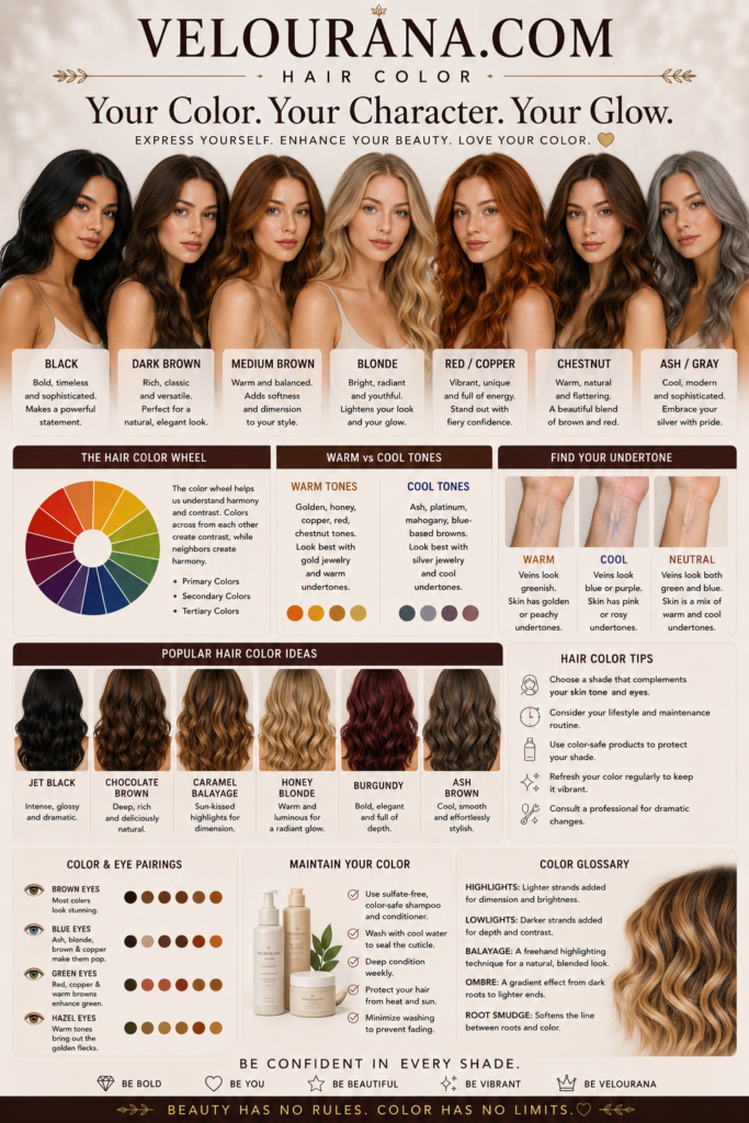
CATEGORY: Warm Undertones
A warm undertone does more than influence which foundation shade looks believable. It changes the entire visual conversation between skin and color. A blouse, lipstick, hair color, pair of earrings, or sweep of blush can either reinforce the complexion's natural warmth, create purposeful contrast, or introduce a temperature that makes the skin appear unexpectedly muted. Understanding these relationships turns undertone analysis from a beauty label into a practical method of building color around the face.
The most important principle is that warm undertones are not confined to visibly golden skin. Warmth can appear as peach in a fair complexion, golden beige in light skin, honey through medium tones, amber and caramel through tan skin, or copper and red-gold within deep complexions. Its expression changes with depth, pigmentation, and contrast.
This is why a universal "warm palette" cannot adequately describe everyone with warm skin. The same mustard yellow, coral lipstick, or golden foundation will not behave identically across every complexion. Warmth establishes a direction, but depth determines how much visual weight a color needs, saturation determines how vivid it can become, and contrast influences whether the face responds best to softness or definition.
A sophisticated warm palette begins with the skin itself.
Seeing the Complexion as More Than a Surface Color
Skin is visually complex because several kinds of color can be present simultaneously. The underlying complexion may be warm while the cheeks show temporary pinkness. Freckles may introduce brown and rust. Hyperpigmentation may create deeper areas around the mouth or forehead. Natural lip pigmentation can contribute mauve, brown, rose, or red. Veins and translucency can add blue, green, or violet impressions in particular areas.
When these visible details are mistaken for undertone, color analysis becomes inconsistent. Someone may conclude that facial redness means cool skin and select a pink foundation, only to discover that it clashes with the golden neck. Another person may interpret a summer tan as evidence of warmth even though the underlying skin remains neutral or cool.
Undertone is more stable than these surface changes. It describes the persistent temperature bias that remains recognizable through seasonal fluctuations in skin depth. A warm complexion may become lighter during winter and significantly deeper during summer, yet the underlying affinity for golden, peach, amber, or warm brown tones often remains.
This stability makes undertone especially useful when selecting products designed to merge with the skin. Foundation, concealer, skin tint, and certain nude lip colors depend heavily on accurate temperature. Decorative makeup is more flexible because it can harmonize or deliberately contrast, but complexion products generally become more convincing as their undertone approaches the natural skin.
Warmth should therefore be assessed through patterns rather than isolated clues. The relationship between face and neck, the behavior of different foundation undertones, the effect of warm and cool fabrics, and the way metals interact with the skin collectively provide stronger evidence than any single popular test.
Why Warm Skin Can Look Golden, Peach, Amber, or Copper
The language used to describe warm undertones often centers on yellow, but human skin is never simply yellow. Skin color emerges from a complex mixture of biological pigments and optical effects, which is why warmth can present in several distinct ways.
Fair warm skin may appear creamy rather than golden. Its warmth can be so delicate that it becomes visible only when compared directly with a cool pink complexion. A cool beige foundation may make the skin look slightly grey or rosy, while a soft ivory or peach-beige suddenly seems to disappear.
Peach warmth contains a visible relationship between yellow and red. It can create a fresh, softly sunlit appearance without the strong gold associated with more obviously yellow-warm complexions. Cosmetics that are aggressively yellow may therefore look unnatural even though the skin is unquestionably warm.
Golden warmth becomes more apparent through light, medium, and tan complexions. Here the skin may reflect honey, wheat, golden beige, or caramel qualities. Gold jewelry frequently looks integrated against this coloring, and foundations with golden undertones often blend more naturally than pink or cool-neutral formulas.
In deeper skin, warm undertones can become increasingly dimensional. Amber, copper, bronze, mahogany, and red-gold may describe the complexion more accurately than yellow. The undertone may be visible in areas where light catches the face, while deeper contours reveal rich brown or red-brown dimensions.
These variations have practical consequences. Two warm foundations at the same depth can look entirely different because one is strongly yellow and another is peach or orange. Likewise, two warm red lipsticks may differ dramatically: one may be bright tomato red, while another is a deep brick containing substantial brown. Both belong to the warm spectrum, but they serve different complexions and styling effects.
Building a Foundation Match Around Warm Skin
A convincing foundation match should create continuity between the face, jaw, neck, and visible upper body. When foundation is noticeable primarily because of its color rather than its texture, undertone or depth is often contributing to the problem.
Warm skin wearing a foundation that is too cool may develop an artificial pink, rosy, or slightly grey cast. The effect can be subtle indoors and striking in daylight or photographs. The face may appear disconnected from the neck even when the depth seems approximately correct.
An excessively warm foundation creates a different problem. It may turn yellow, orange, or ochre against the natural complexion. This is particularly common when someone correctly identifies warmth but assumes that the strongest available yellow or golden shade must therefore be ideal.
True matching requires restraint. The foundation should reproduce the skin rather than exaggerate one of its qualities.
For fair warm complexions, successful bases often inhabit ivory, warm porcelain, peach-beige, or delicate golden families. The warmth may need to be extremely subtle. A foundation described as strongly golden can overpower pale skin even when the undertone direction is correct.
Light and medium warm complexions frequently have broader options, including warm beige, golden beige, honey, sand, and peach-gold variations. The challenge is determining whether the natural warmth leans clearer and more golden or softer and more peach.
Tan warm skin may require caramel, amber, golden tan, or warm brown foundations with sufficient depth. Deep warm skin often benefits from formulations that recognize the complexity of brown skin rather than simply adding orange pigment to a dark base. Golden brown, copper, red-brown, amber, and warm-neutral mixtures can all be relevant.
Concealer introduces another consideration because its purpose may differ from foundation. A concealer intended to disappear over blemishes should closely correspond with the complexion. An under-eye concealer may contain a controlled peach or warm corrective influence to counter visible blue, violet, or grey tones. The corrective effect should still integrate with the surrounding skin rather than producing obvious orange patches.
The final judgment should be made after the product has settled. Foundation can darken or shift in temperature after application, and warm formulas are particularly vulnerable to appearing increasingly orange when oxidation occurs. A patient comparison is therefore more reliable than an immediate swatch.
Warm Blush, Bronzer, and Highlight as Extensions of the Complexion
Complexion color products become most elegant when they create dimension rather than obvious stripes of pigment. Warm undertones provide a natural affinity with many blush and bronzing families, but successful application depends on selecting colors with the right depth and character.
Peach blush is frequently associated with warm skin because it echoes the mixture of red and yellow already present in many warm complexions. On fair skin, a sheer peach can resemble a natural flush. On deeper skin, however, the same pale peach may disappear or create a powdery cast. The concept remains useful, but the depth must evolve into richer coral, burnt peach, terracotta, cinnamon, or coppered rose.
Warm pinks can be equally flattering. Warm undertones do not eliminate pink from the palette; they simply change which pinks interact most naturally. A pink containing peach, coral, brown, or warm red can retain freshness without becoming icy. Rose-brown shades are particularly versatile because they combine the liveliness of rose with an earthy structure that connects beautifully with warm skin.
Bronzer requires careful distinction from warmth itself. The objective is usually to suggest depth, sun exposure, or sculptural warmth. If the bronzer is excessively orange, it can exaggerate the undertone and look cosmetic rather than believable. Golden brown, caramel, warm tan, reddish brown, and neutral-warm bronzers often create more sophisticated dimension.
On deep warm skin, bronzer must be deep enough to remain visible. A product that functions as bronzer on medium skin may behave as a pale setting powder on a deep complexion. Rich brown with red, golden, or warm neutral dimensions can create the intended warmth without ashiness.
Highlighter works through both color and reflection. Fair warm skin may respond beautifully to soft champagne, ivory-gold, or delicate warm pearl. Medium skin can often support richer champagne and true gold. Tan complexions may suit deeper gold, bronze-gold, and warm metallic beige, while deep warm skin can become luminous in bronze, copper-gold, and rich golden highlights.
The transition between skin and highlight matters more than the fashionable name of the shade. When the base pigment is too pale, the reflective area can appear grey or chalky from certain angles. A well-matched highlighter remains connected to the complexion even when the light catches it intensely.
Lip Color and the Temperature of the Face
Lipstick occupies relatively little physical space, yet it can change the apparent temperature of the entire face. This makes lip color one of the most expressive tools for warm undertones.
A warm nude is not simply a beige lipstick. Nude color should relate to the wearer's complexion and natural lip depth. Fair warm skin may find harmony in peach-beige, warm pink-beige, soft coral nude, or light caramel rose. Medium skin can often support warm rose, cinnamon nude, caramel, peach-brown, and terracotta beige. Tan and deep complexions may require considerably richer rose-brown, caramel-brown, cinnamon, chestnut, warm cocoa, or brick-infused nudes.
When nude lipstick becomes too pale relative to the complexion, it can erase natural definition. This effect is especially visible on deeper skin and naturally pigmented lips. A successful nude usually preserves enough depth to make the mouth look intentional and alive.
Warm reds offer extraordinary variety. Tomato red carries an orange influence and can create vivid brightness. Poppy and coral-red bring a lighter, more energetic warmth. Brick introduces brown and earthy depth. Rust moves further toward orange-brown, while mahogany and warm burgundy provide greater darkness and sophistication.
The complexion's contrast level influences which of these reds feels most balanced. Someone with warm skin and high natural contrast may look spectacular in a saturated red, while a softer complexion may be better served by muted brick, warm rose, or diffused terracotta.
Warm undertones can also wear berry and plum, provided the shade's balance works with the skin. Warm berry may contain red, brown, or wine-like depth rather than a strongly blue-purple base. Warm plum can incorporate brown or burgundy, creating richness without the icy quality of cooler violet.
This flexibility demonstrates an important principle: undertone analysis is not about eliminating entire color families. It is about understanding variations within those families.
Eye Color, Warm Skin, and Intentional Contrast
Eye makeup offers a different opportunity because colors do not need to imitate the complexion to flatter it. Harmony can be created through similarity, but definition often emerges through contrast.
Bronze and copper are natural companions to warm skin because they repeat its underlying temperature while adding metallic depth. Gold can brighten the eye area, while warm taupe and caramel create quieter definition. Chocolate brown provides structure without the starkness that black can sometimes introduce, particularly on softer warm complexions.
Olive and khaki are especially interesting because they combine earthy warmth with green. Against golden or peach skin, they can appear sophisticated and dimensional rather than overtly colorful. Deep forest green can provide greater drama while maintaining an organic relationship with warm coloring.
Rust, cinnamon, paprika, and terracotta can intensify warmth around the eyes, although their reddish components require thoughtful placement depending on eye shape and natural redness. When balanced with brown, bronze, or defined lashes, they can produce depth rather than making the eye area appear irritated.
Cooler colors can create some of the most striking effects. Teal, petrol, turquoise, and certain blues stand in chromatic opposition to orange and golden influences, allowing warm skin to appear even more radiant by contrast. The success of these shades depends on their specific temperature and saturation. A rich teal often feels more integrated with warm skin than an icy pastel blue because it carries greater depth and sometimes a subtle green influence.
Black eyeliner remains entirely possible for warm undertones, particularly on high-contrast faces or dramatic makeup. Brown, espresso, bronze, olive-black, and deep warm charcoal can offer softer alternatives when pure black feels visually severe.
The aim is not to surround warm skin exclusively with warm pigment. A sophisticated palette uses temperature deliberately, sometimes repeating the complexion and sometimes setting it against an opposing color to create definition.
Clothing Colors That Illuminate Warm Undertones
Clothing creates one of the largest color fields near the face, which means its effect can be stronger than makeup. A neckline in the right color can make the complexion appear rested and clear; a difficult shade can alter the appearance of shadows, redness, or sallowness even though nothing about the skin itself has changed.
Warm neutrals form a strong foundation. Cream and ivory often relate more naturally to warm skin than brilliant blue-white. Camel, cognac, warm taupe, tan, caramel, chocolate, and espresso can create depth without the coolness of blue-grey or some forms of stark black.
Earth colors are equally important but should not be interpreted as dull. Olive, moss, loden green, rust, paprika, cinnamon, ochre, terracotta, and burnt orange can range from restrained to intensely saturated. Their shared warmth allows them to relate naturally to golden, peach, amber, and copper undertones.
Reds deserve particular attention. Warm scarlet, tomato, coral-red, brick, paprika red, and warm burgundy each produce a different level of intensity. A bright warm red can make the complexion look energized, while brick or burgundy creates greater depth and sophistication.
Green can be remarkably expansive on warm skin. Yellow-greens such as olive and moss reinforce warmth, while emerald and teal can create stronger contrast. The exact success of a green depends on whether the individual complexion is bright or muted, light or deep.
Blue is sometimes incorrectly described as difficult for warm undertones. In reality, many blues work beautifully. Warm navy, petrol, peacock, teal-blue, turquoise, and blue-green shades can be especially effective. Even cooler blues may work when their depth and clarity correspond with the person's overall coloring.
The same principle applies to pink and purple. Peach-pink, salmon, coral pink, warm rose, dusty warm pink, aubergine, warm plum, and reddish purple can all belong within a warm-oriented wardrobe. Color families are broad; their internal temperature matters more than their names.
The Relationship Between Warm Undertones and Seasonal Color
Seasonal color analysis expands undertone into a multidimensional system. Warmth is important, but it interacts with clarity, softness, depth, and contrast. This is why two people with warm undertones can require dramatically different wardrobes.
Spring-oriented warmth is generally associated with greater clarity and freshness. The complexion may respond to luminous peach, coral, warm turquoise, fresh green, golden yellow, warm pink, and clear red. Neutrals often feel lighter and cleaner, with cream, camel, warm beige, and clear warm brown providing support.
Autumn-oriented warmth tends toward greater depth, softness, or earthiness. Olive, moss, rust, mustard, cinnamon, chocolate, warm burgundy, deep teal, camel, and burnished metallics can feel particularly integrated. Instead of bright clarity, the palette gains beauty from complexity and richness.
Yet real complexions do not always fit neatly into one theoretical season. A warm-neutral person may borrow successfully from neighboring palettes. Someone with deep warm coloring may need colors more saturated than conventional Autumn suggestions. A person with warm skin but very bright eyes and strong contrast may find muted earth colors less effective than clearer shades.
Hair changes can also alter seasonal impressions. Natural greying, lightening, darkening, or dramatic color changes affect contrast around the face. The skin undertone may remain warm while the most flattering wardrobe palette evolves because the relationship between skin, hair, and eyes has changed.
Seasonal analysis is therefore most useful when it refines observation rather than replacing it. Warm undertone establishes a significant part of the color story, but it is not the whole story.
Hair Color as a Frame for Warm Skin
Hair surrounds the face more consistently than almost any other color, making its temperature particularly influential. When hair color relates naturally to the complexion, the face often appears coherent even without makeup.
Warm blondes can range from pale beige-gold to honey and deeper caramel. The most flattering choice depends on skin depth and natural contrast. Extremely yellow blonde may appear artificial where a dimensional honey or beige-gold creates a softer transition.
Warm brunette shades include golden brown, chestnut, caramel brown, warm chocolate, and rich espresso with subtle warm reflection. Highlights can introduce honey, caramel, amber, or copper dimensions without requiring the entire head of hair to become obviously warm.
Copper and auburn can be especially striking beside warm undertones because they amplify red and golden relationships already present in the skin. Yet intensity matters. A soft peach-warm complexion may be overwhelmed by extremely saturated orange-red hair, while a deeper or clearer warm complexion may support it beautifully.
Dark warm hair does not need to look visibly red or golden. Deep brown and near-black shades can contain subtle warmth that appears primarily under natural light. This can preserve dramatic depth while avoiding the blue-black cast that sometimes looks disconnected from warm skin.
The concept of harmony should not eliminate experimentation. Cool hair colors can create deliberate fashion contrast, and some people prefer precisely that effect. Undertone analysis simply explains why the result changes. A cool ash shade may neutralize the apparent warmth of the complexion, while golden or copper hair may intensify it.
Jewelry and the Reflection of Warmth
Metallic color is unusually revealing because jewelry sits directly against the skin and reflects light back onto it. Yellow gold has long been associated with warm undertones for good reason: its golden temperature often echoes the complexion and creates visual continuity.
The effect varies with the gold itself. Pale gold, rich yellow gold, antique gold, brushed gold, and high-polish gold each produce different relationships. A softly warm complexion may prefer restrained or antique finishes, while strong warm coloring may carry saturated yellow gold with ease.
Rose gold introduces red and pink into the metallic mixture. On peach-warm and neutral-warm skin, this can create an especially seamless effect. Copper and bronze offer deeper warmth and can look remarkable against medium, tan, and deep complexions.
Silver is not automatically excluded. Bright silver creates a cooler contrast that can look crisp and modern, especially on warm skin with strong natural contrast. Oxidized silver, mixed metals, or combinations of gold and silver can also create complexity.
The question is not whether a metal is permitted but what visual role it performs. Gold tends to reinforce warmth. Silver may create contrast. Rose gold can bridge warmth and softness. Bronze can deepen earthiness. Jewelry becomes another tool for controlling the temperature around the complexion.
When Warm Colors Become Too Warm
One of the most useful discoveries in undertone analysis is that flattering warmth has limits. Warm skin can be overwhelmed by colors that exaggerate its temperature rather than harmonize with it.
Foundation is the clearest example. An overly yellow base can make golden skin look jaundiced rather than radiant. Excessively orange bronzer can create an artificial stripe. A very orange lipstick may dominate a softly warm complexion. Bright mustard can overpower someone whose warmth is delicate and neutral leaning.
This happens because color harmony requires proportion. The complexion may contain warmth without being intensely saturated. Adding a much stronger version of that warmth can overwhelm the skin's natural balance.
Muted warm complexions often need complex colors in which warmth is softened by brown, grey, or neutral pigment. Warm rose may work better than brilliant coral. Olive may outperform vivid lime. Antique gold may feel more elegant than highly polished yellow gold.
Clear warm complexions can often tolerate stronger saturation. Their natural coloring remains visible beside vivid coral, turquoise, warm red, fresh green, or bright gold. The same colors may appear disconnected on a softer person even though both share a warm undertone.
Depth creates another limit. Pale camel may harmonize beautifully in temperature with deep warm skin but offer insufficient contrast near the face. A deeper cognac, chocolate, rich teal, or saturated rust may create a stronger result. Temperature has been preserved, but visual weight has been adjusted.
Warm Undertones as a Flexible Color Identity
The purpose of identifying warm undertones is not to create a narrow wardrobe or repetitive makeup collection. It is to understand the skin's natural position within color relationships.
Once that position becomes clear, choices become more intentional. A golden foundation can be selected because it genuinely disappears into the complexion rather than because a label says "warm." A brick lipstick can be chosen for earthy harmony, while teal eyeliner can be chosen for deliberate contrast. Cream may replace stark white when softness is desired, while pure white can still be worn when sharp graphic contrast is the goal.
Warmth can be amplified, moderated, or opposed. Each approach creates a different visual effect.
This flexibility is particularly important because human coloring cannot be reduced to a handful of rules. Warm skin may be fair and translucent, medium and golden, tan and amber, deep and coppered, muted and olive, or almost neutral with only a subtle warm direction. Each expression requires its own balance.
The most refined personal palette emerges when undertone is considered alongside skin depth, natural contrast, hair, eyes, lip pigmentation, and the intensity of the colors being worn. It also leaves room for personality. Color analysis can explain why something works, but personal style determines whether that effect is desirable.
Warm undertones provide a powerful starting point because they reveal the underlying relationship between the complexion and the golden side of the spectrum. From cream and camel to coral and copper, from olive and chocolate to teal and warm red, the possibilities extend far beyond the conventional image of a "warm palette."
When those possibilities are approached with attention to depth and intensity, warm skin does not simply look warmer. It looks dimensional. The complexion gains clarity, features become more distinct, and surrounding colors seem connected rather than imposed. That is the real value of understanding undertone: not obedience to a color category, but greater control over how color and skin are allowed to interact.
THE END VELOURANA
 Discover More From Our Family of Websites
 ZodiacBearing (Astrology, Tarot, Numerology, Angel Numbers & Spiritual Guidance)
 Velourana (Beauty, Makeup, Hair Care, Skincare & Beauty Tips)
 HavenBearing (Home, Living, Organization, Décor & Everyday Inspiration)
 PawBearing (Pet Care, Dog Breeds, Animal Health, Training & Pet Products)
 PsyCatherine (Notes From the Journal of a Psychologist on Real Life)

