
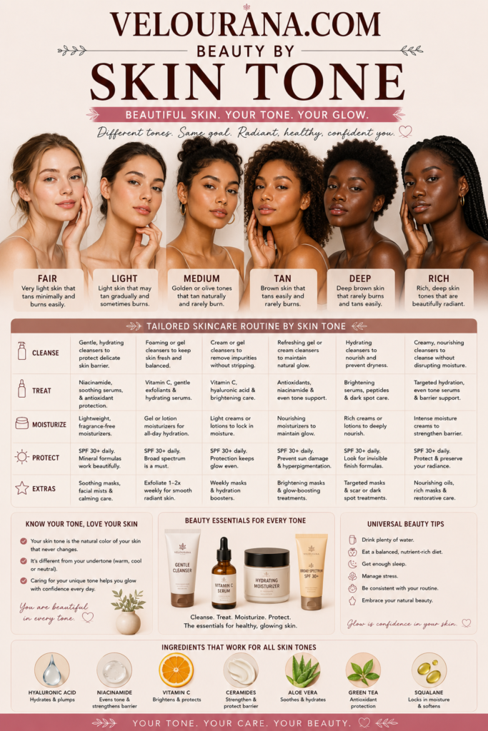
CATEGORY: Deep Skin Colors
Deep skin is not a single color, a single undertone, or even a narrow family of shades. It is an expansive spectrum that can move through deep caramel, mahogany, chestnut, walnut, espresso, ebony, and other richly pigmented tones, with countless variations that resist simple labels. Two people whose complexions appear similarly deep at first glance may have completely different undertones, levels of saturation, areas of natural brightness, and responses to particular colors. Understanding this complexity is one of the foundations of choosing makeup, clothing, hair colors, and beauty finishes that complement rather than obscure deep skin.
For decades, beauty language often treated deeper complexions as though darkness itself were the defining characteristic. That approach ignored the extraordinary range visible within deep skin. Depth is only one element. Temperature, undertone, surface tone, contrast, pigmentation patterns, and the way light reflects from the complexion all contribute to how color actually appears.
Deep skin can carry warmth that glows almost coppery in sunlight. It can have a distinctly cool cast with red, blue, or violet undertones. It can appear neutral, balancing warmth and coolness without leaning strongly toward either direction. Some deep complexions also have olive characteristics, where muted green or golden undertones influence the way surrounding colors behave.
This variety is why color selection becomes much more successful when it begins with the individual complexion rather than a generalized idea of what should suit dark or deep skin.
Depth Is Only the Beginning
Skin depth describes roughly how light or dark a complexion appears, but it does not tell the complete color story. Within the deep range, there can be substantial differences between complexions that sit toward the medium-deep end and those that are exceptionally rich and dark.
The visible surface color is influenced primarily by melanin, but complexion is not visually uniform. Areas around the forehead, mouth, jaw, cheeks, and neck can differ naturally. Some people have a noticeably deeper forehead or perimeter of the face. Others experience pigmentation around the mouth or under the eyes. The center of the face may appear brighter than the outer areas.
These variations are normal components of facial dimension.
A foundation shade that matches only the brightest part of the face can therefore appear too light overall. One chosen solely from the deepest area can make the center of the complexion look unexpectedly flat. Successful complexion matching often involves identifying the overall visual balance between the face, neck, and upper chest rather than searching for a theoretically perfect match to every individual area.
Deep skin also interacts dramatically with lighting. Warm indoor lighting can exaggerate golden or red tones. Cool fluorescent lighting may suppress warmth. Direct sunlight can reveal undertones that appear almost invisible indoors.
For this reason, evaluating complexion colors under more than one lighting condition can be especially useful. Natural daylight remains one of the clearest references because it exposes differences between the skin and cosmetic pigments that artificial lighting may disguise.
Warm Deep Skin Colors
Warm deep complexions often contain visible golden, yellow, copper, amber, red-gold, or warm brown undertones. The warmth may be obvious, but it can also be subtle beneath substantial depth.
Rich warm skin can appear particularly luminous beside saturated earthy colors. Terracotta, cinnamon, burnt orange, warm burgundy, bronze, copper, ochre, deep coral, brick red, and certain golden shades can echo the natural warmth already present in the complexion.
This does not mean that someone with warm deep skin must wear only warm colors. Color harmony is not a restrictive rule. Cool colors can create deliberate and striking contrast. The distinction is useful primarily because it explains why two superficially similar shades may behave very differently.
A warm red containing orange or brick undertones may merge naturally with a golden-brown complexion, while a blue-red may create a sharper contrast. Neither effect is inherently superior. They simply create different visual relationships with the skin.
The same principle applies to foundation. A formula described only as "deep" may still appear ashy or strangely muted if its undertone is too cool for a strongly warm complexion. Conversely, excessive orange pigment can make a foundation visibly separate from skin that is warm but not orange.
True warmth is more nuanced than simply adding yellow or red pigment.
Cool Deep Skin Colors
Cool deep complexions can contain red, berry, blue, violet, or cool brown undertones. These undertones may become particularly noticeable around naturally flushed areas, at the perimeter of the face, or when the complexion is compared with strongly golden colors.
Deep cool skin can create an exceptional backdrop for jewel tones and blue-based pigments. Plum, blackberry, wine, cool burgundy, cobalt, sapphire, emerald, blue-red, violet, and certain icy metallics can appear exceptionally vivid.
Again, this is not a prescription. Warm shades can be equally beautiful when contrast is desired.
One common challenge occurs when complexion products designed for deeper skin rely heavily on warm red or orange pigment. On genuinely cool deep skin, these formulas may become visibly reddish or orange after application. The mismatch can sometimes be mistaken for an incorrect depth when the real issue is undertone.
Testing several undertones at approximately the same depth can reveal the difference. A correct shade tends to visually settle into the complexion rather than remaining identifiable as a separate layer of color.
Cool deep skin also demonstrates why simplistic descriptions such as "dark brown" are inadequate. A complexion may be deeply brown while simultaneously carrying unmistakable berry or blue-red qualities beneath the surface.
Those underlying characteristics influence virtually every color placed beside the face.
Neutral and Olive Dimensions
Neutral deep skin occupies a particularly interesting position because obvious warmth and coolness may appear balanced. A person may look slightly warm under one light and subtly cool under another without either quality dominating consistently.
Neutral complexions often accommodate an unusually broad range of colors. However, neutral does not mean undertone-free. It simply means that the visible balance between warm and cool characteristics is relatively even.
Deep olive skin introduces another dimension. Olive undertones can combine muted green, golden, gray, or neutral characteristics beneath the brown surface. In deeper complexions, olive qualities are sometimes overlooked because they may not resemble the olive tones commonly demonstrated on lighter skin.
A foundation that is sufficiently deep can still look too red, orange, or saturated on deep olive skin. Muted or neutral-olive formulations may integrate much more naturally.
Olive undertones can also change how decorative colors appear. Some browns become unexpectedly reddish. Certain nude lip colors become pinker than expected. Warm beige may appear orange. Colors that look muted in packaging can become surprisingly vivid once surrounded by the complexion's natural undertones.
This interaction between skin and pigment is precisely why swatching remains more reliable than relying entirely on shade names.
Why Color Appears Differently on Deep Skin
Every cosmetic color is viewed in relation to the skin beneath and around it. Deep skin provides a rich, highly pigmented background, which can dramatically alter the apparent intensity of makeup.
A pale pink that appears soft and subtle on light skin may create a much stronger contrast on deep skin. A brown lipstick that looks dramatically dark in its packaging may become an understated nude. A highly saturated orange or fuchsia may appear remarkably harmonious rather than overpowering.
Opacity also matters.
Products with insufficient pigment concentration may appear chalky because the formula does not provide enough color to remain visually clear over deeper skin. This is especially noticeable with pastel eyeshadows, pale blushes, translucent powders, and some complexion products.
A chalky result is not necessarily evidence that a particular color is unsuitable. Sometimes the formulation is responsible.
A richly pigmented lavender, for example, can look completely different from a weakly pigmented lavender containing a large amount of white base. The first may appear vivid and sophisticated; the second may leave a pale cast.
This distinction is essential when discussing color suitability for deep skin. Formula quality, opacity, base pigment, and finish can matter as much as the color family itself.
Reds, Berries, and Pinks
Red is extraordinarily versatile on deep skin because different red families can either harmonize with the complexion or create deliberate contrast.
Brick, rust, tomato, and orange-red shades can emphasize warmth. True reds can produce clean definition. Blue-red and cranberry shades can look particularly striking against cool or neutral deep complexions. Extremely dark wine and oxblood tones can create sophisticated tonal depth.
Pink offers an equally broad spectrum.
Deep rose, raspberry, magenta, berry, fuchsia, and warm coral-pink can retain their presence beautifully on richly pigmented skin. Pale pinks can work as well, although their base formulation becomes especially important. A pastel pink dominated by opaque white pigment may appear stark, while a translucent or carefully balanced version can create a refined contrast.
For blush, deeper and more saturated colors often provide greater flexibility because they remain visible after blending. Berry, raisin, burnt coral, terracotta, deep rose, and red-brown blushes can create effects ranging from subtle warmth to pronounced editorial color.
The final appearance depends heavily on application intensity. A highly saturated blush does not automatically produce a dramatic result. Applied lightly, it can create a remarkably natural flush precisely because its pigment remains compatible with the depth of the complexion.
Browns and the Complexity of the Nude
"Nude" is one of the most relative concepts in beauty.
On deep skin, nude colors can range from warm caramel and cinnamon through rose-brown, mauve-brown, chocolate, espresso, and deep neutral brown. The most convincing nude is not necessarily identical to the skin. Often it differs enough to create definition while remaining connected to the natural colors of the lips or complexion.
Lip pigmentation adds another variable. Deep skin frequently accompanies naturally pigmented lips, sometimes with different colors on the upper and lower lip. A lipstick's appearance can therefore differ substantially from its appearance in a tube or on a pale swatch.
Opaque formulas may cover natural pigmentation completely. Sheer formulas allow it to influence the result. Neither is preferable in every situation.
Brown itself deserves careful attention because it is not a single neutral category. Browns can lean orange, yellow, red, rose, purple, gray, or almost black. Against deep skin, these undertones become particularly important.
A medium brown may disappear almost completely on one complexion while appearing distinctly warm on another. A chocolate shade with red undertones can bring warmth to the face, whereas a cool espresso can provide stronger definition.
Understanding brown as a family rather than one generic color opens considerably more sophisticated possibilities.
Gold, Bronze, Silver, and Metallic Color
Metallic colors interact beautifully with deep skin because reflective particles create visible contrast against a rich background.
Gold is often associated with deep complexions, but even gold has numerous variations. Yellow gold can amplify warmth. Antique gold offers a muted effect. Champagne gold introduces brightness. Rose gold incorporates pink or copper characteristics. Bronze provides deeper, earthier luminosity.
Copper can be especially effective where red and golden undertones are naturally present because it echoes both simultaneously.
Silver creates a different relationship. Rather than blending into warmth, it can introduce a cool, high-contrast brilliance. On cool deep complexions, silver may feel naturally integrated; on warm deep skin, its contrast can look intentionally graphic and modern.
Gunmetal, pewter, metallic plum, deep bronze, and blackened gold can produce dimension without relying on extremely light reflective pigments.
The finish matters as much as the metallic color. Fine shimmer tends to create smooth luminosity, while larger reflective particles produce stronger visual texture. Deep skin can support both effects exceptionally well because the contrast between reflection and complexion depth makes metallic details easy to perceive.
Bright and Saturated Colors
Deep complexions can carry saturated colors with remarkable visual clarity.
Cobalt blue, emerald green, turquoise, royal purple, vivid orange, magenta, chartreuse, crimson, and electric pink can all create compelling relationships with deep skin. Their success does not come from a universal rule that bright colors "look good on dark skin." Rather, the depth of the complexion provides enough visual strength to coexist with highly saturated pigment.
The result can be balanced even when the color itself is intense.
Pastels operate differently because they contain more lightness and often more white pigment. This creates greater contrast. Mint, lilac, powder blue, pale yellow, and soft peach can therefore become prominent rather than subtle.
That prominence can be desirable.
The key is distinguishing between intentional contrast and an unwanted chalky effect. A clean pastel garment may provide beautiful contrast, while a poorly formulated pastel eyeshadow may look dusty because its base does not translate well onto deeper pigmentation.
Deep skin should therefore not be approached through lists of forbidden colors. The more useful questions concern undertone, saturation, opacity, contrast, and the intended visual effect.
Complexion Makeup and Dimensional Color
Foundation for deep skin should preserve dimension rather than transforming the face into a single flat shade.
Natural facial color is rarely perfectly uniform. Matching foundation successfully means respecting that variation while creating the desired degree of evenness.
Some people prefer one foundation shade that harmonizes with the overall complexion. Others find that subtle adjustments around the center and perimeter of the face create a more natural result. Concealer, bronzer, contour, blush, and highlighter can then restore or emphasize dimension.
Bronzer on deep skin requires enough depth and warmth to remain visible. A product that is lighter than the complexion cannot create convincing bronzed warmth simply because it is labeled bronzer. Rich red-browns, warm chocolates, deep terracottas, and other appropriately deep shades may provide a more authentic sun-warmed effect.
Contour has a different purpose. Rather than adding warmth, it creates the impression of shadow. Depending on the complexion, this may require a neutral or cooler deep brown rather than a warm bronze.
Highlighter introduces reflected light. Gold, bronze, copper, rose gold, neutral champagne, and even cool pearl effects can work, provided the base does not leave an unwanted pale stripe.
The objective is not to follow a fixed formula but to preserve the visual richness already present in the skin.
Hair Color Beside Deep Skin
Hair occupies a large visual area around the face, making its color especially influential.
Natural black and deep brown shades can create elegant continuity with deep skin. Softer browns may reduce contrast, while blue-black can intensify it. Warm chocolate, chestnut, auburn, copper, burgundy, caramel, and strategically placed golden tones can introduce additional dimensions.
The relationship between hair color and undertone can be subtle. Warm copper may echo golden or red warmth in the complexion. Burgundy can draw attention to cool red undertones. Ash brown can create a quieter contrast on neutral or olive deep skin.
Very light hair colors produce a much stronger visual separation. Platinum, pale blonde, silver, or pastel hair can look intentionally dramatic because the difference in value between hair and skin is substantial.
There is no requirement for deep skin to remain within dark hair colors. The question is simply whether the desired result is harmonious, softly contrasting, or deliberately bold.
Recognizing that distinction makes color experimentation far more purposeful.
Deep Skin in Different Light
One of the most beautiful characteristics of deep skin is how dramatically its color can change with illumination.
In soft daylight, subtle undertones may become visible. Under direct sunlight, warm complexions can reveal golden, bronze, copper, or red reflections. Cool deep skin may show berry or blue-red dimensions. Indoor lighting can deepen shadows and change the apparent balance of the face.
Photography introduces additional variables. Camera exposure, white balance, flash, editing, and screen calibration can all change how deep skin is represented.
Underexposure can erase detail and dimension. Excessive brightening can distort the actual complexion. Poor white balance can introduce unwanted orange, gray, or red casts.
This is one reason photographs are not always reliable references for choosing foundation or analyzing undertone.
The living complexion is dynamic. It reflects surrounding colors, responds to changing light, and contains subtle variations that a single photograph may not capture.
A More Expansive Understanding of Deep Skin Color
The most useful way to understand deep skin colors is to abandon the idea that they form one homogeneous beauty category.
Deep skin contains extraordinary variation.
It can be warm, cool, neutral, olive, muted, saturated, red-rich, golden, bronze, or combinations that resist conventional labels. It can contain several visible depths within the same face. It can transform dramatically under different lighting and interact unpredictably with cosmetic pigments.
That complexity should be preserved rather than corrected away.
Color becomes more successful when it responds to the actual complexion. Foundation can respect undertone. Blush can remain visible without appearing artificial. Lip color can work with natural pigmentation. Metallics can amplify luminosity. Bright colors can create deliberate contrast. Browns and neutrals can be selected with the same precision traditionally reserved for more obvious colors.
Deep skin does not need a narrow palette designed around assumptions about darkness. It benefits from the full spectrum.
Understanding depth is simply the starting point. Undertone, saturation, contrast, texture, finish, and personal preference complete the picture.
The richest beauty choices emerge when deep skin is treated not as one color category, but as the vast and highly individual spectrum that it is.
THE END VELOURANA
 Discover More From Our Family of Websites
 ZodiacBearing (Astrology, Tarot, Numerology, Angel Numbers & Spiritual Guidance)
 Velourana (Beauty, Makeup, Hair Care, Skincare & Beauty Tips)
 HavenBearing (Home, Living, Organization, Décor & Everyday Inspiration)
 PawBearing (Pet Care, Dog Breeds, Animal Health, Training & Pet Products)
 PsyCatherine (Notes From the Journal of a Psychologist on Real Life)

