
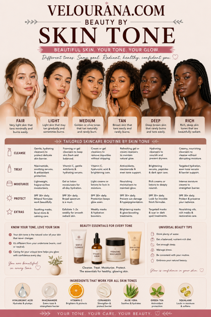
CATEGORY: Light Skin Colors
Light skin can support an exceptionally diverse color palette because it occupies a position where both subtle and dramatic relationships remain clearly visible. Pale shades can create gentle continuity, medium colors can provide balanced definition, and deep colors can introduce substantial contrast without necessarily overwhelming the complexion.
Yet there is no universal collection of colors that belongs to everyone with light skin.
The complexion may lean warm, cool, neutral, peach, golden, rosy, or olive. Natural hair may be pale blonde, red, brunette, black, gray, or somewhere between. Eyes may be light or deep. Eyebrows can create little contrast or dramatically frame the face.
All of these characteristics influence how color behaves.
The same red can look warm and vibrant on one light complexion while appearing cooler and more dramatic on another. Beige can disappear naturally into one person's coloring and make someone else look muted. Emerald may create perfect harmony for one individual and exciting contrast for another.
Understanding the light-skin palette therefore means understanding relationships rather than memorizing rules.
Light Skin Has More Than One Color Identity
Skin-depth categories are useful descriptions, but they do not reveal the complete complexion.
Light skin can contain considerable variation in undertone.
Cool light skin may have pink, rosy, bluish, or violet characteristics.
Warm light skin can contain peach, yellow, cream, or golden qualities.
Neutral light skin balances warm and cool influences.
Light olive skin may contain subtle green, gray-green, muted yellow, or golden-olive characteristics.
These undertones can be obvious or extremely subtle.
Surface redness can make a warm or neutral complexion appear cooler than it really is. Freckles may introduce golden or reddish points of color. Seasonal tanning can temporarily increase warmth.
The most useful undertone observations therefore come from repeated comparison rather than a single visual test.
Depth Determines the Strength of Contrast
The difference between the depth of the complexion and the depth of a color strongly influences how noticeable that color becomes.
Light beige beside light skin creates relatively little depth contrast.
Medium brown provides more structure.
Espresso or black creates substantial separation.
The same principle applies across every color family.
Pale pink appears softer than berry.
Powder blue is gentler than navy.
Sage is quieter than forest green.
Peach creates less depth than rust.
This does not mean lighter colors are automatically more suitable.
Depth is simply a tool.
Low contrast can create softness and cohesion.
High contrast can create drama and definition.
Saturation Determines Color Intensity
Two colors can have similar depth while differing dramatically in saturation.
Dusty rose and vivid pink may both sit in a medium-light range, but vivid pink contains far greater intensity.
Muted teal and saturated turquoise behave differently even when their depth is similar.
Light skin can make highly saturated colors particularly visible.
This can produce exceptional clarity.
Cobalt, emerald, ruby red, vivid coral, and fuchsia can become striking focal colors.
Muted shades create another type of effect.
Sage, dusty blue, faded rose, mushroom, mauve, muted teal, and softened terracotta can provide richness without extreme brightness.
Some people naturally harmonize with clear color.
Others integrate more easily with muted palettes.
Personal contrast and undertone help explain these differences.
Temperature Changes the Complexion by Comparison
Warm colors contain yellow, orange, golden, or warm red influences.
Cool colors contain blue, violet, cool red, or icy characteristics.
When a warm color is placed beside light skin, the complexion may appear cooler by comparison.
When a cool color surrounds the face, natural warmth may become more visible.
This comparative effect explains why the same complexion can appear different depending on clothing or makeup.
Warm camel may make rosy skin appear cooler.
Icy blue can emphasize golden warmth.
Coral can bring peach qualities forward.
Mauve may highlight yellow or olive undertones.
These changes are not necessarily improvements or problems.
They are visual interactions.
Understanding them makes color more predictable.
The Cool Light-Skin Palette
Cool light skin often has a natural affinity with blue-based, violet-based, and rosy colors.
Rose, mauve, raspberry, cranberry, lavender, lilac, plum, cool red, slate blue, navy, charcoal, cool taupe, emerald, and blue-green can create harmonious relationships.
Soft versions of these colors produce understated results.
Dusty rose, misty blue, pale lavender, dove gray, and muted mauve can create an elegant low-contrast palette.
Deeper versions introduce structure.
Burgundy, navy, plum, charcoal, and forest green can create sophisticated depth.
Highly saturated cool shades such as cobalt, fuchsia, sapphire, and vivid blue-red provide stronger visual impact.
Cool light skin can also wear warm colors intentionally.
Gold, camel, peach, coral, rust, and copper can introduce warmth that contrasts with the complexion.
The Warm Light-Skin Palette
Warm light skin may have a creamy, peach, golden, or yellow quality.
Warm palettes can reinforce this natural character.
Ivory, cream, peach, apricot, coral, camel, warm beige, caramel, cinnamon, terracotta, copper, bronze, olive, moss, warm red, and chocolate can create cohesive combinations.
Soft warmth can be especially elegant.
Peach-beige, oatmeal, muted coral, warm taupe, sage, and cream provide subtle color without excessive saturation.
Deeper earth tones create stronger definition.
Rust, olive, chocolate, warm burgundy, forest green, and bronze can provide richness.
Warm light skin can also contrast beautifully with cool shades.
Navy, cobalt, icy pink, violet, sapphire, and blue-green can make golden qualities more noticeable.
The Neutral Light-Skin Palette
Neutral light skin often supports a broad range of temperature.
Balanced rose, dusty peach, taupe, mushroom, beige, neutral red, sage, cocoa, navy, muted berry, champagne, and soft plum can work naturally.
Neutral complexions can shift direction depending on the palette.
Gold and peach may make the appearance warmer.
Silver, mauve, and charcoal may move it cooler.
This flexibility makes neutral coloring particularly adaptable.
However, saturation and depth remain important.
A neutral undertone does not automatically mean every intensity will feel equally balanced.
Natural contrast still determines whether muted or highly saturated colors appear more integrated.
Light Olive Skin and Color
Light olive skin frequently contains a muted quality.
This can make some conventional warm and cool palettes feel too bright or too obvious.
Muted rose, taupe, mushroom, sage, olive, khaki, antique gold, burgundy, mauve, softened berry, and earthy red can interact beautifully with olive undertones.
Some olive complexions also respond exceptionally well to jewel tones.
Emerald can echo green undertones while increasing saturation.
Burgundy provides complementary warmth.
Navy creates deep neutral structure.
Fuchsia can produce dramatic contrast.
Orange and coral may behave unpredictably depending on how green or golden the complexion appears.
Rather than avoiding these shades automatically, observing their individual effect provides better guidance.
Soft Neutrals as a Foundation Palette
Light skin often works beautifully with nuanced neutrals.
Ivory, cream, oatmeal, beige, stone, mushroom, taupe, camel, soft gray, cocoa, and muted brown can create sophisticated combinations.
The undertone of each neutral matters.
Cream contains warmth.
Dove gray introduces coolness.
Mushroom combines gray and brown.
Camel is warmer and deeper.
Taupe can lean cool or warm.
These differences influence the complexion even when the palette appears understated.
A neutral wardrobe can therefore contain substantial color complexity.
Crisp White Versus Cream
White and cream create different relationships with light skin.
Crisp white provides clarity and stronger contrast.
It can make warm skin appear more golden and cool skin appear more rosy or clear.
Cream introduces yellow or ivory warmth.
It often creates a softer transition with warm complexions.
Neutral and olive skin may prefer one or the other depending on their specific undertone.
Neither is universally more flattering.
The choice depends on whether the desired effect is crispness or softness.
Beige Is Never Just Beige
Beige can contain yellow, pink, peach, gray, olive, or brown influences.
Against light skin, these undertones become noticeable.
Warm beige can reinforce golden qualities.
Pink beige may harmonize with rosy skin.
Gray-beige can create sophistication on muted complexions.
Olive beige may integrate naturally with light olive skin.
A beige too close to the skin depth can create a tonal appearance.
This can be elegant when intentional.
Adding contrast through hair, jewelry, lipstick, or accessories can prevent a tonal palette from appearing visually flat.
Gray and Charcoal
Gray provides a broad spectrum from pale silver to deep charcoal.
Cool gray can create beautiful harmony with rosy or cool light skin.
Warmer greige may suit neutral and warm complexions.
Muted olive skin can often work well with complex gray-brown shades.
Charcoal offers substantial depth without the absolute darkness of black.
This makes it a useful structural neutral.
It can anchor pastel palettes, support jewel tones, or create minimalist combinations with white, cream, and taupe.
Brown as a Complex Color Family
Brown should never be treated as one universal neutral.
Warm caramel, chestnut, cocoa, reddish brown, chocolate, espresso, mushroom brown, taupe-brown, and bronze each contain different undertones.
Warm light skin may naturally harmonize with caramel, cinnamon, bronze, and warm chocolate.
Cool light skin may prefer taupe-brown, cool cocoa, and espresso.
Neutral and olive skin can often move across several families.
Brown can create softer structure than black while still providing considerable depth.
This makes it particularly versatile around light complexions.
Earth Colors and Natural Warmth
Earth tones can give light skin richness without requiring extreme saturation.
Terracotta, clay, rust, ochre, camel, olive, moss, tobacco, cinnamon, and muted brown create palettes inspired by soil, stone, foliage, and natural pigments.
Warm complexions may integrate easily with these shades.
Cool complexions can use them for deliberate temperature contrast.
Olive skin often responds naturally to muted earth colors because both contain complex, subdued undertones.
Earth tones can also be paired with cooler neutrals to prevent the overall palette from becoming excessively warm.
Rose and Dusty Pink
Rose occupies a particularly versatile position.
It can lean warm, cool, neutral, brown, or mauve.
Dusty rose reduces saturation and introduces a muted quality.
These colors often work beautifully with light skin because they provide visible color without necessarily creating extreme contrast.
Cool skin may prefer blue-based rose.
Warm skin may respond to peachy or brown-influenced rose.
Neutral and olive complexions may find muted rose especially adaptable.
Rose can function as a cosmetic color, wardrobe neutral, or accent shade.
Its versatility comes from the enormous variation within the family.
Coral and Warm Pink
Coral combines pink, red, and orange in different proportions.
Some corals are almost pink.
Others approach orange-red.
Light skin often displays these differences clearly.
Warm light skin can look luminous beside peach-coral and apricot-coral.
Cool skin may create a more energetic contrast.
Neutral skin can often move comfortably between pinker and warmer coral shades.
Saturation determines whether coral feels soft or dramatic.
Muted coral can behave almost like an earthy neutral.
Bright coral becomes a focal color.
Berry and Burgundy
Berry shades provide greater depth than conventional pink while maintaining red or violet character.
Raspberry is relatively bright.
Cranberry adds cool red depth.
Blackberry becomes darker.
Burgundy and wine introduce greater richness.
Light skin can carry these colors beautifully because the contrast is noticeable without necessarily becoming extreme.
Berry can add life to muted palettes.
Burgundy can replace black or brown when deeper color is desired.
Wine can create sophistication in both clothing and cosmetics.
These shades are particularly useful during autumn and winter but are not inherently seasonal.
Orange, Rust, and Terracotta
Orange-based colors can create strong warmth.
Pure vivid orange may become highly noticeable against light skin.
Rust and terracotta are more muted, containing brown or earthy influences that reduce brightness.
Warm complexions may integrate naturally with these shades.
Cool skin can use them for deliberate contrast.
Light olive skin may respond differently depending on whether the orange emphasizes golden warmth or greenish undertones.
Terracotta often provides greater versatility than pure orange because its muted quality makes it easier to combine with neutral colors.
Red as an Accent or Foundation Color
Red can serve as a small accent or dominate an entire palette.
Light skin gives red enough contrast to remain highly visible.
Warm tomato and poppy reds create energy.
Cool blue-reds provide clarity.
Brick red introduces earthiness.
Crimson adds depth.
Burgundy moves toward dark sophistication.
The same complexion can wear several different reds successfully because each creates a different effect.
Choosing red according to intention is more useful than searching for one supposedly perfect version.
Yellow and Gold
Yellow can be challenging because it shares some pigment qualities with warm skin while contrasting strongly with cool or olive undertones.
Pale butter yellow can create softness.
Mustard introduces earthiness.
Clear yellow creates brightness.
Golden yellow adds warmth and depth.
Warm light skin may harmonize naturally with creamier yellows.
Cool skin can create striking contrast with clear or golden yellow.
Olive skin may respond beautifully to mustard or muted gold, while certain greenish yellows can amplify olive characteristics.
Metallic gold introduces reflection, making its effect different from flat yellow fabric or pigment.
Blue From Powder to Navy
Blue is one of the most versatile families for light skin.
Powder blue creates softness.
Denim is casual and adaptable.
Slate introduces gray.
Cobalt creates saturation.
Sapphire provides jewel-like richness.
Navy adds deep structure.
Cool skin may naturally harmonize with blue, while warm skin creates complementary temperature contrast.
Neutral and olive complexions can often wear multiple blue families successfully.
Navy deserves particular attention because it can replace black while remaining deeply neutral in practical use.
Green From Sage to Emerald
Green can move from pale mint through muted sage and earthy olive to saturated emerald and deep forest.
Sage provides softness.
Olive introduces warmth and earthiness.
Emerald creates clarity and saturation.
Forest green provides depth.
Light olive skin may harmonize naturally with muted greens.
Warm skin can work beautifully with moss and olive.
Cool skin may respond strongly to emerald and blue-green.
The family is broad enough to provide both subtle and dramatic possibilities.
Purple, Lavender, and Plum
Purple spans delicate lavender, dusty mauve, violet, aubergine, and deep plum.
Lavender creates a soft cool effect.
Mauve introduces gray and pink.
Violet increases saturation.
Plum adds depth and red influence.
Aubergine approaches a deep neutral.
Cool light skin often harmonizes naturally with these shades.
Warm skin can create attractive contrast.
Olive skin may find muted mauve and plum especially sophisticated.
Purple families can therefore move from delicate pastel to dramatic dark color without leaving the same broad temperature direction.
Jewel Tones for Strong Definition
Jewel colors offer saturation and depth simultaneously.
Emerald, sapphire, ruby, amethyst, and deep teal can create striking contrast against light skin.
These colors often work particularly well when the natural features contain strong contrast.
Dark hair, deep eyes, or defined brows can help saturated colors feel integrated.
Softer coloring may experience jewel tones as more dominant, which can still be highly attractive.
The decision depends on whether the color should support the person quietly or become an obvious part of the visual statement.
Black and Maximum Contrast
Black provides the strongest conventional neutral contrast with light skin.
It can sharpen the appearance, create structure, and make the complexion appear lighter by comparison.
People with dark hair or brows may find black naturally repeated within their coloring.
Those with softer features may experience it as more dominant.
Charcoal, navy, espresso, and deep plum can provide alternatives when slightly less contrast is desired.
Black remains entirely available when maximum definition is the objective.
Its strength is a characteristic rather than a flaw.
Metallics and Reflected Light
Silver, gold, champagne, bronze, copper, pewter, and rose gold interact with light skin through both pigment and reflection.
Cool skin may naturally harmonize with silver and pewter.
Warm skin may integrate with gold, copper, and bronze.
Neutral skin can often wear mixed metals comfortably.
Olive skin may respond beautifully to antique gold and muted metallics.
However, deliberate contrast can be equally successful.
Silver against warm skin can create crispness.
Gold beside cool skin can introduce visible warmth.
The reflective quality makes metallics particularly dynamic under changing light.
Color Near the Face Matters Most
A color worn near the face usually has a stronger effect on complexion perception than one worn farther away.
Tops, scarves, collars, earrings, necklaces, makeup, and hair color directly influence the visual environment around the skin.
A shade that feels difficult near the face can still be used elsewhere.
Trousers, shoes, bags, belts, or small accessories allow nearly any color to participate in the overall palette without strongly altering complexion perception.
This provides additional freedom.
A personal palette does not need to become a rigid wardrobe restriction.
Color Combinations Matter More Than Isolated Shades
A color rarely appears completely alone.
Coral beside cream behaves differently from coral beside black.
Burgundy with navy feels different from burgundy with camel.
Emerald beside white creates greater crispness than emerald beside chocolate.
The surrounding palette changes the apparent temperature and intensity of every shade.
This means a color that feels difficult in one combination may become highly successful in another.
Creating repetition can also improve cohesion.
A warm color near the face can be echoed in jewelry, lipstick, or accessories.
A strong dark neutral can be repeated in shoes or hair.
Color relationships extend across the entire appearance.
Personal Preference Is Part of Color Success
A technically harmonious palette is not automatically the most satisfying one.
Someone may prefer dramatic contrast even when softer colors blend more naturally.
Another person may prefer muted neutrals despite being able to carry vivid jewel tones.
Personal style determines whether color should whisper or dominate.
Color theory provides an explanation of effects.
It should not replace individual taste.
The most useful knowledge allows someone to predict what a color is likely to do and then decide whether that effect is desirable.
Building an Individual Light-Skin Palette
Developing a personal palette can be approached through comparison.
Observe similar shades beside the face.
Compare ivory with white.
Compare rose with coral.
Compare camel with taupe.
Compare navy with black.
Compare gold with silver.
Compare muted berry with vivid red.
Rather than asking only which looks better, notice what each one changes.
Does the complexion appear warmer?
Does redness become more noticeable?
Do the eyes become clearer?
Does the color dominate the face?
Does the overall appearance become softer or sharper?
These observations reveal the actual relationship between color and complexion.
Over time, patterns emerge.
Certain neutrals become dependable.
Some colors consistently create desirable contrast.
Others work best in small amounts.
The result is not a rigid collection of approved shades.
It is a personal understanding of color.
Light skin can participate in nearly every color family. What changes is the visual effect produced by depth, saturation, temperature, and contrast.
Soft neutrals can create refinement.
Pastels can provide delicacy.
Earth tones can add warmth.
Jewel shades can create richness.
Deep neutrals can introduce structure.
Bright colors can become expressive focal points.
The versatility of light skin lies precisely in these possibilities.
A successful palette does not attempt to reduce them.
It provides the knowledge required to use them deliberately.
THE END VELOURANA
 Discover More From Our Family of Websites
 ZodiacBearing (Astrology, Tarot, Numerology, Angel Numbers & Spiritual Guidance)
 Velourana (Beauty, Makeup, Hair Care, Skincare & Beauty Tips)
 HavenBearing (Home, Living, Organization, Décor & Everyday Inspiration)
 PawBearing (Pet Care, Dog Breeds, Animal Health, Training & Pet Products)
 PsyCatherine (Notes From the Journal of a Psychologist on Real Life)

