
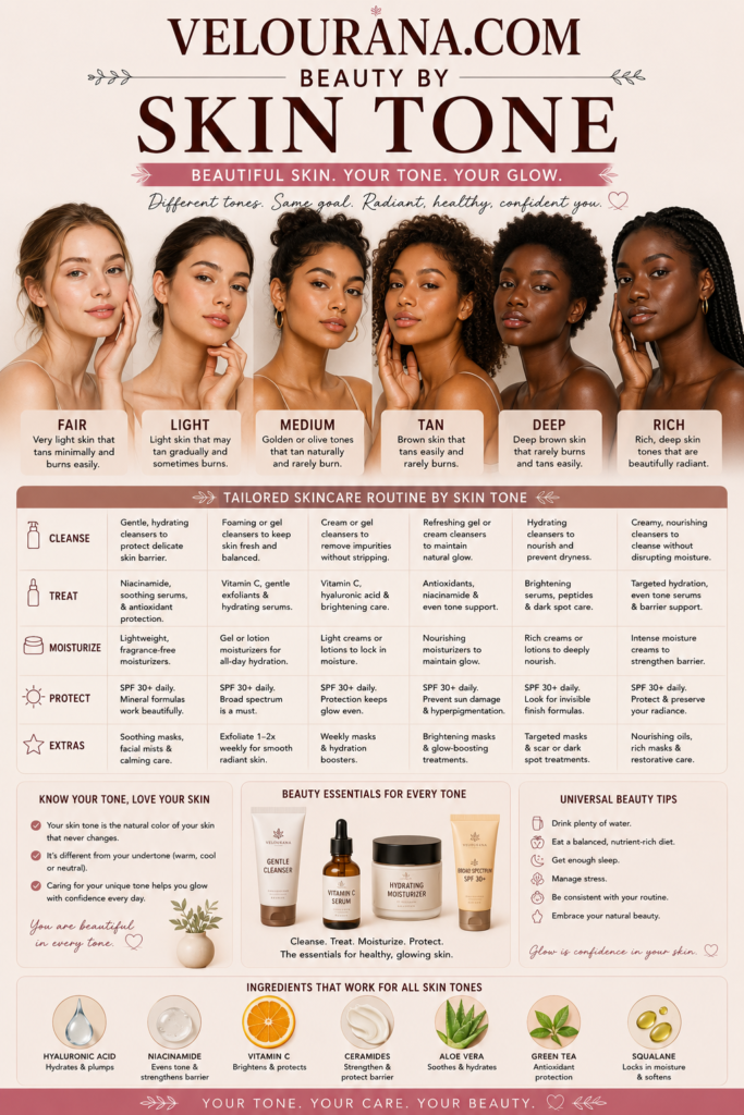
CATEGORY: Fair Skin Colors
A fair complexion can make color extraordinarily expressive. Because the skin itself occupies a light position on the color spectrum, surrounding shades often become more visible, more defined, and sometimes more intense than expected. Small differences between pink and peach, beige and ivory, taupe and brown, or raspberry and burgundy can become remarkably clear once those colors are placed beside fair skin.
This creates both opportunities and challenges.
Choosing colors purely by their names is rarely sufficient. A lipstick called rose may be warm, cool, muted, bright, brown-influenced, or violet-influenced. Beige can contain yellow, peach, gray, pink, or olive characteristics. Red can move toward orange, blue, brown, or purple.
The interaction becomes even more complex because fair skin itself is not one color.
Fair complexions may be rosy, peachy, golden, creamy, neutral, olive, or combinations that do not fit neatly into conventional categories. Natural hair, eyebrows, eyes, freckles, and lips further change the overall visual balance.
A sophisticated fair-skin palette therefore begins with relationships rather than rules.
The Color Dimensions That Matter
Every color has several qualities operating simultaneously.
Depth describes how light or dark the shade is. Temperature describes whether it leans warmer or cooler. Saturation describes how vivid or muted it appears. Undertone describes the subtler color influence within the shade.
Fair skin responds to all of these dimensions.
A pale cool pink and a deep cool berry share a temperature family but create completely different levels of contrast. A muted warm terracotta may appear less visually aggressive than a highly saturated coral even though both are warm. A cool charcoal can create greater depth than a vivid medium blue despite the blue appearing more colorful.
This is why simple rules based entirely on warm and cool categories can be misleading.
Someone may believe that warm colors are unsuitable when the real problem is excessive saturation. Another person may think pastels are unflattering when the issue is that the particular pastels are too chalky or too close to the skin depth.
Separating the dimensions makes color behavior easier to understand.
The Importance of Undertone
Fair describes skin depth, not undertone.
A cool fair complexion may contain pink, rosy, bluish, or violet characteristics. Warm fair skin may have peach, yellow, cream, or golden influences. Neutral fair skin usually contains a more balanced mixture. Fair olive skin may show greenish, gray-green, or muted golden qualities.
These undertones influence how surrounding colors behave.
When a cosmetic shade shares qualities with the complexion, the result often appears harmonious. When the temperatures differ, contrast becomes more noticeable.
A cool rose lipstick on cool fair skin may seem naturally integrated. The same lipstick on warm fair skin might create a crisp cooler contrast. Peach blush may melt naturally into a warm complexion but stand out more distinctly on cool skin.
Neither result is inherently better.
Harmony creates continuity. Contrast creates emphasis.
Knowing the undertone allows the wearer to choose deliberately between those effects.
Why Fair Skin Reveals Color Differences So Clearly
Light skin creates a relatively bright background.
As the depth of a cosmetic or garment increases, the difference between that color and the complexion becomes more pronounced.
This is why deep lipstick can become an immediate focal point on fair skin. Black eyeliner can look extremely defined. Medium bronzer can appear much darker than expected. Berry blush may require only a small amount to become visible.
Fair skin can also expose undertone mismatches quickly.
A foundation that is only slightly too warm may appear orange. One that is too cool can become noticeably pink. A pale concealer with excessive yellow may remain visibly separate from surrounding skin.
The same sensitivity applies to decorative color.
A small shift from dusty pink to coral can noticeably change the warmth of the face. Changing a neutral eyeshadow from taupe to caramel can alter the entire impression of the eye area.
This sensitivity makes thoughtful color selection especially rewarding.
Cool Fair Complexions
Cool fair skin often has a natural relationship with colors containing blue, violet, cool pink, or cool red influences.
Rose, mauve, raspberry, cranberry, lavender, lilac, plum, cool taupe, slate, charcoal, navy, blue-green, and blue-based red can create attractive continuity.
The amount of saturation determines whether the result remains subtle or becomes dramatic.
A soft mauve blush may appear understated. A saturated raspberry can become vivid. Pale lavender can create delicacy, while deep violet produces significant contrast.
Cool neutrals can be particularly useful.
Taupe provides definition without strong warmth. Charcoal offers depth. Navy can function almost like a softer alternative to black. Dove gray can create a quiet relationship with very fair rosy skin.
Cool fair skin does not need to avoid warmth.
Copper, coral, peach, camel, and warm brown can create intentional contrast. Repeating warmth elsewhere in the overall appearance can make these shades feel integrated even when they do not match the natural undertone.
Color theory is most useful when it explains the effect rather than forbidding it.
Warm Fair Complexions
Warm fair skin often carries peach, golden, yellow, cream, or warm beige influences.
Colors that repeat these qualities can create a luminous, unified appearance.
Peach, apricot, coral, warm rose, camel, cream, ivory, terracotta, bronze, copper, olive, moss, cinnamon, warm brown, and tomato red can interact naturally with this complexion family.
Intensity remains important.
A pale apricot blush can produce a delicate warmth, while vivid coral may become extremely noticeable. Soft camel can function as a neutral, while deep rust creates stronger contrast.
Warm fair skin also demonstrates the importance of choosing the correct neutral.
Stark white may create a sharp contrast, while cream or ivory can appear more integrated. Cool gray may emphasize warmth in the skin, whereas warm taupe can create greater continuity.
These are effects rather than universal judgments.
Someone may prefer the crispness of white precisely because it contrasts with a warm complexion.
Personal preference determines whether harmony or separation is more desirable.
Neutral Fair Complexions
Neutral fair skin occupies a flexible position between strongly warm and strongly cool coloring.
Balanced rose, dusty peach, taupe, beige, neutral red, muted berry, cocoa, champagne, sage, navy, soft plum, and many medium browns can work naturally.
Neutral skin can often move between warm and cool palettes with relatively small adjustments.
A peach blush paired with bronze eyes can create warmth. Mauve lips and charcoal eyes can shift the appearance cooler.
The complexion itself remains adaptable.
Neutrality can sometimes make foundation selection challenging because formulas that lean strongly in either direction may look artificial. A highly yellow base can become obvious, while a strongly pink foundation can look equally disconnected.
Balanced shades tend to provide a better starting point.
This flexibility does not eliminate considerations of depth and saturation. A vivid color can still overwhelm low-contrast features, and a very pale color can still reduce definition.
Neutrality simply broadens the temperature possibilities.
Fair Olive Complexions
Fair olive skin deserves special consideration because it is frequently misclassified.
Olive undertones are not restricted to medium and deep skin. A very light complexion can still contain subtle green, gray-green, yellow-green, or muted golden qualities.
These characteristics may become most obvious during foundation matching.
Pink bases can appear excessively rosy. Yellow formulas may look too golden. Peach foundations may become orange. Conventional neutral shades may still fail to disappear naturally.
Muted colors can be especially interesting on fair olive skin.
Dusty rose, muted mauve, sage, olive, mushroom, antique gold, softened berry, burgundy, taupe, and earthy neutrals may interact beautifully with the complexion's subdued qualities.
Extremely bright pink or orange can create stronger contrast. Chalky pastels may emphasize the muted quality of the skin.
Again, contrast is not automatically undesirable.
Recognizing olive undertones simply makes the behavior of these colors more predictable.
Understanding Pink on Fair Skin
Pink is often presented as the quintessential fair-skin color, but there is no single pink.
Shell pink is pale and delicate. Ballet pink can be soft and slightly muted. Rose may contain red or brown. Mauve-pink introduces violet or gray. Raspberry becomes deeper and cooler. Fuchsia increases saturation dramatically. Coral-pink introduces warmth.
These differences matter.
A pale pink close to the skin depth may create very little contrast. A medium rose can provide definition. A vivid fuchsia can become the dominant color in the entire appearance.
Blush application changes the result further.
A highly pigmented pale blush can sometimes look stronger than a deeper but translucent formula. A deep berry applied sparingly may produce a believable flush rather than a dramatic patch of color.
Fair skin therefore benefits from considering both the shade and the concentration in which that shade is applied.
Peach, Apricot, and Coral
Peach combines pink, orange, and sometimes beige characteristics.
On warm fair skin, it can resemble a natural flush. On neutral skin, it may introduce gentle warmth. On cool fair skin, it can create a more visible contrast.
Apricot generally moves further toward warm orange-gold territory, while coral can range from pink-dominant to strongly orange-red.
This variation explains why someone may love one coral and dislike another.
Soft peach can function almost as a neutral blush. Bright coral lipstick can become a statement color. Apricot eyeshadow can introduce warmth without necessarily creating the intensity of copper.
Fair skin can make orange pigment particularly visible, so application strength becomes important.
Bronzers illustrate this clearly. A bronzer with excessive orange can appear unnatural on a very light complexion even when the skin itself is warm.
Warmth needs to relate not only to undertone but also to depth.
Mauve, Berry, Plum, and Burgundy
Deeper red-violet families offer some of the richest possibilities for fair complexions.
Mauve can contain pink, violet, gray, and brown. This complexity allows softer mauves to function almost like neutrals.
Berry introduces greater red saturation. Plum moves further toward violet. Burgundy and wine create deeper, more dramatic versions of the same general family.
Against fair skin, these colors can develop considerable intensity.
A sheer berry lip can appear fresh and translucent. An opaque berry can become glamorous. Burgundy lipstick creates high contrast, while a lightly diffused burgundy blush can produce a sophisticated flush.
Plum and burgundy also work beautifully around the eyes because they provide depth without relying entirely on black or brown.
They can create definition while maintaining visible color.
These shades demonstrate that depth does not necessarily equal harshness. A muted deep plum may appear more sophisticated and less aggressive than an extremely bright medium pink.
Red and the Power of Contrast
Red becomes especially striking against fair skin because it combines strong pigmentation with substantial depth contrast.
Different reds create very different effects.
Blue-red can appear crisp and cool. Tomato red introduces warmth. Poppy red can feel energetic. Brick red adds earthiness. Crimson provides depth. Burgundy introduces wine and violet influences.
Lipstick makes these differences particularly obvious.
A sheer red stain can resemble naturally intensified lip pigmentation. A satin red becomes polished and noticeable. An opaque matte red creates strong graphic definition.
Fair skin does not require one specific type of red.
The better approach is to decide what the red should accomplish.
A warm red can introduce heat. A cool red can create clarity. A dark red can provide drama. A translucent red can retain softness.
The color becomes a creative choice rather than a test of whether a particular shade is technically correct.
Nude Colors Are More Complex Than Beige
Nude lipstick should not necessarily resemble foundation.
Natural lips contain pigmentation. Even on very fair complexions, they may contain pink, rose, peach, mauve, red, or brown.
Removing all of that color can make the mouth disappear.
A successful nude often preserves some relationship with natural lip pigmentation while reducing contrast.
Rosy beige, peach-beige, pink-brown, muted mauve, soft caramel, and balanced neutral shades can all function as nudes depending on the individual.
The same principle applies to clothing.
Cream, ivory, oatmeal, blush beige, stone, mushroom, taupe, pale camel, and soft gray are all light neutrals, yet each has a distinctive undertone.
Because these colors may sit close to fair skin in depth, their temperature becomes particularly visible.
A cream garment can reinforce warmth. Dove gray may emphasize coolness. Mushroom can complement muted undertones. Blush beige may highlight rosy qualities.
Neutral does not mean colorless.
Pastels and Light Colors
Pastels are frequently associated with fair skin because they create relatively low depth contrast.
Powder blue, pale lavender, soft peach, mint, blush pink, buttercream, light aqua, and misty gray can create an airy effect.
But pastels differ considerably in undertone and saturation.
Some contain large amounts of white and appear chalky. Others are softened through gray and appear more muted.
A fair complexion with naturally delicate coloring may harmonize beautifully with subtle pastels. Another fair complexion with dark hair and strong eyebrows may benefit from clearer or deeper colors that echo its natural contrast.
Pastels can also be combined with stronger accents.
A pale outfit with burgundy lips, soft lavender with dark eyeliner, or cream clothing with a saturated red lip can preserve lightness while introducing a defined focal point.
The palette does not need to remain equally soft everywhere.
Earth Tones on Fair Skin
Earth colors are sometimes associated primarily with warmer or deeper complexions, but they can work beautifully against fair skin.
Olive, moss, rust, terracotta, clay, cinnamon, camel, tobacco brown, warm taupe, muted ochre, and chocolate offer varying combinations of warmth, depth, and muted saturation.
On warm fair skin, these colors may create natural continuity.
On cool fair skin, they can provide deliberate warmth and contrast.
Muted earth tones can be particularly sophisticated because their lower saturation prevents them from becoming excessively vivid even when they are substantially deeper than the complexion.
Terracotta lipstick, for example, can create warmth without the brightness of coral. Olive eyeshadow can introduce color while behaving almost like a neutral. Camel clothing can provide depth without approaching the strength of black.
Earth tones demonstrate that fair-skin palettes need not be dominated by pink and pastel shades.
Jewel Colors and Saturated Shades
Emerald, sapphire, ruby, amethyst, cobalt, deep teal, and other saturated colors can create spectacular contrast with fair skin.
Their richness makes the complexion appear lighter by comparison.
This can produce an elegant, dramatic effect, particularly when the person's natural coloring already contains significant contrast through dark hair, eyebrows, or eyes.
Low-contrast fair coloring can also wear jewel tones, but the colors may become more dominant.
That dominance can be used intentionally.
A saturated emerald garment can become the central visual element. Cobalt eyeliner can create a graphic accent. Deep teal eyeshadow can introduce drama without relying on conventional black.
The key is recognizing that saturated colors demand attention.
Whether that attention is desirable depends on the intended style rather than the skin tone alone.
Black, Navy, Charcoal, and Espresso
Deep neutrals provide structure around fair skin.
Black creates maximum contrast. Navy retains considerable depth while introducing blue. Charcoal softens black slightly. Espresso provides similar depth with warmer brown characteristics.
These colors can affect the complexion differently.
Black may make fair skin appear even lighter. Navy can provide strong definition without the absolute severity of black. Charcoal often feels softer around low-contrast coloring. Espresso may integrate beautifully with warm hair or eyes.
In makeup, these differences are especially useful.
Black eyeliner creates sharp definition. Espresso can produce a softer frame. Charcoal creates a smoky effect. Navy can subtly emphasize blue or gray eyes while remaining dark enough to function almost like a neutral.
No deep neutral is universally superior.
The best choice depends on the desired degree of contrast and the other colors already present.
Blue and Green Families
Blue and green offer enormous variety.
Powder blue creates softness. Denim and slate provide muted middle ground. Navy offers depth. Cobalt produces strong saturation.
Green ranges from pale mint through sage and olive to emerald and forest.
Fair skin can interact with all of these colors.
Cool complexions may naturally echo blue-based shades. Warm complexions may create a complementary contrast with them. Olive skin can develop interesting harmony with sage, moss, and muted green.
Eye color also influences the result.
Blue eyes may become more noticeable beside copper, bronze, or warm brown because of complementary contrast. Green eyes can become more prominent beside plum, berry, or burgundy. Brown eyes can interact beautifully with both cool and warm palettes depending on their individual undertones.
The face should therefore be considered as a complete color composition rather than skin alone.
Metallic Shades
Metallic colors introduce reflection as well as pigment.
Silver, pewter, gold, champagne, bronze, copper, and rose gold can all behave differently against fair skin.
Silver and pewter can reinforce coolness. Gold and bronze introduce warmth. Champagne often occupies a flexible middle position. Rose gold combines warmth with pink influences.
For complexion highlighting, depth matters significantly.
A metallic highlighter with a base that is too dark can remain visible as a stripe when it is not reflecting light. Fair skin often requires a relatively light base pigment when the goal is a seamless highlight.
Eye makeup allows much greater contrast.
Copper can create warmth. Silver provides a cool reflective effect. Bronze offers richness. Pewter can create smoky definition. Metallic plum combines reflection with deeper color.
Jewelry creates similar relationships around the face and can subtly change how the complexion is perceived.
Hair Color Alters the Entire Palette
Hair is one of the largest areas of color surrounding the face.
Fair skin with black or deep brunette hair creates strong natural contrast. Fair skin with platinum, pale blonde, silver, or light red hair may create a much softer value pattern.
A change in hair color can therefore alter how familiar cosmetics and clothing appear.
Deep lipstick that seemed extremely dramatic with pale blonde hair may feel more integrated after the hair becomes dark brown. Warm colors may become more harmonious after introducing copper or auburn into the hair. Ash blonde can shift the overall appearance toward cooler or more muted territory.
Eyebrows also contribute significantly.
Dark brows can provide enough structure to support stronger makeup even when the hair itself is light. Soft brows reduce contrast and can make highly saturated cosmetics appear more dominant.
Color choices should therefore respond to the complete appearance rather than an isolated skin classification.
Seasonal Changes in Fair Skin
Fair skin may change visibly throughout the year.
Some people develop freckles or a slight tan during warmer months. Others experience increased redness, dryness, or pallor during winter.
These changes do not necessarily alter the underlying undertone, but they can change the way colors behave.
Foundation depth may need adjustment. A blush that appeared strong during winter may become more subtle after the complexion deepens slightly. Nude lipstick may need additional depth to preserve definition.
Seasonal clothing colors also alter the visual environment.
Winter wardrobes may introduce black, charcoal, burgundy, forest green, and navy. Summer may bring white, cream, pastel, aqua, coral, or brighter colors.
The complexion can appear different simply because the surrounding palette has changed.
A useful personal color system therefore allows flexibility rather than assuming the complexion remains visually identical throughout the year.
Creating a Balanced Makeup Palette
A balanced fair-skin makeup palette does not require every product to share the same undertone.
Instead, the colors should communicate intentionally with one another.
A cool berry lip can be combined with neutral taupe eyes and soft rose cheeks. Warm coral lips can be supported by peach blush and subtle bronze around the eyes. Burgundy lipstick can become the dominant element while the rest of the face remains restrained.
Balance often comes from controlling where contrast appears.
If the eyes are highly dramatic, a softer lip can preserve visual hierarchy. If the lipstick is saturated and deep, minimal eye makeup can allow the mouth to remain the focal point.
Alternatively, deliberately dramatic makeup can use strong contrast in several areas.
There is no universal requirement for subtlety simply because the complexion is fair.
The important consideration is whether the intensity is intentional.
Moving Beyond Restrictive Color Rules
The most useful color guidance explains what a shade is likely to do.
It should not dictate what someone is allowed to wear.
A warm complexion can wear icy blue. A cool complexion can wear orange. Fair olive skin can wear fuchsia. Someone with very low natural contrast can wear black.
These choices simply produce different visual relationships.
Harmony can create softness and cohesion. Contrast can create energy and drama.
Personal style determines which is preferable.
Understanding undertone, saturation, and depth gives the wearer greater ability to control those effects. It becomes possible to recognize why one peach looks natural while another becomes orange, why one pink looks delicate while another dominates, or why navy feels softer than black despite providing substantial definition.
This knowledge expands the palette.
It does not reduce it.
Developing a Personal Fair-Skin Color Language
The most reliable fair-skin palette develops through observation over time.
Notice what happens when different colors are placed directly beside the face. Compare cream with bright white, rose with peach, navy with black, taupe with caramel, raspberry with coral, silver with gold.
The purpose is not simply to identify winners and losers.
Observe the type of effect each color creates.
One shade may make the complexion appear warmer. Another may emphasize rosy tones. One may create clarity, while another creates softness. A deep color may provide desirable drama. A muted shade may produce quiet sophistication.
These observations gradually create a personal color language.
Someone may discover that muted rose is a dependable neutral, navy provides ideal definition, cream feels more natural than white, burgundy works beautifully for drama, and emerald creates a favorite high-contrast effect.
Another person with equally fair skin may reach completely different conclusions.
That difference is exactly why fair skin cannot be reduced to one prescribed palette.
The lightness of the complexion creates a distinctive canvas, but undertone, natural contrast, surrounding features, and personal preference determine how that canvas interacts with color.
Fair skin can support softness without becoming fragile, darkness without becoming overwhelmed, brightness without becoming artificial, and neutrality without becoming dull.
The most sophisticated approach is therefore not to ask which colors belong to fair skin.
It is to understand how colors behave against a particular fair complexion and then choose the effect deliberately.
THE END VELOURANA
 Discover More From Our Family of Websites
 ZodiacBearing (Astrology, Tarot, Numerology, Angel Numbers & Spiritual Guidance)
 Velourana (Beauty, Makeup, Hair Care, Skincare & Beauty Tips)
 HavenBearing (Home, Living, Organization, Décor & Everyday Inspiration)
 PawBearing (Pet Care, Dog Breeds, Animal Health, Training & Pet Products)
 PsyCatherine (Notes From the Journal of a Psychologist on Real Life)

