
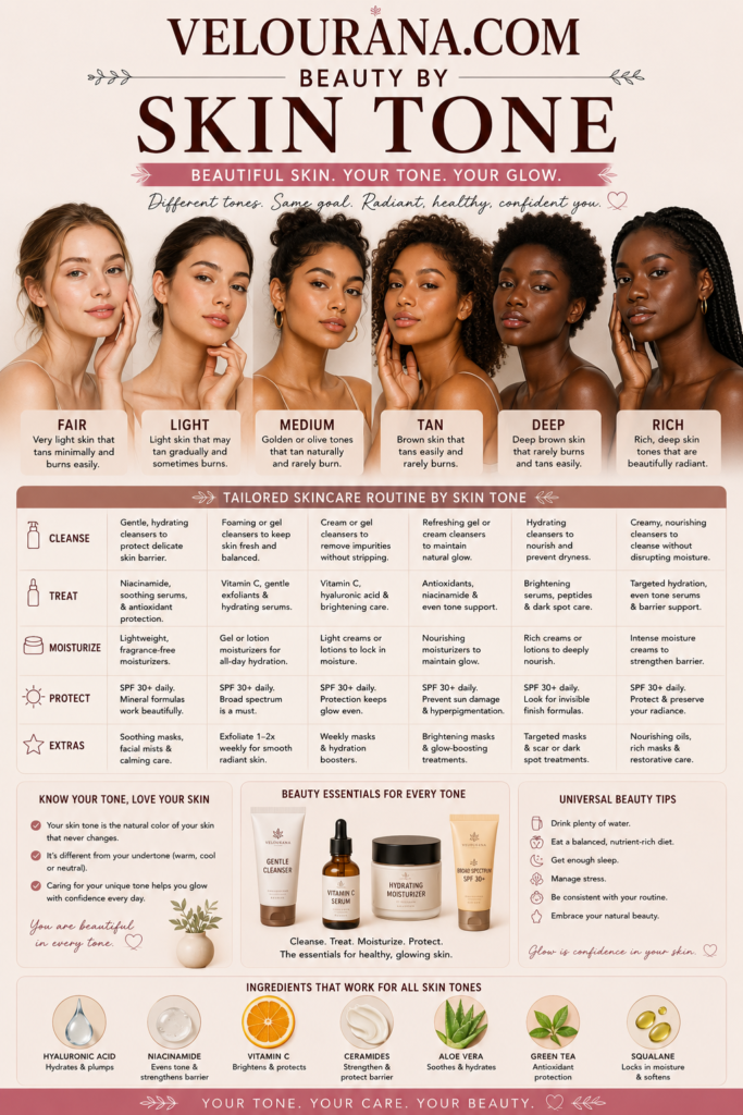
CATEGORY: Tan Skin Colors
Tan skin has enough natural depth to create a rich relationship with color. Soft shades can remain visible without appearing washed out, medium tones can create refined tonal harmony, and deeper or more saturated colors can add striking contrast without immediately overwhelming the complexion. This makes tan skin exceptionally versatile across warm earth palettes, luminous neutrals, jewel tones, deep reds, vivid blues, greens, and metallic finishes.
The category itself is broad. Tan skin may be golden, olive, bronze, peach, neutral, reddish, muted, or cool. Some complexions tan into a distinctly warm caramel color, while others develop more olive or bronze characteristics. Hair color, eye color, brows, natural lip pigmentation, and seasonal changes all affect how surrounding shades are perceived.
This is why useful color selection begins with the complexion's undertone rather than with depth alone.
A warm tan complexion may glow beside terracotta, bronze, caramel, rust, and coral. Olive-tan skin may interact beautifully with muted rose, deep green, burgundy, antique gold, and smoky blue. Neutral tan skin can move comfortably between warm and cool palettes, while cooler tan complexions may create elegant harmony with berry, plum, navy, charcoal, and blue-red.
The goal is not to find one universal list of colors that belong to tan skin.
It is to understand how different colors behave against the individual complexion and then choose deliberately between harmony, contrast, softness, richness, or intensity.
Tan Skin Is More Than Warmth
Tan skin is often assumed to be automatically warm.
Many tan complexions do contain golden, bronze, caramel, or peach undertones, but others are neutral, olive, rosy, or cool.
This distinction matters because temperature influences how colors interact with the complexion.
Warm tan skin often contains yellow, gold, peach, bronze, or red-brown influences. Cool tan skin can contain muted red, rosy, bluish, or violet undertones. Neutral tan skin balances warm and cool characteristics. Olive-tan skin may contain green, gray-green, muted yellow, or golden-olive qualities.
A color that shares the undertone often creates continuity.
A color that opposes it creates contrast.
Neither effect is inherently better.
Warm camel against golden tan skin can create a seamless tonal relationship.
Cool cobalt against the same complexion can make the warmth appear stronger.
A berry shade may integrate naturally with cool or neutral tan skin but become a richer contrasting accent on golden skin.
Understanding the undertone gives greater control over the result.
The Advantage of Natural Depth
Tan skin has enough natural depth to support colors that might create extreme contrast against very fair complexions.
Deep plum, burgundy, navy, espresso, forest green, charcoal, and black can all provide structure while remaining integrated with the overall appearance.
At the same time, lighter shades such as ivory, cream, pale peach, soft blue, lavender, and blush can create bright contrast.
This range gives tan skin substantial flexibility.
Medium-depth colors often create particularly sophisticated tonal combinations.
Camel, bronze, terracotta, rose-brown, olive, caramel, muted rust, cocoa, and mushroom can sit close enough to the complexion to create richness without sharp separation.
The result can look polished and cohesive.
The same complexion can then move into high contrast through crisp white, saturated jewel tones, bright red, cobalt, or deep black.
This ability to move from tonal to dramatic palettes is one of the strongest characteristics of tan skin.
Warm Tan Skin and the Richness of Earth Color
Warm tan skin often has a natural affinity with colors drawn from earth, spice, wood, metal, and sunlight.
Terracotta, rust, cinnamon, camel, caramel, bronze, copper, olive, moss, ochre, warm brown, chocolate, coral, tomato red, apricot, and warm rose can create deeply harmonious relationships.
These shades work because they repeat warmth already present in the complexion.
They also contain enough depth to stand beside tan skin without becoming weak.
Terracotta can behave almost like a neutral.
Camel can create tonal sophistication.
Rust adds red-orange warmth.
Olive and moss introduce earthiness.
Copper and bronze bring metallic richness.
Chocolate creates structure.
The palette can remain warm without becoming visually flat because the colors vary in depth, saturation, and finish.
Warm tan skin can also use cool contrast very effectively.
Cobalt, sapphire, navy, emerald, blue-green, violet, and cool red can make golden undertones appear even richer by comparison.
The complexion becomes more visibly warm precisely because the surrounding color moves in the opposite direction.
Cool Tan Skin and Refined Color Contrast
Cool tan skin may contain rosy, reddish, blue, or muted violet undertones.
These complexions can interact beautifully with berry, plum, mauve, cranberry, cool rose, blue-red, charcoal, slate, navy, cool taupe, blue-green, and violet.
Because the skin has natural depth, these colors can be worn in rich versions without automatically becoming severe.
Deep plum can look sophisticated rather than dramatic.
Burgundy can function almost as a neutral.
Navy can provide structure without the absolute intensity of black.
Cool taupe can create subtle tonal definition.
Warm colors remain entirely available.
Copper, camel, coral, terracotta, peach, and warm brown can create visible temperature contrast.
This can produce a particularly striking effect because the complexion remains stable enough to support the added warmth.
Color harmony is useful, but contrast can often be more expressive.
Neutral Tan Skin and Broad Flexibility
Neutral tan skin generally contains a balanced mixture of warm and cool influences.
This gives it considerable temperature flexibility.
Balanced rose, taupe, cocoa, muted peach, sage, navy, champagne, mushroom, berry, warm gray, burgundy, and neutral red can all interact naturally.
Neutral tan skin can move warmer through bronze, caramel, gold, and coral.
It can move cooler through plum, charcoal, silver, mauve, and sapphire.
The skin itself acts as a bridge between these directions.
The main consideration becomes not temperature but saturation and contrast.
Some neutral tan complexions are naturally clear and support vivid color beautifully.
Others are more muted and integrate more easily with softened shades.
Natural hair and eye contrast can also change how strong colors feel.
Neutrality creates range, but the rest of the appearance determines how that range is best used.
Olive-Tan Skin and Complex Color Relationships
Olive undertones can become especially noticeable within tan complexions because the skin may combine green, gray-green, golden, and bronze characteristics.
This can create a rich but muted color identity.
Olive-tan skin often interacts beautifully with complex shades.
Burgundy, muted rose, plum, deep teal, sage, forest green, taupe, antique gold, khaki, mushroom, rust, and earthy red can all create sophisticated harmony.
Saturated colors can also look exceptional.
Emerald intensifies the green relationship.
Cobalt creates cool contrast.
Ruby or clear red opposes the green undertone.
Fuchsia can become strikingly vivid.
Deep sapphire provides strong depth.
The result depends on whether the goal is to echo the complexion or separate from it.
Olive-tan skin is especially versatile because it can support muted earth palettes and dramatic jewel colors equally well.
Tonal Color Can Look Particularly Luxurious on Tan Skin
Colors close to tan skin in depth can create sophisticated low-contrast styling.
Camel, caramel, bronze, cocoa, warm taupe, terracotta, muted rust, olive, mushroom, cinnamon, and rose-brown can all participate in tonal palettes.
When depth contrast is low, undertone becomes more important.
A camel that shares the complexion's golden warmth can create seamless continuity.
A beige with too much pink may stand out more than expected.
A gray-brown may create elegance on muted skin but appear dull beside a very clear golden complexion.
Tonal color also benefits from variation in texture.
Metallic bronze, matte cocoa, satin camel, glossy caramel, and soft terracotta can all sit within one color family while remaining visually distinct.
This prevents the palette from becoming flat.
Light Colors Create Bright Contrast
Tan skin can carry light colors particularly well because they create noticeable value contrast without requiring high saturation.
Ivory, cream, pale peach, blush, powder blue, lavender, mint, butter yellow, and soft aqua can all bring brightness toward the face.
Bright white creates the strongest contrast.
Cream and ivory soften the effect by introducing warmth.
Pastels can appear fresh and modern, particularly when their undertone is clear.
Muted light colors create a softer transition.
The amount of white in a pastel affects how graphic the contrast becomes.
A chalky pastel can stand sharply against tan skin.
A dusty pastel can appear more sophisticated.
This gives lighter colors much more range than simply being described as soft.
Earth Tones Can Become Everyday Neutrals
Earth colors often feel almost effortless on tan skin because their depth and muted saturation sit naturally beside the complexion.
Terracotta, rust, clay, olive, moss, ochre, camel, cinnamon, tobacco, cocoa, chocolate, and warm stone can all create rich everyday palettes.
These shades work particularly well because they contain complexity.
They are not pure red, orange, yellow, green, or brown.
They are mixtures.
Tan skin often responds well to this complexity because the complexion itself contains several undertone influences.
Earth palettes can also be made lighter or darker without changing their overall character.
Cream and sand add brightness.
Camel and terracotta provide middle depth.
Chocolate and deep olive anchor the palette.
The result can be cohesive without becoming monotonous.
Jewel Tones Bring Saturation and Richness
Jewel tones can be especially powerful on tan skin.
Emerald, sapphire, ruby, amethyst, deep teal, garnet, cobalt, and rich magenta combine depth with saturation.
The complexion has enough natural depth to support these shades without being overwhelmed.
Jewel tones can therefore become focal colors while still feeling connected to the person wearing them.
Warm tan skin often becomes more luminous beside cooler jewel tones.
Cool tan skin may integrate naturally with sapphire, amethyst, burgundy, and deep teal.
Olive-tan skin can carry emerald and garnet beautifully.
Neutral tan skin can often move comfortably among all of them.
The strongest effect usually comes when saturated color is given enough visual space.
One jewel-toned garment or makeup feature can be more effective than several equally strong colors competing at once.
Red Can Be Warm, Earthy, Cool, or Dramatic
Red is one of the most versatile color families for tan skin.
Tomato red creates warmth.
Orange-red feels energetic.
Brick and rust-red introduce earthiness.
Blue-red creates crispness.
Crimson provides depth.
Burgundy and wine offer richer, darker interpretations.
Warm tan skin may harmonize naturally with tomato, brick, coral-red, and rust.
Cool tan skin can respond beautifully to cranberry, burgundy, blue-red, and berry-red.
Olive tan skin may create especially strong contrast with clear red because red and green naturally oppose one another.
Neutral tan skin can often wear several different red families successfully.
The question is not which red is universally best.
It is what kind of visual effect is desired.
Pink Can Be Much Stronger Than It Appears
Pink can look extraordinarily rich against tan skin because there is enough depth difference for the color to remain clear.
Dusty rose can create refinement.
Warm rose can integrate naturally.
Coral-pink adds warmth.
Mauve-pink cools the palette.
Raspberry provides depth.
Fuchsia creates maximum saturation.
On olive-tan skin, clear pink may appear especially vivid because it contrasts with green undertones.
Muted pinks create a completely different effect.
They can behave almost like sophisticated neutrals.
This makes pink useful across both subtle and dramatic palettes.
Blue Can Reveal Warmth in the Complexion
Blue often creates a particularly attractive contrast with tan skin.
Powder blue offers light brightness.
Denim provides casual middle depth.
Slate introduces gray.
Navy creates structure.
Cobalt provides vivid clarity.
Sapphire adds jewel-toned richness.
Teal bridges blue and green.
Warm tan skin often looks more golden beside blue.
Neutral tan skin can appear clearer.
Cooler tan skin may create greater harmony.
Navy is especially useful because it provides dark structure without the absolute neutrality of black.
Cobalt and sapphire create much stronger focal effects.
This range makes blue one of the most adaptable families for tan complexions.
Green Can Move From Tonal to Dramatic
Green can either echo tan skin's warmth and earthiness or create strong saturated contrast.
Sage creates softness.
Olive and khaki can become near-neutrals.
Moss provides earthy depth.
Forest green adds structure.
Emerald introduces saturated richness.
Teal and blue-green create cooler interpretations.
Olive-tan skin may integrate naturally with sage, olive, khaki, and moss.
Warm tan skin can look rich beside forest or emerald.
Cool tan skin may respond beautifully to blue-green and teal.
The family covers enough range to support both natural and dramatic styling.
Purple, Plum, and Mauve Add Sophisticated Depth
Purple families can work exceptionally well against tan skin because they provide both coolness and red influence.
Lavender creates light contrast.
Mauve offers muted sophistication.
Plum introduces depth.
Aubergine becomes almost a dark neutral.
Amethyst creates jewel saturation.
Warm tan skin often looks striking beside violet because the temperature contrast is clear.
Cool tan skin may harmonize naturally with mauve, plum, and berry-violet.
Olive-tan skin can respond especially well to plum and burgundy because the red-violet component creates complementary tension.
Purple can therefore move from understated to dramatic within the same broad family.
Black, Navy, Espresso, and Charcoal Provide Structure
Tan skin can support deep neutrals comfortably.
Black creates maximum contrast.
Navy provides similar depth with a cooler quality.
Espresso adds warmth.
Charcoal creates muted structure.
Deep chocolate offers richness.
Aubergine and deep olive provide colored alternatives.
The complexion's natural depth prevents these shades from always becoming overly severe.
Black may look particularly integrated when the hair and brows are also dark.
Navy can soften the overall effect while still anchoring the palette.
Espresso may harmonize beautifully with warm or golden skin.
Charcoal can provide sophisticated contrast against neutral or cool tan skin.
The best choice depends on the type of structure desired.
Cream, Beige, and Brown Need Undertone Awareness
Neutral colors can become surprisingly expressive against tan skin.
Cream introduces warmth.
Ivory softens white.
Beige can contain pink, peach, yellow, gray, or olive influences.
Camel creates deeper warmth.
Taupe can lean cool or warm.
Brown ranges from caramel to espresso.
When a neutral sits close to the complexion in depth, undertone becomes particularly important.
A peach beige can appear more orange.
A pink beige may stand out unexpectedly.
A muted taupe can create sophistication.
A warm camel may blend beautifully with golden skin.
Neutral palettes can therefore be as complex as colorful ones.
Metallics Can Intensify the Natural Radiance of Tan Skin
Metallic colors interact strongly with tan skin because the complexion already contains enough depth to support reflective pigment.
Gold can reinforce warmth.
Bronze adds richer depth.
Copper introduces red-orange character.
Champagne provides lighter luminosity.
Rose gold combines warmth with pink.
Silver creates cool contrast.
Pewter adds muted coolness.
Antique gold can work especially well on olive or muted tan skin.
Metallics are dynamic because they change according to light.
A bronze may appear subtle in shadow and highly reflective under direct illumination.
This allows metallics to create richness without relying solely on saturation.
Hair Color Changes the Color Balance
Tan skin appears different depending on surrounding hair color.
Black or very dark brown hair increases natural contrast.
Rich brunette can reinforce warmth or coolness depending on undertone.
Caramel and honey highlights can make the complexion appear more golden.
Auburn and copper introduce red-orange influence.
Ash brown can create a cooler, more muted appearance.
Lighter hair can reduce the overall contrast and make saturated clothing or makeup feel more dominant.
This means a personal palette may shift after a significant hair-color change.
The complexion has not changed, but the visual environment around it has.
Eye Color Can Redirect the Palette
Eye color can influence which shades feel especially expressive.
Brown eyes can support almost any color family because their natural depth provides structure.
Hazel eyes may shift toward green or gold depending on surrounding shades.
Green eyes often respond strongly to plum, burgundy, berry, and red-brown.
Blue or gray eyes can become especially noticeable beside bronze, copper, rust, and warm brown.
The best color may therefore be one that creates a relationship among the skin, eyes, and hair simultaneously.
Color selection does not need to focus on skin alone.
Seasonal Changes Can Increase or Reduce Contrast
Tan skin often changes noticeably through the year.
Summer may increase depth, golden warmth, bronze, or olive qualities.
Winter can make the complexion appear lighter or more muted.
The same color can therefore behave differently by season.
Cream may create less contrast during summer.
White can become more dramatic.
Earth tones may become more tonal.
Cool jewel colors may make increased warmth more visible.
In winter, burgundy, charcoal, taupe, navy, and muted rose may create stronger harmony.
A flexible palette acknowledges these changes without assuming the undertone has completely transformed.
Color Harmony Does Not Need to Be the Only Goal
A color can be successful because it blends naturally with tan skin.
It can also be successful because it creates deliberate contrast.
Camel beside golden tan skin creates harmony.
Cobalt creates contrast.
Terracotta reinforces warmth.
Sapphire cools the composition.
Olive creates tonal depth.
Fuchsia creates saturation.
Black provides structure.
Ivory provides brightness.
Each relationship contributes something different.
Color becomes more useful when these effects are recognized rather than reduced to a binary choice between flattering and unflattering.
Developing a Personal Tan-Skin Palette
The most accurate palette comes from direct comparison.
Observe cream beside white.
Compare camel with taupe.
Look at coral beside rose.
Compare navy with black.
Try emerald beside olive.
Compare gold with silver.
Place brick red beside blue-red.
Notice what changes.
Does the complexion become warmer?
Does a color create clarity?
Does it blend almost tonally?
Does it become the dominant feature?
Does it emphasize the eyes?
These reactions reveal the actual color identity of the complexion.
Over time, certain relationships become dependable.
A deep blue may consistently create beautiful contrast.
A warm neutral may become the foundation of everyday styling.
Burgundy may provide ideal depth.
Coral may add energy.
Emerald may create exceptional richness.
Another person with a similar tan skin depth may build an entirely different palette.
Both can be correct because tan skin is not one standardized undertone.
Its strength comes from its ability to work with light contrast, tonal neutrals, earth colors, rich reds, jewel saturation, deep structure, and metallic warmth.
The most sophisticated palette does not try to limit that range.
It understands how each part of it behaves.
THE END VELOURANA
 Discover More From Our Family of Websites
 ZodiacBearing (Astrology, Tarot, Numerology, Angel Numbers & Spiritual Guidance)
 Velourana (Beauty, Makeup, Hair Care, Skincare & Beauty Tips)
 HavenBearing (Home, Living, Organization, Décor & Everyday Inspiration)
 PawBearing (Pet Care, Dog Breeds, Animal Health, Training & Pet Products)
 PsyCatherine (Notes From the Journal of a Psychologist on Real Life)

