
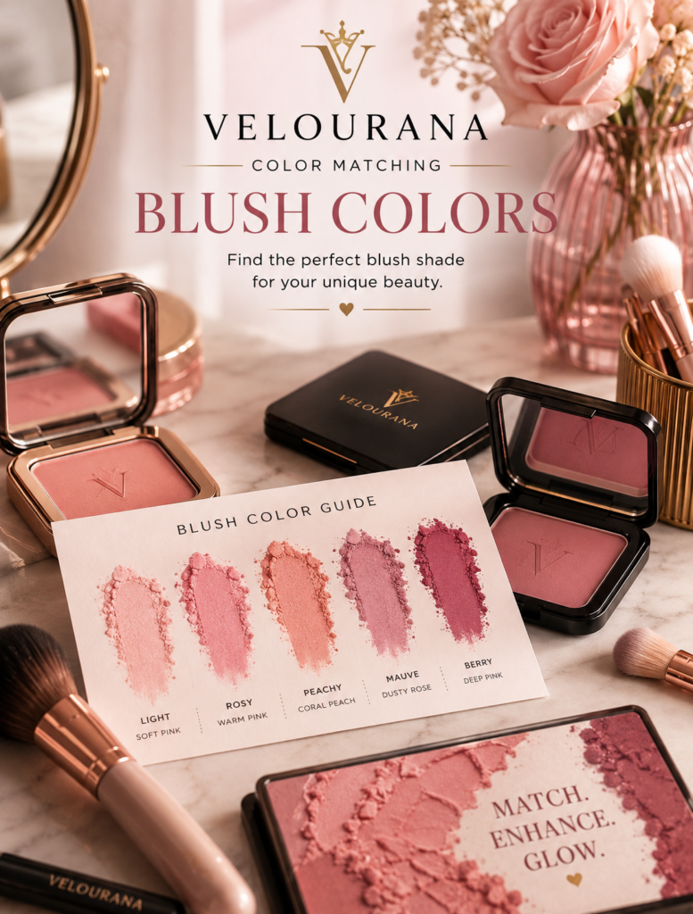
CATEGORY: Blush Colors
Red blush can appear intimidating for one simple reason: red is powerful.
In a compact, a true red blush may look far more intense than familiar pink, peach, or rose shades. Cherry red can appear almost theatrical. Scarlet looks exceptionally bright. Brick red can seem too dark or earthy. A deep wine-red may resemble lipstick more than something you would naturally consider putting across your cheeks.
Yet red is one of the most logical colors to use as blush.
When the cheeks naturally flush because of cold weather, exercise, embarrassment, heat, or increased circulation, the color appearing through the skin is fundamentally related to red. The exact appearance changes according to skin depth, undertone, and the translucency of the skin, but natural flushing is rarely created from pastel pink pigment.
This is why a frighteningly red blush can become surprisingly believable once it is applied in a thin, diffused layer.
The important question is not whether red blush is wearable.
It is which red you choose, how that red interacts with your complexion, and how much of it you apply.
Red Is Not One Color
The phrase “red blush” covers a broad spectrum.
Cherry red usually has a cooler blue-pink character.
Scarlet is bright and highly saturated.
Tomato red contains noticeable orange warmth.
Brick red introduces brown and earthy depth.
Rose-red softens pure red with pink.
Berry-red moves toward raspberry or cranberry.
Burgundy contains deeper purple or wine characteristics.
Warm red may contain orange, yellow, or brown.
Cool red contains more blue, pink, or violet.
These differences are central to color matching.
Two red blushes can look similar in their packaging yet create completely different effects once applied.
Why Red Can Look More Natural Than Pale Pink
Imagine naturally flushed skin.
The color usually emerges from beneath the complexion rather than sitting as an opaque pastel layer on top of it.
A sheer red blush can recreate this effect extremely well.
Instead of trying to imitate a flush with a pale pink containing substantial white pigment, a translucent red allows the natural skin tone to remain visible underneath.
The complexion effectively mixes with the red.
On fair skin, the result may become rosy pink.
On medium skin, it can become a richer warm flush.
On deep skin, saturated red can remain visible while still appearing integrated.
This is one reason red blush can work across such a wide range of skin depths.
Fair Skin Requires Control Rather Than Fear
Fair complexions create considerable contrast with strong red pigment.
That means quantity matters enormously.
A brush heavily loaded with scarlet powder can create an immediate block of color.
But a tiny amount of the same blush, thoroughly diffused, may produce an extraordinarily natural effect.
The solution is not necessarily choosing a weaker color.
Sometimes a strong color applied transparently works better than a pale color applied heavily.
This distinction is important in color matching because opacity and hue work together.
Fair Cool Skin and Cherry Red
Cherry red usually contains blue or pink characteristics that make it cooler than tomato or brick red.
Against fair cool skin, this temperature relationship can create natural harmony.
Applied sheerly, cherry red may transform into a fresh rosy flush.
The color can resemble the way fair cool skin naturally reddens in cold weather.
If the blush is highly pigmented, however, application must remain controlled.
The goal for a natural effect is translucency rather than visible red coverage.
Fair Warm Skin and Warm Red
Fair warm complexions can often integrate reds containing peach, orange, or warm rose characteristics particularly well.
Warm red, soft tomato red, and red-coral can echo the warmth already present in the complexion.
A blue-based cherry creates greater contrast.
That contrast can make the face appear brighter and the cheek color more noticeable.
Once again, warm skin does not prohibit cool red.
It simply changes the effect.
Fair Neutral Skin Can Explore Both Directions
Neutral fair complexions can often wear both cool and warm reds successfully.
A rose-red creates an easy everyday option.
Cherry introduces cooler freshness.
A soft tomato red creates warmth.
Muted brick-red can produce a more sophisticated earthy effect when used carefully.
Because the skin itself is relatively balanced in temperature, the blush can strongly influence whether the final makeup appears warm or cool.
Medium Skin Supports Greater Red Saturation
Medium skin often provides an excellent background for red blush because stronger pigment can remain visible without becoming immediately overwhelming.
Rose-red, cranberry-red, warm red, cherry, and muted brick can all create different forms of natural-looking color.
A medium complexion may require less caution with saturation than a fair complexion, although highly pigmented formulas should still be built gradually.
The relationship between the depth of the blush and the depth of the complexion becomes more balanced.
Medium Warm Skin and Tomato Red
Tomato red contains noticeable orange warmth.
On medium golden or warm skin, this can create a lively, sun-warmed effect.
The color may appear less obviously red after blending because the warm complexion absorbs some of the orange relationship visually.
Tomato red works particularly well with warm bronzer, golden highlighter, copper eye makeup, and warm lip colors.
The entire palette becomes connected through temperature.
Medium Cool Skin and Rose-Red
Rose-red provides an excellent bridge between classic rose blush and stronger true red.
Its red component creates depth, while pink or cool rose characteristics keep it connected to cooler undertones.
This can produce richer cheek color without moving fully into berry or burgundy.
For someone who finds pale cool pink too delicate, rose-red can provide the same temperature family with greater visual strength.
Red Blush on Olive Skin
Olive complexions can transform red blush dramatically.
The yellow, green, golden, or muted characteristics of olive skin interact with red through strong color relationships.
Red and green sit opposite each other in traditional color theory, so a clear red can become especially noticeable against olive undertones.
This does not mean the combination is unsuitable.
It means the contrast may be stronger.
Muted brick-red, warm rose-red, terracotta-red, and cranberry can provide more complex alternatives when pure scarlet feels too vivid.
Fair Olive Skin and Muted Red
Fair olive complexions may find a perfectly clean bright red highly contrasting.
Adding brown, rose, or muted orange can soften the effect.
A muted rose-red may create natural warmth.
A soft brick can provide understated color.
Cranberry introduces cool richness.
The ideal direction depends on whether the olive complexion itself leans warmer, cooler, or more neutral.
Medium Olive Skin and Brick Red
Brick red can work beautifully on medium olive skin.
It combines red with brown and sometimes subtle orange.
This earthiness can integrate naturally with the muted golden qualities often present in olive complexions.
Brick red does not necessarily create the obvious flushed appearance of cherry.
Instead, it can provide warmth, color, and definition simultaneously.
It is particularly effective in autumnal and neutral makeup palettes.
Deep Skin and True Red
Deep complexions can carry true red with extraordinary richness.
A saturated red remains visible without needing white pigment to brighten it.
This is important because pale blushes often depend on white bases that can become ashy against deeper skin.
Red achieves visibility through saturation instead.
True red, deep cherry, burgundy-red, brick, and warm scarlet can all create distinctive effects.
What appears extremely strong in the pan may become beautifully balanced after blending.
Deep Warm Skin and Brick or Warm Scarlet
Deep warm skin often harmonizes naturally with brick, warm scarlet, red-orange, and deep terracotta-red.
These shades contain enough warmth to relate to golden undertones while maintaining the depth needed to remain visible.
A warm scarlet can create brightness.
Brick provides sophistication.
Deep red-orange creates an energetic warm cheek.
Each remains within the red family while producing a different mood.
Deep Cool Skin and Blue-Based Red
Blue-based red can look exceptionally rich on deep cool complexions.
Cherry, cranberry-red, burgundy, and cool wine-red all reinforce the cooler characteristics of the skin.
Because deep complexions can carry greater pigment saturation, these shades may appear elegant rather than excessively dramatic.
A deep red blush can create definition while still reading clearly as cheek color.
Cherry Red Creates Freshness
Cherry sits close to cool true red but often contains enough pink or blue to feel fresh rather than earthy.
It can imitate a cold-weather flush particularly well.
On fair skin, use it transparently.
On medium skin, it creates richer rosy color.
On deep skin, choose a sufficiently saturated cherry so that the pigment retains its clarity.
Cherry works especially well when you want red blush without orange or brown warmth.
Scarlet Is Clean and Powerful
Scarlet is usually bright, saturated, and unmistakably red.
Because it contains less obvious muting than brick or burgundy, it attracts attention quickly.
The secret to wearing scarlet naturally is diffusion.
A tiny amount spread over a larger area can become surprisingly soft.
For dramatic makeup, greater opacity allows scarlet to remain intentionally vivid.
The same blush can therefore move from natural to editorial simply through concentration.
Tomato Red Adds Orange Warmth
Tomato red sits between red and orange.
It can be especially flattering on golden, warm, and olive complexions because its warmth connects naturally with the skin.
Against cool complexions, tomato red becomes more contrasting.
That can create a beautiful warming effect, particularly in summer makeup.
If it looks excessively orange, move toward rose-red or neutral red.
Brick Red Adds Brown
Brick is red grounded by brown, sometimes with an orange or terracotta influence.
This makes it more muted than scarlet.
Brick blush can provide both color and subtle structure because its brown component adds depth.
It works particularly well on medium, olive, medium-deep, and deep complexions.
Fair skin can also wear brick, but the amount applied becomes important.
A sheer brick wash can create earthy sophistication without becoming heavy.
Rose-Red Is an Easy Introduction
For someone hesitant about true red, rose-red is one of the easiest places to begin.
It retains the familiar character of rose blush while increasing the red component.
This creates more depth without the immediate intensity of scarlet.
Rose-red is also highly adaptable across undertones.
Warm versions lean slightly brown or peach.
Cool versions move toward raspberry.
Neutral versions sit comfortably between them.
Burgundy Red Creates Depth
Burgundy combines deep red with purple, brown, or wine characteristics.
It is considerably darker than classic red but can become beautifully translucent once blended.
On deep complexions, burgundy can create rich, elegant cheek color.
On fair skin, a tiny amount can produce a dramatic but sophisticated flush.
Because burgundy contains more cool depth, it works particularly well in autumn and winter palettes, although there is no need to restrict it seasonally.
Red Versus Pink Blush
Pink is essentially related to red but usually appears lighter, softer, or cooler depending on the mixture.
Red provides greater saturation and often greater depth.
If pastel pink looks chalky, a sheer red can sometimes produce a more convincing pink effect because the complexion itself softens the pigment.
This is particularly important for medium-deep and deep skin.
Red Versus Coral
Coral introduces peach and orange characteristics into red-pink.
It therefore tends to feel warmer and more tropical.
True red looks cleaner and more direct.
If coral appears too orange, moving toward red may create a more natural flush.
If red feels too stark, coral can introduce warmth and softness.
Red Versus Berry
Berry adds pink, blue, purple, or wine complexity to red.
Red is generally clearer.
Berry is more layered.
A person who finds cherry red too direct may prefer cranberry or raspberry.
Someone who finds berry too purple may discover that a neutral or warm red looks more natural.
These neighboring families allow fine adjustments.
Red Versus Terracotta
Terracotta contains more brown and orange.
Red contains greater visible flush color.
Brick sits between them.
If you want cheek color that also creates warmth and definition, brick or terracotta-red can be particularly useful.
If you want a fresher flushed effect, move toward rose-red or cherry.
Natural Redness Must Be Considered
Red blush interacts strongly with existing surface redness.
On bare skin, the blush may intensify the natural rosy areas.
This can create a cohesive flushed effect.
But if you want greater control, foundation or concealer can first neutralize unwanted redness, allowing you to reintroduce red exactly where you want it.
The same blush can therefore produce completely different results depending on base coverage.
Red Over Full-Coverage Foundation
Full-coverage foundation removes much of the natural variation from the complexion.
Red blush becomes responsible for restoring life.
Because the background is more uniform, the red may initially appear stronger.
Start with a small amount and build gradually.
The objective is to recreate dimension without making the blush appear detached from the face.
Red on Bare Skin
Sheer red cream or liquid blush can look particularly convincing on bare skin.
Freckles, pigmentation, and natural undertones remain visible underneath.
The red merges visually with these features rather than covering them.
This can create the impression that the color comes from within the complexion.
Bronzer Changes the Temperature of Red
Warm bronzer beside red blush can make cool red appear more balanced.
With warm red, bronzer creates strong harmony.
A neutral bronzer allows the red itself to remain more obvious.
This is why the same red blush can look different depending on whether bronzer is used.
Cheek products should be considered together rather than independently.
Red and Highlighter
Champagne and gold highlighters introduce warmth beside red.
Pearl and icy highlights reinforce cooler red shades.
A subtle highlight can soften the visual density of a matte red cheek.
However, highly reflective products may change the focus from color to texture and shine.
The finish should support the intended effect.
Red Blush With Red Lipstick
Red cheeks and red lips can create an elegant monochromatic relationship.
They do not need to match exactly.
A cool red lip can work with a softer rose-red cheek.
A warm orange-red lipstick can pair with tomato or brick blush.
The important consideration is intensity.
If the lipstick is the focal point, keep the blush translucent.
If the entire look is intentionally dramatic, both can be stronger.
Red Blush With Nude Lips
A nude lip allows red blush to become more prominent.
Warm beige nude paired with warm red creates harmony.
Cool pink nude with cherry creates a cooler palette.
Brown nude can ground a bright red cheek.
This combination can make red blush feel surprisingly wearable because there is less competing color elsewhere on the face.
Red Blush With Berry Lips
Berry lips introduce additional purple or pink complexity.
A cranberry-red blush can connect naturally with them.
A warm brick-red creates more contrast.
When combining neighboring but different colors, repeating one characteristic—such as similar depth or muting—can help the look feel deliberate.
Red Blush With Warm Eye Makeup
Copper, bronze, gold, and warm brown eyes work naturally with tomato, brick, and warm red blush.
The palette becomes rich and cohesive.
A cool cherry blush can instead create contrast, preventing the entire face from becoming uniformly warm.
Both approaches can be successful.
Red Blush With Cool Eye Makeup
Taupe, grey, silver, charcoal, and cool brown eyes pair naturally with cherry, rose-red, and burgundy.
A warm scarlet can create deliberate contrast.
If the difference feels excessive, a neutral red provides a middle ground.
Hair Color Alters the Context
Copper and auburn hair can emphasize the warm characteristics of red blush.
Golden blonde and warm brunette hair behave similarly.
Ash blonde, silver, cool brunette, and blue-black hair may reinforce cooler cherry or burgundy shades.
Hair does not dictate your blush.
It simply contributes another large area of color surrounding the face.
Clothing Can Make Red More Noticeable
Green clothing can make red blush appear stronger because red and green create complementary contrast.
Blue may emphasize warmer red characteristics.
Orange and warm brown can make brick or tomato red feel more integrated.
Neutral black, white, grey, or beige allow the blush to stand more independently.
These relationships become especially noticeable in photographs.
Formula Is Crucial With Red Blush
A strongly pigmented matte powder can deposit intense red immediately.
A sheer cream allows greater control.
Liquid stains can create an exceptionally natural effect because the color becomes translucent.
Balms can soften red through shine.
The formula changes how much of the underlying complexion participates in the final result.
Sheer Red Is Often Easier Than Pale Red
This may seem contradictory.
A dark-looking red product can actually be easier to integrate than a pale red-pink containing a large amount of white pigment.
The sheer red lets your complexion show through.
The pale opaque blush covers it.
For deeper skin especially, this difference can determine whether the result looks vibrant or chalky.
Matte Red Creates Greater Visual Density
Matte red can appear more saturated because there is no light reflection softening the color.
This makes it excellent for controlled, sophisticated makeup but potentially unforgiving when over-applied.
Use a small amount.
Blend beyond the visible edge.
Then evaluate before adding more.
Application Should Begin With Almost Nothing
With red blush, restraint at the beginning makes everything easier.
Touch the brush lightly into the product.
Remove excess if necessary.
Apply a small amount.
Blend.
Step away.
Only then decide whether the complexion needs more.
The difference between a beautiful red flush and excessive redness can be surprisingly small.
Placement Changes Red Dramatically
Red concentrated on the apples of the cheeks can imitate a traditional natural flush.
Swept higher toward the cheekbones, it becomes more sophisticated.
Diffused across the cheeks and lightly over the nose, it can create an outdoorsy, sun- or cold-touched effect.
Placed high toward the temples, deeper red can become more editorial.
Color and placement work together.
When Red Looks Too Bright
If the shade appears excessively bright, first reduce the amount.
If the problem remains, move toward muted rose-red, brick, cranberry, or burgundy.
Adding brown, purple, or muted rose reduces the visual purity of the red.
You remain within the family while lowering its intensity.
When Red Looks Too Orange
Move away from tomato and warm scarlet toward neutral red, cherry, rose-red, or cranberry.
A cooler lipstick or eye color can also alter how the blush is perceived.
But if the orange character remains undesirable, changing the pigment is the more reliable solution.
When Red Looks Too Cool
If cherry becomes excessively blue-pink against your complexion, move toward neutral red, warm rose-red, brick, or tomato.
Warm bronzer can also create greater balance.
This is particularly useful for strongly golden complexions that want red without obvious cool contrast.
When Red Looks Like a Patch
A visible red patch usually indicates too much pigment, insufficient blending, or a formula that set before it could be diffused.
The solution is often application rather than color.
Apply smaller amounts across a wider area and build gradually.
Red looks most natural when the transition into the surrounding complexion is almost invisible.
Red Can Be an Everyday Blush
Red does not need to be reserved for editorial makeup.
A translucent rose-red or cherry can be quieter than a heavily applied pastel pink.
The intensity visible in the compact tells you little about the final result.
Concentration is what matters.
Once this becomes familiar, red can become one of the most practical everyday blush colors.
Red Can Also Be Deliberately Dramatic
Of course, red does not always need to imitate nature.
A stronger scarlet cheek can become the focus of a makeup look.
Deep burgundy can create dramatic structure.
Bright cherry can produce modern, high-energy color.
Color matching does not require every blush to disappear into the complexion.
Sometimes contrast is the objective.
Choosing Red Through Color Matching
Begin with the type of red.
Cherry for cool freshness.
Rose-red for versatility.
Tomato for obvious warmth.
Brick for earthiness.
Scarlet for clean intensity.
Burgundy for depth.
Then consider the depth of your complexion.
Fair skin generally requires less pigment.
Medium skin can carry stronger saturation.
Deep skin can support rich reds that remain clear and dimensional without relying on pale bases.
Next consider undertone.
Choose related temperatures for harmony.
Choose opposing temperatures for contrast.
The Complexion Completes the Color
A red blush does not remain the same color after application.
Fair skin may visually transform sheer scarlet into pink-red.
Golden skin can make warm red appear more integrated.
Olive undertones can intensify the contrast of clean red.
Deep skin can turn a frighteningly dark burgundy into elegant, believable cheek color.
This transformation is why judging red blush from the compact is particularly unreliable.
Red Blush Reveals the Logic Behind Color Matching
Red blush demonstrates an important principle: the strongest-looking pigment is not necessarily the least natural.
What matters is the relationship between pigment, complexion, opacity, and application.
A pale blush can look artificial when its white base conflicts with the skin.
A deep red can look natural when it is sufficiently translucent.
A warm red can harmonize with golden skin.
A cool red can deliberately brighten it through contrast.
There is no universal red that performs identically on everyone.
There is a spectrum of reds, and each creates a different relationship with the person wearing it.
Once you begin distinguishing cherry from tomato, scarlet from brick, rose-red from burgundy, red blush becomes far less intimidating.
You stop seeing a frightening block of pigment in a compact.
You begin seeing temperature, depth, saturation, and possibility.
And when the right red is applied in the right concentration, it can do something remarkably simple: recreate the vitality that blush was originally designed to bring back to the face.
The End
Velourana
 Discover More From Our Family of Websites
 ZodiacBearing (Astrology, Tarot, Numerology, Angel Numbers & Spiritual Guidance)
 Velourana (Beauty, Makeup, Hair Care, Skincare & Beauty Tips)
 HavenBearing (Home, Living, Organization, Décor & Everyday Inspiration)
 PawBearing (Pet Care, Dog Breeds, Animal Health, Training & Pet Products)
 PsyCatherine (Notes From the Journal of a Psychologist on Real Life)

