
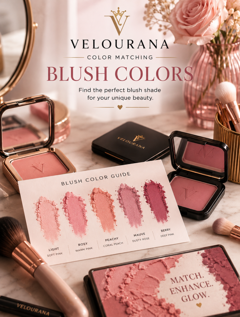
CATEGORY: Blush Colors
Pink blush is often treated as the default blush.
Walk through almost any beauty department and the blush selection will contain an enormous spectrum of pink: delicate baby pink, romantic rose, cool ballet pink, warm strawberry, dusty pink, raspberry, watermelon, bubblegum, fuchsia, magenta, and deep pink-red.
Calling all of these shades simply “pink” hides the most important part of choosing one.
Pink is a color family, not a single color.
Some pink blushes contain obvious blue or violet undertones. Others contain enough yellow or orange to move toward peach. Some are softened with grey or brown. Some contain a considerable amount of white pigment, creating a pastel appearance. Others are highly saturated and almost red.
This is why one pink blush can make your complexion appear beautifully fresh while another pink, sitting beside it in the same display, can look artificial or strangely disconnected.
Color matching helps explain the difference.
The goal is not to decide whether you “can wear pink.” Almost everyone can wear some version of pink blush. The useful question is which pink produces the effect you want against your particular combination of skin depth and undertone.
Understanding the Temperature of Pink
Pure red can move in two broad directions when transformed into pink.
Add a cooler blue or violet influence and the result becomes a cool pink.
Add warmer yellow, orange, coral, or peach characteristics and the pink becomes warmer.
Between those extremes sits an enormous middle territory of balanced rose and neutral pink.
This temperature matters because the blush interacts with the temperature already visible in your complexion.
A cool pink against cool skin often creates harmony.
A warm pink against golden skin may merge naturally with the warmth of the complexion.
But contrast can be equally attractive.
A cool pink against warm skin may create a noticeably bright, fresh effect precisely because it does not completely blend into the existing warmth.
Color matching therefore gives you two possibilities: harmony and contrast.
Understanding which one you are creating is more useful than following a rigid rule.
Fair Skin and the Importance of Pigment Control
Fair complexions create strong contrast with highly saturated blush.
A small amount of raspberry or fuchsia can therefore appear much stronger on fair skin than it does in the compact.
For a naturally understated result, light and medium pinks are often easier to control.
Soft rose, ballet pink, delicate neutral pink, and translucent strawberry can create visible color without immediately dominating the face.
But there is no reason fair skin must avoid darker pinks.
The difference lies in application and formula.
A sheer raspberry cream applied sparingly can create the appearance of a natural cold-weather flush. A dense, highly pigmented raspberry powder applied heavily may create a much more theatrical result.
The color itself is not necessarily wrong.
Its concentration determines much of the effect.
Very Pale Pink Can Behave Differently Than Expected
Pastel pink blush usually contains a noticeable amount of white pigment.
Against very fair skin, this may create a soft, delicate effect because the depth difference between the blush and complexion is relatively small.
As skin becomes deeper, however, the same white base becomes more visible.
Instead of appearing naturally pink, the blush may begin to look pale, chalky, or almost lavender-white.
This is an important color-matching principle.
A blush shade is not only defined by its hue.
Its depth and the amount of white, grey, brown, or black mixed into the color matter too.
Light Skin With Cool Undertones
Light cool complexions often have a natural relationship with blue-based pinks.
Soft cool rose, ballet pink, raspberry pink, and certain mauves can echo the cooler characteristics already present in the skin.
The result can look especially fresh because the blush appears connected to the complexion rather than sitting separately on top of it.
If the skin already has considerable visible redness, however, an extremely red-pink blush may intensify that appearance.
A slightly muted rose or pink-mauve can sometimes create more control.
The objective is not automatically to add the maximum amount of pink.
It is to create the balance you want.
Light Skin With Warm Undertones
Warm light skin can work beautifully with pink, but the particular pink changes the result.
A warm strawberry pink, pink-peach, salmon pink, or warm rose may blend naturally with golden or peach undertones.
A distinctly blue-based pink creates more contrast.
That contrast can be extremely attractive.
The cheek looks brighter and cooler against the warmth of the complexion.
This is why the traditional advice that warm skin should never wear cool pink is unnecessarily restrictive.
The cool pink simply creates a different visual relationship.
Medium Skin Can Carry Greater Saturation
As skin depth increases, slightly richer pinks often become easier to wear.
Medium complexions can frequently support rose pink, watermelon, strawberry, warm raspberry, dusty rose, and brighter classic pink without the color becoming overwhelming immediately.
Very pale pink may still work, but the formula becomes increasingly important.
If the blush contains a dense white base, it can appear lighter on the skin than intended.
A more translucent formula allows the complexion to remain visible underneath, producing a more integrated result.
This is why two blushes that appear almost identical in their pans can behave completely differently on the face.
Medium Warm Skin and Strawberry Pink
Strawberry pink is particularly interesting on medium warm complexions because it often sits between classic pink and warm red.
It can introduce freshness without creating the obvious orange quality of coral.
This makes it useful when peach blush feels too warm but cool pink feels too contrasting.
Warm rose performs a similar function.
These shades bridge the natural warmth of the complexion and the lively quality associated with pink blush.
Medium Cool Skin and Raspberry Pink
Raspberry contains a stronger cool red or berry influence.
On medium cool skin, it can create a rich but harmonious flush.
Because the complexion has enough depth to support greater saturation, raspberry may appear more natural than an extremely pale pink.
Applied lightly, it can resemble naturally flushed skin.
Layered more strongly, the same color can become sophisticated and dramatic.
This ability to change character through intensity makes richer pinks surprisingly versatile.
Pink Blush on Olive Skin
Olive complexions deserve particular attention because pink can behave unpredictably against green, yellow, golden, or neutral-olive undertones.
Some pale cool pinks can become almost lavender.
Certain warm pinks can appear more coral than expected.
Muted rose shades may become extremely natural because their complexity relates well to the complexity of olive skin.
For many olive complexions, rose pink, dusty pink, berry pink, warm raspberry, and pink-brown shades can be especially interesting.
But olive skin varies greatly in depth and temperature.
The actual complexion should always override generic rules.
Why Dusty Pink Can Work So Well on Olive Complexions
Dusty pink usually contains some degree of grey, brown, or muted mauve.
That reduction in saturation can prevent the blush from fighting visually with an olive undertone.
Instead of creating a bright block of obvious pink, the color becomes more subdued and dimensional.
On a light olive complexion, a soft dusty rose can create understated definition.
On deeper olive skin, a richer rosewood or deep dusty pink may be required so that the blush does not disappear.
Again, the principle is relative depth.
Deep Skin Needs Enough Color Strength
One of the most persistent misconceptions about pink blush is that deep complexions should avoid bright colors.
In reality, highly saturated pink can be extraordinary on deep skin.
Fuchsia.
Magenta.
Deep raspberry.
Hot pink.
Rich rose.
Pink-red.
These shades contain enough pigment to remain visible against greater skin depth.
A pink that appears almost frighteningly bright in the compact may transform into a lively, sophisticated flush once blended into deep skin.
Why Pale Pink Can Become Ashy on Deep Skin
The problem is often not pink itself.
It is white pigment.
A pastel pink designed to look pale may rely heavily on white to create that lightness.
On deep skin, the white base can remain visually prominent and create an ashy or chalky appearance.
A saturated pink without the heavy white base may produce a much more natural result even though it looks dramatically brighter in the packaging.
This is one reason pan color can be misleading.
Deep Warm Skin and Vibrant Pink
Warm deep complexions can wear vibrant pink in several ways.
A warm fuchsia, rich watermelon, deep coral-pink, or intense warm rose can connect with the warmth of the skin while retaining enough saturation to remain visible.
Cooler magenta or blue-pink can create a striking temperature contrast.
The choice depends on whether the desired effect is harmonious warmth or a brighter statement.
Neither needs to be treated as a mistake.
Deep Cool Skin and Blue-Based Pink
Cool deep complexions can create an especially beautiful relationship with raspberry, magenta, cool fuchsia, wine-pink, and blue-based red-pink shades.
These colors maintain their richness without requiring a pale base.
The result can range from a soft berry flush to intense editorial color depending on application.
A dense pigment can be applied with extraordinary restraint.
Deep color does not automatically mean heavy makeup.
Neutral Skin and Balanced Pink
Neutral undertones often work beautifully with pinks that sit between obvious warmth and coolness.
Classic rose.
Neutral pink.
Dusty rose.
Muted raspberry.
Rosewood.
These shades can integrate easily because they do not strongly oppose either side of the undertone spectrum.
Neutral skin also provides flexibility for deliberate experimentation.
A peach-pink can warm the complexion.
A cool pink can brighten it.
A dusty pink can soften it.
One complexion can therefore produce several distinct moods simply by changing the temperature of the blush.
Baby Pink Creates a Particular Effect
Baby pink is not simply a lighter version of every other pink.
It usually carries a soft, youthful, sometimes slightly cool character.
On fair skin, it can create delicate freshness.
On medium skin, it may produce more visible contrast.
On deep skin, a sufficiently pigmented baby pink can create a striking brightening effect, but formulas containing excessive white can become chalky.
The desired result matters.
A deliberately bright cheek is different from a blush intended to imitate natural flushing.
Bubblegum Pink Is More Playful
Bubblegum pink usually has greater saturation than baby pink.
It can lean cool and vivid, creating a distinctly noticeable cheek.
On fair skin, a tiny amount may be enough.
On medium and deep skin, its stronger saturation can become an advantage.
The color creates energy.
Paired with minimal eye makeup and a balanced lip, it can become the focal point of the face.
Rose Pink Is Exceptionally Versatile
Rose sits close to the natural red-pink family associated with flushing.
This gives it broad usefulness.
A light rose can be subtle.
A muted rose can look polished.
A deep rose can create sophisticated intensity.
Warm rose introduces golden or brown influence.
Cool rose moves toward raspberry or mauve.
When someone says that rose blush looks “natural,” what they often mean is that its combination of red and pink resembles colors that already appear naturally in human skin.
Dusty Pink Creates Softness
Dusty pink reduces the brightness of traditional pink by introducing muted grey, brown, mauve, or beige characteristics.
This creates sophistication rather than obvious sweetness.
It can be particularly effective in understated makeup, professional looks, and autumnal palettes.
On deeper skin, choose enough saturation and depth to prevent the dusty quality from becoming ashiness.
Muted does not need to mean pale.
Hot Pink Can Be More Wearable Than It Looks
Hot pink blush frequently looks extreme before application.
This can discourage people from even trying it.
But blush is blended over a relatively large area of the cheek, often in a very thin layer.
A strong hot pink therefore becomes much softer once diffused.
On medium and deep skin, this can create exceptional vitality.
On fair skin, careful application can produce a surprisingly natural bright flush.
The important skill is controlling quantity.
Fuchsia Combines Pink With Cool Drama
Fuchsia sits between pink and purple and usually has strong cool energy.
It can be striking on cool complexions and beautifully contrasting on warm ones.
Against deep skin, fuchsia often retains a vivid clarity that pale pink cannot achieve.
Against fair skin, it should generally be approached with a light hand unless a dramatic effect is intentional.
Fuchsia demonstrates why color intensity should never be judged only from the pan.
Raspberry Bridges Pink and Berry
Raspberry is one of the most useful deeper pink families.
It contains enough red and berry depth to work across a wide range of complexions.
On fair skin, it can create a translucent just-came-in-from-the-cold effect.
On medium skin, it becomes a rich rosy flush.
On deep skin, a saturated raspberry can create natural-looking depth without disappearing.
The same family adapts because the amount applied changes the visual result.
Pink-Red Mimics Natural Flushing
Pink-red blush can look intimidating because red is powerful.
Yet natural blood circulation produces red and pink tones in the skin.
A sheer pink-red can therefore appear extremely believable.
The deeper the complexion, the richer the red-pink may need to be to remain visible.
The lighter the complexion, the more important application control becomes.
Match Pink Blush With Lip Color Through Relationship, Not Duplication
Your lipstick does not need to be identical to your blush.
Instead, look for a relationship between them.
Cool pink blush can pair naturally with rose, mauve, berry, or cool pink lips.
Warm pink blush can connect with peachy nude, warm rose, coral-pink, or warm red.
Dusty pink blush works beautifully with rosewood and muted nude lips.
Fuchsia cheeks can be balanced with a quieter lip or deliberately intensified with a related statement color.
The entire face should be considered as one palette.
Bronzer Can Transform Pink Blush
Pink and bronzer create an interesting color relationship.
Bronzer usually introduces warmth.
A cool pink applied beside warm bronzer creates temperature contrast.
This can make the pink look particularly fresh.
A warm pink creates a smoother transition between bronzer and cheek color.
Neither approach is inherently superior.
One emphasizes contrast.
The other emphasizes continuity.
Pink Blush Without Bronzer Looks Different
Remove bronzer and the same pink becomes more dominant.
On a neutral base, cool pink can create a clean, fresh effect.
This is particularly effective in makeup styles where the cheek is intended to provide most of the facial color.
The absence of bronzer allows the true temperature of the pink to become more obvious.
Foundation Coverage Changes Pink
Full-coverage foundation may remove much of the natural redness and variation from the face.
A pink blush then has to recreate the vitality that the foundation concealed.
On bare skin or sheer foundation, natural redness mixes visually with the blush.
This can make the same shade appear stronger or more complex.
Always judge blush in the context of the base makeup you normally wear.
Cream Pink and Powder Pink May Not Look Identical
Formula affects color perception.
A sheer cream pink allows skin to remain visible underneath.
This can make a strong shade look surprisingly natural.
An opaque powder may display the pigment more directly.
Liquid stains can appear almost translucent.
Luminous blush reflects light and can make pink look softer.
Matte pigment often appears denser.
When choosing between two pinks, consider not only the color but how the formula delivers that color.
Placement Can Change the Impression of Pink
Color matching is not only about shade selection.
Placement influences how much color the eye perceives.
Pink concentrated on the apples of the cheeks creates a traditional flushed effect.
Sweeping it upward can create a more lifted appearance.
Extending it across a larger area in a sheer layer can create a diffused wash.
The same pink can therefore appear youthful, sophisticated, dramatic, or almost invisible depending on placement and intensity.
Test Pink on the Face Whenever Possible
A wrist or hand can tell you whether a pink is cool, warm, pale, or saturated.
It cannot show exactly how that color will interact with your face.
The complexion may have different pigmentation.
Your foundation changes the background.
Your natural facial redness changes the result.
Apply the blush where it will actually be worn.
Then check it in daylight.
Do Not Judge the Color From Three Inches Away
After applying blush, step away from the mirror.
Color matching should be evaluated as part of the entire face.
Does the pink brighten your complexion?
Does it overpower everything else?
Does it disappear?
Does it look grey?
Does it pull orange?
Does it emphasize redness more than you want?
These questions are easier to answer from a normal viewing distance.
The Right Pink Depends on the Effect You Want
There is no single ideal pink for every occasion.
You may want soft everyday freshness.
Choose a balanced rose or subtle pink that integrates easily with your complexion.
You may want romantic softness.
Try dusty rose or muted cool pink.
You may want summer energy.
A strawberry or watermelon pink can introduce brightness.
You may want dramatic evening color.
Raspberry, fuchsia, magenta, or deep pink-red may provide greater impact.
Color matching is not about reducing your options.
It gives you the information needed to use more of them deliberately.
Build a Pink Blush Wardrobe by Mood
If pink is a favorite blush family, owning several versions can be more useful than searching endlessly for one perfect shade.
A soft everyday pink.
A warm strawberry pink.
A muted dusty rose.
A deeper raspberry or fuchsia.
These four colors can create noticeably different effects while remaining within the pink family.
The variation comes from temperature, saturation, and depth.
Break the Undertone Rules Intentionally
Once you understand your undertone, you do not need to obey it rigidly.
If you have warm skin and want harmony, choose a warm pink.
If you want contrast, try a cool pink.
If you have cool skin and want harmony, choose rose or raspberry.
If you want warmth, experiment with strawberry or peach-pink.
The difference is intention.
You understand why the color looks different, and you decide whether you like the result.
Pink Blush Is Really a Study in Color Relationships
The question is rarely whether pink suits you.
Pink is too broad a family for that question to be useful.
The real questions are:
How light or deep is the pink?
How warm or cool is it?
How saturated is it?
Does it contain white, grey, brown, red, peach, or violet?
How does that combination interact with your complexion?
A baby pink and a raspberry blush may technically belong to the same color family, yet they can behave almost like entirely different products.
Understanding those differences turns pink blush from a guessing game into a flexible color tool.
You can choose harmony when you want the blush to melt naturally into your complexion.
You can choose contrast when you want brightness and energy.
You can choose muted pink when you want sophistication.
You can choose saturated pink when you want the cheeks to become a stronger part of the makeup.
The best pink is therefore not simply the shade somebody says matches your undertone.
It is the pink whose depth, temperature, saturation, and finish create the effect you want on your actual skin.
Once you begin choosing pink this way, an entire family of blush colors opens up rather than narrowing down.
The End
Velourana
 Discover More From Our Family of Websites
 ZodiacBearing (Astrology, Tarot, Numerology, Angel Numbers & Spiritual Guidance)
 Velourana (Beauty, Makeup, Hair Care, Skincare & Beauty Tips)
 HavenBearing (Home, Living, Organization, Décor & Everyday Inspiration)
 PawBearing (Pet Care, Dog Breeds, Animal Health, Training & Pet Products)
 PsyCatherine (Notes From the Journal of a Psychologist on Real Life)

