
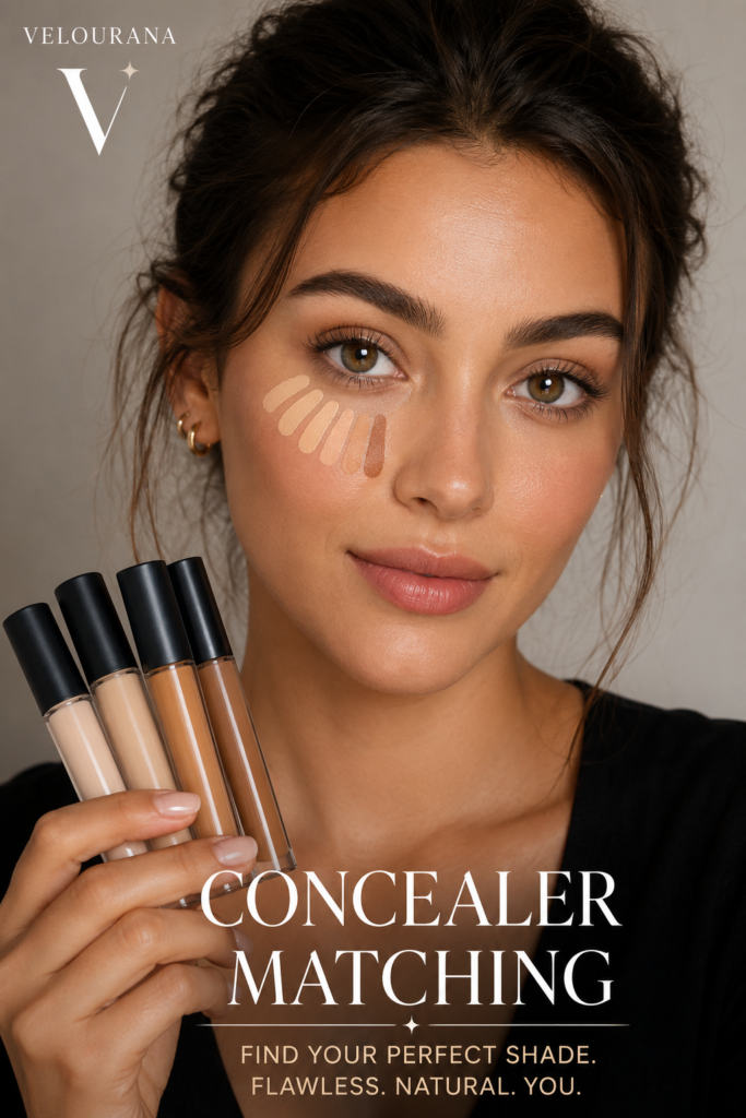
CATEGORY: Concealer Matching
Finding a concealer that appears to be the correct depth is only half of successful shade matching. The other half—and often the more frustrating half—is undertone.
You can select a concealer that seems almost identical to your complexion in terms of lightness or darkness, blend it carefully and still discover that something looks wrong. Perhaps the concealed area appears distinctly yellow. Maybe the product turns peachy or orange against your skin. Sometimes a concealer seems strangely pink even though its depth is nearly perfect.
These are classic signs that the problem may not be shade depth at all.
It may be undertone.
Undertone is one of the most frequently discussed concepts in complexion makeup, yet it remains surprisingly easy to misunderstand. Cosmetic terminology is not completely standardized, brands classify colors differently and real human skin rarely fits perfectly into three convenient categories.
The solution is not memorizing a rigid set of rules.
Instead, learn how different colors behave on your own complexion. Once you can recognize an undertone mismatch, selecting concealer becomes much more systematic.
What Undertone Actually Means
Your visible complexion contains many different colors.
You may have redness around your nose, blue or purple shadows beneath your eyes, brown pigmentation, freckles, areas of sun exposure and sections of your face that appear lighter or deeper than others.
Those visible variations are not necessarily your undertone.
Undertone describes the more persistent underlying color quality that influences the overall appearance of your complexion.
Most cosmetic systems divide undertones into warm, cool and neutral categories. Many contemporary shade ranges also recognize olive undertones, while some brands use additional descriptions such as golden, peach, rosy, red, yellow, neutral-warm or neutral-cool.
Warm undertones commonly contain noticeable golden, yellow or peach characteristics.
Cool undertones commonly lean toward pink, rosy, red or sometimes bluish characteristics.
Neutral undertones generally sit somewhere between obvious warmth and obvious coolness.
Olive undertones often contain a muted green, golden-green or gray-green quality.
These definitions are useful, but they should not become restrictions.
Your complexion does not have to cooperate with a cosmetics company’s classification system.
Skin Tone and Undertone Are Different
Skin tone—or more precisely, skin depth—describes how light or deep your complexion is.
Undertone describes the underlying color direction.
This distinction matters because every undertone can occur across a range of skin depths.
Fair skin is not automatically cool.
Deep skin is not automatically warm.
Medium skin is not automatically olive.
A person can have fair skin with golden undertones, deep skin with cool undertones, medium skin with neutral undertones or almost any other combination.
When selecting concealer, you therefore need to answer two separate questions.
First, how light or deep should the product be?
Second, what undertone should that shade contain?
Solving only the first question can leave you with a concealer that is technically the correct depth but visibly the wrong color.
Why Undertone Matters So Much With Concealer
Concealer is often concentrated in relatively small areas.
That makes color differences easier to notice.
Imagine applying a foundation with a slightly imperfect undertone across the entire face. Because the color is distributed over a large area, the result may still appear reasonably harmonious, particularly if the product has light coverage.
Now imagine applying an opaque yellow-toned concealer to one small blemish on distinctly pink-neutral skin.
You have effectively created a tiny yellow spot.
The same problem occurs beneath the eyes. A concealer with the wrong undertone can produce two visibly different patches underneath the eyes even if the depth is appropriate.
Higher coverage increases the effect because more pigment is deposited onto the skin.
This is why undertone matching becomes particularly important with full-coverage concealers.
The Difference Between Undertone and Color Correction
Undertone matching and color correction are related, but they are not the same thing.
An undertone-matched concealer is selected because its overall color harmonizes with your complexion.
A color corrector is deliberately selected to interact with a specific unwanted color such as blue-purple under-eye darkness or pronounced redness.
For example, someone with a cool-neutral complexion might deliberately use a peach corrector beneath the eyes.
That does not mean the person’s natural undertone is peach.
The peach is performing a corrective function.
A skin-toned concealer can then be applied over it.
Confusing these two concepts can lead to incorrect shade choices. A corrective color that works beautifully underneath another complexion product may look completely unsuitable when used as a standalone concealer elsewhere on the face.
Why Your Face Can Mislead You About Undertone
The face is not a perfectly uniform color chart.
Cheeks may contain redness.
The forehead may be more tanned.
The area around the mouth can contain pigmentation.
The nose may be redder than the jaw.
The under-eye area may contain blue, violet or brown tones.
If you look exclusively at one of these areas, you can easily misidentify your overall undertone.
Suppose your cheeks are naturally flushed. You might conclude that you have a cool or rosy undertone even though the underlying complexion across your neck, forehead and jaw is neutral-golden.
Conversely, tanning may create temporary warmth that makes a naturally neutral complexion appear more golden.
Undertone assessment works better when you look at the overall relationship between your face, jaw, neck and upper chest rather than isolating one colorful area.
Warm Undertones and Concealer
Warm undertones generally harmonize with concealers containing yellow, golden, peach or related warm pigments.
However, “warm” is an extremely broad category.
One warm complexion may look distinctly golden.
Another may lean peach.
Another may have yellow-olive characteristics.
This is why selecting any product labeled “warm” does not guarantee a match.
If a warm concealer appears orange on your skin, it may contain too much red or peach relative to your natural undertone.
If it looks excessively yellow, the shade may be warmer in the wrong direction.
A good match should integrate with your complexion rather than visibly announcing its warmth.
Warmth is part of the color—not the objective.
Cool Undertones and Concealer
Cool undertones are frequently described as pink, rosy or reddish, but cool complexions are also diverse.
Some people have obvious rosy qualities while others have subtler cool-neutral coloring.
A concealer that is excessively golden can look yellow against a cooler complexion.
Peach-heavy shades may appear orange.
This does not necessarily mean that every concealer you use should be visibly pink.
A strongly pink concealer can be just as incorrect if your complexion sits closer to neutral-cool.
The objective remains harmony.
You are looking for enough coolness to prevent the concealer from turning yellow or orange without creating a separate pink patch.
Neutral Undertones Are Not Necessarily Easy to Match
Neutral undertones sound straightforward because they theoretically balance warm and cool characteristics.
In practice, neutral complexions can be difficult to match because cosmetic “neutral” shades vary considerably.
Some neutral concealers lean slightly yellow.
Others lean peach.
Some appear beige or muted.
A person can also sit somewhere between neutral and another undertone family.
You may be neutral-warm, neutral-cool or neutral-olive rather than perfectly centered.
If products labeled warm consistently look yellow while cool products consistently look pink, neutral shades are an obvious place to investigate.
But do not assume the word “neutral” on the packaging guarantees neutrality on your skin.
Always evaluate the actual color.
Understanding Olive Undertones
Olive undertones are particularly important in concealer matching because they can expose weaknesses in traditional shade systems.
Olive complexions contain a subtle greenish or muted quality. Depending on the person, that quality may coexist with golden, neutral or cooler characteristics.
Olive is also not a skin-depth category.
Fair olive skin exists.
Medium olive skin exists.
Deep olive skin exists.
A common experience among people with olive undertones is finding concealers that seem correct in depth but repeatedly appear orange, peach or pink once applied.
The problem may not be that every shade is simply “too warm.”
It may be that the products lack the muted olive component necessary to harmonize with the skin.
Neutral shades sometimes work better than strongly golden shades for olive complexions, but a genuine olive or neutral-olive shade can be significantly more convincing when available.
Why Concealer Looks Yellow
If concealer appears noticeably yellow after application, several possibilities should be considered.
The obvious explanation is that its undertone is too yellow for your complexion.
A cool or neutral-cool complexion can make a golden concealer look particularly obvious.
But undertone is not the only possibility.
The concealer may also be too light. A pale yellow shade can stand out more dramatically because both its depth and color contrast with the surrounding skin.
Your foundation may also be affecting the comparison. If your foundation is cooler or more neutral than your natural complexion, a warmer concealer can look disproportionately yellow beside it.
Finally, lighting can exaggerate the effect.
Before rejecting the product, inspect it in natural daylight and compare it with both your bare skin and your finished base makeup.
Why Concealer Looks Pink
A concealer that appears unexpectedly pink is often too cool or rosy relative to the surrounding complexion.
This is especially noticeable on golden and olive skin.
The product can be exactly the correct depth yet still produce a visible rosy patch.
Neutral and olive complexions sometimes experience this with shades described by brands as “neutral,” because that particular brand’s interpretation of neutral may contain more pink than the wearer’s complexion.
Again, the important information is not the shade label.
It is what the product does when placed against your skin.
If you consistently notice pinkness from certain shade families, use that information when evaluating future concealers.
Why Concealer Looks Orange
Orange concealer is one of the most common complexion-matching complaints.
Several factors can produce it.
The shade may simply contain too much peach or red for your undertone.
It may also be too dark. A deeper warm shade can read as orange when applied to lighter skin.
Some products can become warmer or deeper after they dry down, meaning a shade that initially appeared appropriate may become orange later.
Olive complexions are particularly susceptible to perceiving conventional warm shades as orange because the contrast between the skin’s muted greenish quality and the product’s peachy warmth becomes more apparent.
Do not automatically solve orange concealer by selecting something much lighter.
First determine whether the problem is depth, undertone or dry-down behavior.
Why Concealer Can Look Gray or Ashy
Grayness is slightly different.
An ashy result can occur when a concealer is too light for the complexion, particularly when applied over darker pigmentation.
It can also happen when blue, violet or brown discoloration remains visible through a pale beige concealer.
The underlying color and the concealer visually interact, producing a dull gray cast.
This is common beneath the eyes.
The solution may therefore be color correction rather than a different undertone alone.
On deeper complexions, choosing a concealer that is dramatically too pale can also create an ashy effect even when its undertone would otherwise be appropriate.
Brightness should complement the complexion rather than erase its natural depth.
The Wrist-Vein Test Has Limitations
One of the best-known undertone tests involves looking at veins on the wrist.
Blue or purple-looking veins are traditionally associated with cool undertones, green-looking veins with warm undertones and a mixture with neutral undertones.
This can provide a clue, but it should not be treated as a definitive diagnosis.
Vein appearance depends on skin depth, skin thickness, lighting and the actual location being examined.
Some people cannot clearly determine whether their veins appear blue or green at all.
Others receive a result that contradicts the way complexion products consistently behave on their face.
When a simple undertone trick conflicts with years of actual makeup evidence, trust the evidence.
The Jewelry Test Is Also Only a Clue
Another familiar test asks whether gold or silver jewelry looks better against your skin.
Gold is associated with warm undertones and silver with cool undertones, while people who enjoy both are often classified as neutral.
Again, this can be useful but is not definitive.
Jewelry preference is influenced by personal taste, hair color, clothing, contrast and the exact metal tone.
Someone can have a cool undertone and still love yellow gold.
Someone with a warm complexion may prefer silver.
Makeup matching should ultimately be based on color behavior rather than accessories.
White Versus Cream Clothing Tests
Comparing pure white and cream clothing is another traditional method.
The theory suggests that cool complexions may harmonize particularly well with crisp white, while warm complexions may appear more harmonious beside cream or ivory.
This can contribute another piece of information, but the same limitations apply.
Your overall coloring includes much more than skin undertone.
Hair, eyes, contrast level and personal color preferences influence the way clothing appears.
No single test deserves complete authority.
A combination of observations is more useful.
Your Existing Foundation Can Reveal More Than a Quiz
If you already have a foundation that disappears beautifully into your skin, examine its undertone classification.
This provides real-world evidence.
Suppose you repeatedly find that neutral-golden foundations match while pink foundations look wrong.
That pattern is more informative than a questionnaire telling you that your blue wrist veins supposedly make you cool.
Likewise, if standard warm foundations continually become orange while olive shades disappear, that tells you something important about your complexion.
Keep track of successful matches.
Over time, your makeup collection becomes a personal undertone database.
Compare Multiple Undertones at the Same Depth
One of the clearest ways to understand undertone is to compare several concealers with approximately the same depth.
Place a warm, neutral and cool option next to one another.
Do not blend them immediately.
Look at the individual swatches against your skin.
One may suddenly appear extremely yellow.
Another may become obviously pink.
The third may seem comparatively quiet.
That “quiet” shade is important.
A good undertone match often does not look particularly exciting in a swatch because it is not creating strong contrast.
It simply belongs.
If olive options are available, include one in the comparison when appropriate.
Seeing undertones beside one another is often far easier than trying to identify them in isolation.
Where to Test Concealer Undertone
The ideal testing location depends on how you plan to use the concealer.
For blemishes and general facial concealing, test somewhere representative of the complexion you want to match.
The jaw area can be useful because it allows you to consider the relationship between face and neck.
For under-eye concealer, however, you eventually need to test beneath the eye.
The eye area contains unique discoloration and shadow, so a shade that looks perfect on the jaw may behave differently there.
If you wear foundation regularly, test the concealer with that foundation as well.
Products are not viewed independently once you are wearing a complete makeup look.
Let the Swatch Dry
Fresh concealer can be deceptive.
Some formulas change noticeably as volatile ingredients evaporate and the product settles.
A fresh swatch may appear neutral but dry warmer.
Another may become slightly deeper.
If you choose the shade immediately, you may discover the mismatch only after completing your makeup.
Apply several candidates and wait.
Then compare them again under the same lighting.
The shade that remains harmonious after settling is more useful than the shade that looked perfect for the first thirty seconds.
Always Check in Daylight
Retail lighting is designed to illuminate products and displays, not necessarily to provide perfect complexion matching.
Warm lights can make certain shades appear more flattering.
Cool lights can exaggerate others.
Phone cameras introduce another variable through automatic exposure, white balance and image processing.
Natural daylight provides an important reality check.
After testing a concealer, move near a window or into soft outdoor light.
Look at the product without relying exclusively on your phone screen.
If the undertone suddenly becomes obvious in daylight, believe what you see.
Undertone Matching for Blemishes
For blemish concealing, you generally want the concealer to disappear into the surrounding complexion.
This requires both appropriate depth and compatible undertone.
A lighter concealer may brighten the blemish rather than hide it.
An undertone mismatch can create a colored dot even when coverage is excellent.
Use a small amount of concealer concentrated directly over the blemish.
Blend the edges rather than repeatedly disturbing the center.
If redness remains visible through the concealer, you may need more coverage or a tiny amount of targeted correction rather than a completely different undertone.
The finished result should merge with the surrounding skin.
Undertone Matching for Hyperpigmentation
Hyperpigmentation can complicate matching because the color beneath the concealer affects the final appearance.
If a dark brown mark contains a particular warm or cool quality, a thin concealer layer may allow some of that color to remain visible.
Choosing an excessively light concealer can turn the area gray.
Instead, neutralize pronounced discoloration when necessary and then use a complexion-matched concealer.
This separates two jobs.
The corrector addresses the unwanted color.
The concealer restores the appearance of natural skin.
Trying to force one unsuitable shade to perform both functions can produce thick, unnatural coverage.
Undertone Matching Beneath the Eyes
Under-eye concealing is where strict undertone matching becomes more flexible.
You may deliberately choose a slightly peachier product because the warmth helps counter blue-purple darkness.
You may choose a subtly brighter shade because you want to reduce the appearance of shadow.
This means your ideal under-eye concealer does not necessarily need to match your facial concealer exactly.
However, it still needs to harmonize with your overall complexion.
A peach tone that provides useful correction should not leave two obvious orange crescents beneath the eyes.
A brighter shade should not become chalky.
Think of under-eye matching as a balance between complexion harmony and corrective function.
Warm Corrective Tones on Different Skin Depths
The intensity of a corrective undertone should generally relate to the depth of both the complexion and the discoloration.
Very fair skin may require only delicate peach or pink-peach correction.
Light-to-medium complexions may benefit from peach or salmon families depending on the darkness being addressed.
Deeper complexions can often accommodate richer orange or red-orange correction where significant blue or gray discoloration is present.
These are broad principles rather than fixed rules.
The actual color of the discoloration matters.
The corrector should neutralize without becoming a new problem that requires heavy concealer to hide.
Foundation and Concealer Undertones Should Communicate
Your foundation and concealer do not have to carry identical undertone labels, but they should look harmonious when worn together.
A neutral foundation with a slightly peach under-eye concealer may work beautifully.
A golden foundation with a skin-matched golden concealer may create seamless blemish coverage.
Problems arise when the two products create visible color zones.
If your concealer always looks wrong only after foundation is applied, compare the foundation itself with your skin.
It is possible that the concealer is not the mismatched product.
A foundation with an incorrect undertone can alter your perception of every other complexion product placed over it.
Seasonal Changes Can Affect the Match
Undertone is relatively stable, but the visible expression of your complexion can change throughout the year.
Tanning increases skin depth and can make warmth appear more pronounced.
Winter skin may be lighter and sometimes appear less saturated.
As a result, a concealer that harmonizes perfectly during summer may look too deep or too warm several months later.
This does not necessarily mean your fundamental undertone has changed.
Your depth and surface coloration have changed enough to require a different balance.
Having a summer and winter concealer—or two shades that can be mixed—can solve this efficiently.
Mixing Concealers to Correct Undertone
If you own two compatible concealers, mixing can sometimes rescue an imperfect shade.
A concealer that is slightly too warm may be moderated by mixing it with a more neutral shade.
A product that is slightly too light can be combined with a deeper shade.
This is especially useful during seasonal transitions.
However, mixing dramatically incompatible undertones is less predictable.
It is also important to ensure the formulas behave well together.
Two shades from the same concealer line are generally easier to mix because their textures, coverage and setting characteristics are already compatible.
The goal is controlled adjustment, not laboratory experimentation every morning.
Online Concealer Matching Requires More Caution
Buying concealer online removes one of the most valuable tools available to you: direct comparison against your skin.
Shade descriptions can help, but photographs vary according to lighting, display calibration and image processing.
When shopping online, begin with information you already trust.
Use a successful foundation or concealer match as a reference.
Study brand swatches across multiple skin tones when available.
Pay attention to both depth and undertone descriptions.
Look for comparisons between neighboring shades rather than examining only the shade you think you need.
If a brand provides a virtual matching system, use it as a narrowing tool rather than assuming it can guarantee a perfect match.
The final test still happens on your skin.
Stop Chasing the Label and Watch the Color
Perhaps the most useful lesson in undertone matching is to stop becoming overly attached to labels.
You might believe you are warm because you have always purchased warm foundations.
Then you discover that a neutral-olive concealer disappears into your skin better than anything you have previously used.
That result is valuable information.
Cosmetic categories exist to help consumers navigate enormous shade ranges. They are not rules your complexion is required to obey.
If a shade labeled neutral works, use neutral.
If olive works, use olive.
If a concealer described as warm-neutral provides the best match even though an online quiz classified you as cool, trust the match.
Create Your Own Undertone Test
You can develop a simple personal testing process whenever you try a new concealer.
First, determine whether the depth is reasonably close.
Then ask whether the product looks yellow, pink, orange, peach, gray or unusually saturated compared with your skin.
Allow it to dry.
Inspect it in daylight.
Compare it with your foundation if you regularly wear one.
Finally, test it where you intend to use it.
This process separates the variables instead of treating every mismatch as the same problem.
If the shade is too light, solve the depth.
If the depth is correct but the product is orange, investigate undertone.
If it looks good on your jaw but gray beneath your eyes, investigate the underlying discoloration and possible need for correction.
Every result tells you something.
A Perfect Undertone Match Often Looks Almost Boring
Beautiful complexion makeup frequently comes from colors that disappear rather than colors that look impressive in the container.
The perfect concealer shade may look unremarkable when you first see it.
That is precisely the point.
For natural spot concealing, you do not want to see golden pigment, rosy pigment or peach pigment.
You want to see skin.
When the undertone is compatible, your attention stays on the complexion rather than the makeup sitting on top of it.
The product becomes visually quiet.
Learn the Pattern of Your Own Complexion
Concealer matching becomes progressively easier as you collect evidence about your skin.
Perhaps warm shades routinely turn orange.
Perhaps cool shades look obviously pink.
Maybe conventional neutrals work in winter but neutral-olive shades become more convincing when you tan.
Perhaps peach works beautifully beneath your eyes but looks completely wrong around your mouth.
These patterns are more useful than generic beauty rules because they describe your actual complexion.
Remember them.
They can dramatically reduce the number of incorrect shades you purchase.
Undertone Is a Tool, Not a Restriction
Understanding undertone should make makeup easier, not more complicated.
You do not need to identify yourself permanently with one perfect label before you are allowed to purchase concealer.
Begin with broad categories, compare real shades and observe how they behave.
For natural facial concealing, seek a product whose depth and undertone blend into the surrounding complexion.
For under-eye concealing, allow room for corrective warmth or subtle brightening when required.
If concealer looks yellow, pink or orange, do not immediately assume you selected the wrong depth. Examine the color relationship.
If it looks gray, consider whether underlying discoloration is showing through a shade that is too pale.
Test in the correct location, allow the formula to settle and always check the result in realistic lighting.
Ultimately, the best undertone match is not determined by the word printed beside a shade number.
It is determined by disappearance.
When you apply concealer and the boundary between product and complexion becomes difficult to find, you have achieved what undertone matching is supposed to accomplish: the color stops looking like makeup and starts looking like part of your skin.
The End
Velourana
 Discover More From Our Family of Websites
 ZodiacBearing (Astrology, Tarot, Numerology, Angel Numbers & Spiritual Guidance)
 Velourana (Beauty, Makeup, Hair Care, Skincare & Beauty Tips)
 HavenBearing (Home, Living, Organization, Décor & Everyday Inspiration)
 PawBearing (Pet Care, Dog Breeds, Animal Health, Training & Pet Products)
 PsyCatherine (Notes From the Journal of a Psychologist on Real Life)

