
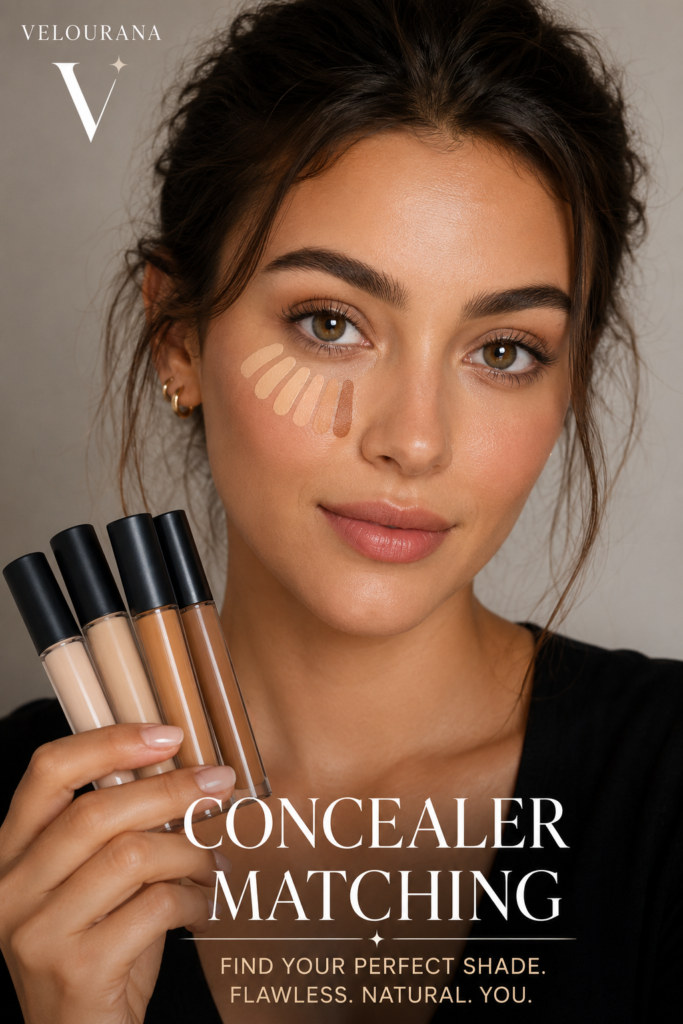
CATEGORY: Concealer Matching
Buying concealer online is convenient, but it removes the most reliable part of shade matching: placing the product directly on your skin before you buy it.
That makes online concealer shopping a different kind of problem.
Instead of comparing a real swatch against your complexion, you are trying to interpret photographs, shade descriptions, undertone labels, model images, foundation references and sometimes automated matching tools. Every one of those resources can be useful, but none is perfectly reliable on its own.
A concealer may look neutral on your screen and arrive noticeably yellow. A shade described as medium warm may appear surprisingly peach. Two colors that look almost identical in product photographs can differ significantly once blended onto skin.
The difficulty is increased by the fact that screens alter color.
Brightness settings, display calibration, image processing, photography lighting and editing can all influence what you see. A retailer may show the same concealer differently from the manufacturer’s own website simply because the photographs were produced under different conditions.
This does not mean online concealer matching is guesswork.
You can make the process much more systematic by starting with shades you already know, separating depth from undertone, studying comparisons rather than isolated photographs and deciding exactly how you intend to use the concealer before selecting a color.
The goal is not to predict the product perfectly from a photograph.
The goal is to reduce uncertainty enough that your final choice is based on evidence rather than intuition.
Decide What the Concealer Is For Before Looking at Shades
Online shopping becomes much easier when the purpose of the concealer is clear.
A shade intended for blemishes should usually match your complexion closely.
A shade intended for under-eye brightening may be slightly lighter.
A concealer intended to correct blue or purple darkness may need a warmer undertone.
A product used primarily around pigmentation may need to work with a separate corrector.
These are different requirements.
If you browse a shade range without deciding what you want the product to do, several shades may appear equally plausible.
The moment you define the purpose, the number of realistic candidates becomes smaller.
For example, if you want an exact spot match, remove shades that are obviously intended to brighten.
If you want an under-eye concealer, you can consider a slightly lighter depth while still maintaining harmony with your complexion.
The more specific the job, the easier the online match.
Start With a Product You Already Know Matches
The strongest reference for online concealer shopping is not an undertone quiz.
It is a complexion product that already works on you.
If you own a foundation that genuinely matches your skin, record the exact brand and shade.
If you already have a concealer that matches well but want to try a different formula, that reference is even more useful.
A successful shade provides real evidence about your depth and undertone.
Instead of beginning with the vague question, “Which concealer looks like my skin?” you can ask a more precise one:
“Which shade in this new range appears closest to the product I already know works?”
Many brand websites and retailers provide cross-reference tools based on existing foundation shades.
These tools can be helpful because they narrow a large range to a few possibilities.
However, treat the result as a shortlist rather than a guarantee.
Different formulas, coverage levels and undertone systems can still cause two supposedly equivalent shades to behave differently.
Never Assume Shade Numbers Correspond Across Products
Shade numbers can create a false sense of precision.
A foundation labeled 4.5 does not automatically correspond to a concealer labeled 4.5.
Even within one brand, different product families may use completely different numbering systems.
One line might use 1 through 10.
Another might use numbers such as 120, 240 and 360.
Another may combine numbers with letters.
The numbers are organizational systems, not universal color measurements.
Always read the accompanying shade description and examine the actual swatches.
If a retailer suggests that your foundation shade corresponds to a specific concealer shade, use that relationship.
Do not invent your own equivalence based on matching numbers.
Brand Undertone Language Can Be Inconsistent
One company may describe yellow-golden shades as warm.
Another may use warm for peach and golden separately.
Some brands classify pink as cool.
Others divide cool shades into pink and red.
Neutral can mean balanced beige in one range and slightly peach in another.
Olive may appear as a separate undertone family or may be hidden inside shades described as neutral or golden.
For this reason, never assume you understand the color simply because you recognize the undertone word.
Look at how the brand defines its terminology.
If the company provides an undertone guide, read it before selecting.
Then compare those definitions with your known successful shades.
Depth and Undertone Should Be Evaluated Separately
Online concealer shopping becomes confusing when depth and undertone are considered simultaneously.
Separate them.
First determine the approximate depth family.
Are you looking among fair shades, light shades, medium shades, tan shades, deep shades or rich shades?
Once you have reduced the range by depth, compare undertones within that group.
Suppose three shades appear to be the correct depth.
One is warm golden.
One is neutral.
One is cool.
Now the decision is easier.
You are no longer comparing thirty concealers.
You are comparing three candidates that already satisfy the first requirement.
Use Your Foundation as a Depth Anchor
A well-matched foundation can provide an excellent depth reference even when you are buying from another brand.
Look for online swatches where the concealer is shown next to familiar foundation shades or where users compare the two products.
If your foundation sits in the medium range with a neutral-olive undertone, you probably do not need to investigate concealers described as light peach or deep warm.
This sounds obvious, but online images can distort depth enough that shoppers sometimes drift surprisingly far from their actual range.
Keep returning to your known reference.
It prevents attractive photography from pulling you toward an unsuitable shade.
Manufacturer Swatches Are More Useful in Groups
A single concealer swatch tells you very little.
A row of neighboring shades tells you much more.
Suppose you are considering Medium Neutral.
Viewed alone, it may appear reasonably balanced.
Place it visually between Medium Warm and Medium Cool and the undertone becomes easier to identify.
Perhaps the neutral shade is actually slightly peach.
Perhaps the warm option is much more golden than expected.
Perhaps the cool shade is only subtly pink.
Shade comparison is therefore more valuable than isolated inspection.
When shopping online, study the neighboring shades even if you do not intend to buy them.
They reveal where your candidate sits within the range.
Look at Several Skin Models, Not Just the Product Swatch
A concealer photographed as a stripe against a white background can show relative color, but it does not reveal how the shade interacts with skin.
Model photographs provide additional context.
If a brand shows several concealer shades on different complexions, look for models whose skin depth resembles yours.
Do not focus only on the finished makeup photograph.
Look for actual swatches where possible.
A product can appear very different when spread across skin compared with how it looks as concentrated pigment in a container.
Model images can also reveal whether a shade has a stronger yellow, peach, red or olive quality than the product photograph suggests.
Do Not Assume a Model Is Your Exact Match
Finding someone online who appears to have a complexion similar to yours can be extremely helpful.
But visual similarity in a photograph is not proof of identical undertone.
Lighting can make warm skin appear neutral.
Camera processing can brighten deep skin.
A model may be wearing foundation.
White balance can change the apparent color of both the skin and the concealer.
Use model comparisons as supporting evidence rather than absolute confirmation.
The more independent clues point toward the same shade, the more confident you can become.
Search for Side-by-Side Shade Comparisons
One of the most useful forms of online information is a direct comparison between neighboring shades.
Suppose you are deciding between two concealers.
A photograph showing both shades on the same person’s arm under the same lighting is far more informative than two separate official photographs.
The same camera, lighting and skin are being used for both.
This helps reveal relative differences in depth and undertone.
If one shade is clearly more yellow, more pink or deeper than the other, you can make a much more informed choice.
Relative comparison is generally more reliable than absolute color reproduction.
Multiple Independent Sources Reduce Risk
Do not rely on one image if the shade decision is difficult.
Compare the manufacturer’s website, reputable retailer images and independent swatches where available.
If the shade looks neutral in one photograph but golden in four others, the broader pattern matters.
You are looking for consistency.
Different photographs will never look identical, but the relative character of the shade should begin to emerge.
Perhaps it repeatedly appears more peach than expected.
Perhaps users with olive skin consistently describe it as orange.
Perhaps it appears lighter after blending than it does in the tube.
Patterns are valuable.
Written Shade Descriptions Still Matter
Photographs dominate online shopping, but written descriptions can provide important information that images hide.
A brand may describe a shade as “medium with neutral olive undertones.”
That is more specific than the word medium alone.
Another shade may be “light-medium with peach undertones.”
If peach concealers normally turn orange on your skin, that description is a meaningful warning even if the photograph looks neutral on your screen.
Use text and images together.
Neither should completely override the other without good reason.
Learn the Brand’s Shade Progression
Some concealer ranges are organized logically from lightest to deepest.
Others are not.
A brand may group shades by undertone rather than depth.
Another may add new shades later, resulting in numbers that no longer follow a simple sequence.
Do not assume Shade 20 must be deeper than Shade 18 without checking.
Study the actual ordering of the range.
This is especially important when a brand has expanded its shade selection over time.
Exact Foundation Equivalents Are Useful but Not Perfect
Many concealers are sold alongside foundations from the same brand.
The company may recommend a concealer shade corresponding to each foundation.
This can be an excellent starting point.
But consider the intended use.
The recommended concealer may be designed to brighten rather than exactly match.
Alternatively, the brand may suggest the same depth for natural coverage.
Read the guidance carefully.
If you want spot concealing and the recommendation is explicitly a brightening shade, you may need a closer depth match instead.
Same-Brand Matching Usually Reduces Uncertainty
If you already use a foundation from a brand and like its undertone system, selecting a concealer from the same company can be easier.
Brands often design their complexion products to coordinate.
This does not guarantee exact correspondence, but it gives you a shared color framework.
If your foundation is described as medium neutral olive and the concealer range contains a similarly described shade, that is useful information.
Cross-brand matching requires more interpretation because each manufacturer defines undertones independently.
Cross-Brand Matching Needs More Evidence
When moving between brands, avoid relying on a single conversion chart.
Use several references.
Start with your known foundation.
Look at cross-brand shade-matching tools.
Check independent comparisons.
Read undertone descriptions.
Study adjacent shades.
If all evidence points toward the same candidate, confidence increases.
If different sources strongly disagree, acknowledge the uncertainty rather than forcing a conclusion.
Sometimes the available online information simply is not good enough to identify an exact match.
Online Shade-Matching Tools Are Best Used as Filters
Virtual shade finders can save time.
They may ask about your existing foundation, skin depth, undertone or preferred level of brightness.
Some use camera input.
These systems are useful for narrowing a range.
They should not be treated as measurements of your exact complexion.
Camera-based matching is influenced by lighting, camera processing and the device itself.
Questionnaire-based systems depend on how accurately you identify your own undertone.
Cross-reference systems depend on the quality of the shade database.
Use the recommendation as a candidate and verify it through other evidence.
Virtual Try-On Has Real Limitations
Augmented reality tools can give a rough visual impression of how a concealer shade might sit on the face.
But concealer is particularly difficult to simulate accurately.
The software cannot perfectly reproduce how underlying blue, purple, brown or red discoloration will interact with the real pigment.
It cannot reproduce opacity, texture, oxidation or dry-down perfectly.
It may also alter skin appearance through the camera feed.
Virtual try-on is more useful for identifying obvious mismatches than for proving a precise match.
If one shade appears dramatically too light and another far too deep, the tool may help eliminate them.
Choosing between two subtle neighboring undertones is much harder.
Screen Brightness Can Change Your Decision
A bright screen can make shades appear lighter and more luminous.
A dim display can make them appear deeper.
Night-shift settings and blue-light filters can add warmth to everything on the screen.
That can make a pink concealer appear more neutral or a golden concealer appear more orange.
If you are making an important shade comparison, disable strong color-shifting display modes temporarily and view the images under normal screen settings.
Even then, remember that your monitor is not a calibrated cosmetics laboratory.
Relative comparisons remain more trustworthy than exact visual color.
Phone and Computer Screens May Show Different Colors
The same concealer photograph may look warmer on your phone and cooler on your computer.
This is normal.
Different displays reproduce color differently.
If you are uncertain between two shades, checking on more than one device can reveal how unstable the visual information is.
If the undertone appears consistently similar across devices, that provides some reassurance.
If it changes dramatically, rely more heavily on written descriptions and relative shade comparisons.
Product Photos Can Be Misleading
The color visible through concealer packaging is concentrated.
When spread thinly across skin, the shade may appear significantly different.
Some containers are frosted or tinted.
Studio lighting may create reflections.
Official product photographs are useful for recognizing the general shade family, but they should not be treated as a realistic prediction of the final blended color.
Swatches are usually more informative.
Wet Swatches and Dry Swatches Can Differ
One major weakness of online swatch photographs is that you may not know when the image was taken.
Some concealers deepen after drying.
Others become warmer.
A photograph taken immediately after application may not represent the shade after ten minutes.
When reading reviews, look for comments about oxidation or dry-down.
If many users report that the formula becomes noticeably deeper, consider this in your selection.
A shade that appears perfect online may ultimately finish darker on the skin.
Oxidation Reports Should Be Interpreted Carefully
People often use the word oxidation to describe any shade change after application.
The exact cause may vary, but the practical observation still matters.
If multiple independent users report that a concealer dries substantially darker or warmer, that pattern is worth considering.
However, one review is not proof.
Shade changes can also be influenced by skincare, foundation, powder and individual skin chemistry.
Look for repeated reports rather than isolated claims.
Decide Whether You Need an Exact Match or a Brightening Match
This distinction should remain visible throughout the online-shopping process.
For facial spot concealing, you generally want the shade closest to your actual complexion.
For under-eye brightening, you may intentionally select a slightly lighter option.
Many online mistakes occur because a recommended brightening shade is purchased and then used over blemishes.
The product is not necessarily wrongly matched for its intended purpose.
It is being used for a different job.
If you need both functions, buying two shades may be more practical than forcing one product to do everything.
Online Matching for Spot Concealer
When buying a concealer for blemishes, scars or dark spots, prioritize depth accuracy.
Use your foundation as the primary reference.
Look for undertone consistency.
Avoid selecting a noticeably lighter shade simply because the product is labeled concealer.
If your existing foundation is an excellent match and the new concealer range provides a direct corresponding shade, begin there.
For strong pigmentation, consider whether a separate corrector would allow you to keep the concealer itself close to your normal skin depth.
Online Matching for Under-Eye Concealer
For the under-eye area, first determine whether you want natural coverage or noticeable brightness.
If natural, stay close to your complexion depth.
If brightening, move slightly lighter while maintaining a compatible undertone.
If your dark circles are blue or purple, a concealer with subtle peach warmth may be more successful than a very pale neutral shade.
If you already know that peach products turn orange on you, do not ignore that history simply because an online tool recommends peach.
Your past shade behavior is valuable evidence.
Online Matching for Olive Complexions
Olive skin can be particularly difficult to match through photography.
Olive undertones are often subtle and can disappear under warm lighting.
A concealer that appears neutral online may contain more peach than expected.
When possible, seek swatches specifically shown on olive complexions.
Look for terms such as olive, neutral olive, golden olive or muted neutral.
Independent descriptions can also help identify shades that repeatedly pull orange or pink on olive skin.
If standard warm shades have failed you before, do not automatically choose warm again simply because your complexion appears golden in photographs.
Online Matching for Fair Skin
Fair skin requires careful depth control.
Online photographs can make very pale shades look almost identical, but small differences become obvious on the face.
Focus closely on undertone.
A fair concealer may lean yellow, pink, peach, neutral or olive even when all the shades look similarly pale on screen.
For brightening, avoid moving dramatically lighter unless that effect is intentional.
There may be very little depth available before the product begins to look white or chalky.
Online Matching for Deep and Rich Skin
Deep and rich complexions require special attention to range depth and undertone.
Some concealer lines provide many shades but cluster too heavily in the medium range.
Do not assume that the deepest available shade must automatically match a deep complexion.
Compare it against your known foundation.
Look for swatches on models with similar depth.
Pay particular attention to red, golden, neutral and olive distinctions.
For under-eye brightening, avoid selecting a very pale shade solely because online tutorials use strong contrast.
A modest depth shift can create significant brightness while preserving harmony.
Customer Photos Can Reveal Real-World Variation
User-submitted photographs can be useful because they show concealer outside a studio environment.
However, they come with their own limitations.
Lighting differs.
Some photographs are filtered.
People may be wearing foundation or powder.
Camera exposure varies.
The value comes from seeing many examples rather than trusting one.
If a concealer repeatedly appears strongly yellow across different user photos, that pattern is informative.
Reviews Are Most Useful When They Describe Comparisons
A review saying “perfect shade” is not especially useful unless you know the reviewer’s complexion.
A review saying “this is slightly more olive and less orange than the previous shade” is much more informative.
Comparative descriptions reveal relationships between shades.
Look for reviews from people who mention a foundation match you recognize or describe undertone behavior that resembles your own experience.
These details can narrow uncertainty substantially.
Be Cautious With Influencer Shade Matches
An influencer may appear to have skin similar to yours and recommend a particular shade.
That can be useful, but remember that online video involves lighting, camera settings and often a full complexion base.
The concealer may also be used for intentional brightening rather than exact matching.
Before copying the shade, determine how the person is using it.
A beautiful under-eye highlight on someone else may be completely unsuitable as your blemish concealer.
Makeup Tutorials Often Favor More Contrast
Online makeup content frequently emphasizes visible transformation.
A brighter under-eye photographs well.
A strong contour is easy to demonstrate.
This can make concealer shades used in tutorials lighter than what you would choose for natural everyday makeup.
Do not confuse demonstration intensity with matching accuracy.
If your goal is subtle skin-like coverage, use tutorials for technique and undertone clues rather than copying the exact contrast level.
Return Policies Matter When Buying Complexion Products Online
Because online matching can never eliminate uncertainty completely, retailer return policies can become relevant.
Check the seller’s current policy before purchasing rather than assuming opened cosmetics can be returned.
Policies differ by retailer and country and can change.
If returns are restricted, the value of careful pre-purchase research becomes even greater.
When uncertainty remains high, buying one candidate first may be wiser than ordering several shades you cannot return.
Samples and Mini Sizes Can Reduce Waste
When available, samples or smaller sizes can make testing less expensive.
Not every concealer range offers them, but they are worth considering when you are uncertain about formula as well as shade.
A perfect color is not useful if the texture performs poorly on your skin.
Mini products can allow you to test both variables before investing in a full size.
Formula Matters as Much as the Shade
Online matching often focuses so intensely on color that formula is forgotten.
A full-coverage matte concealer will display its pigment more strongly than a sheer luminous one.
A flexible medium-coverage product may tolerate a slight shade mismatch.
A dry formula can appear lighter because it sits visibly on textured skin.
A radiant formula may look brighter without actually being much lighter.
When comparing online reviews, consider whether people are discussing shade or formula.
The two can influence each other.
Coverage Level Changes How Precise the Match Must Be
High coverage requires greater accuracy.
If a concealer fully replaces the visible skin color underneath, the product’s own shade becomes dominant.
With light coverage, some natural skin remains visible and can soften differences.
If you are buying an opaque concealer online, be especially conservative about depth.
A full-coverage bright shade will look much more dramatic than a sheer concealer at the same nominal depth.
Finish Can Alter Perceived Brightness
A radiant concealer can appear visually lighter because reflected light increases brightness.
A matte concealer may appear flatter or deeper.
This means you may not need to move as far lighter in a luminous formula to achieve an under-eye brightening effect.
If you are switching formulas, do not assume your previous depth difference should remain identical.
Use Nearby Shades to Create a Range
Instead of asking whether one candidate is perfect, determine where it sits relative to the shades around it.
Suppose Shade A appears slightly too light.
Shade C appears slightly too deep.
Shade B lies between them and has the correct undertone.
Even if the photographs are imperfect, the structure of the range suggests that B is the strongest candidate.
This process is more reliable than selecting a shade from an isolated picture.
Watch for Undertone Changes Between Neighboring Shades
Shade ranges do not always preserve the same undertone as depth changes.
A neutral medium shade may become golden in the next deeper option.
If you move lighter for under-eye brightening, check that the undertone still works.
Do not simply select the shade immediately before your foundation match.
Read its description independently.
A Lighter Shade May Also Become Cooler
Some brands make lighter concealers pinker.
Others make them yellower.
This matters when selecting a brightening shade.
If your exact match is medium olive and the next lighter shade is light peach, you are changing both depth and undertone simultaneously.
The result may look orange even though the degree of brightness is appropriate.
Look for a lighter shade that preserves your undertone as much as possible.
Build a Shade History
Every concealer you use teaches you something.
If one shade was too orange, record it.
If another was perfect in winter but too pale in summer, remember that.
If neutral concealers from a certain brand tend to pull pink on you, note the pattern.
This turns future online shopping into a process of comparison rather than repeated guessing.
You gradually build your own personal complexion reference system.
Photograph Your Known Matches in Daylight
A useful personal reference can be created from products you already own.
Apply small swatches of your successful foundation and concealer shades to your skin in indirect daylight and photograph them.
These photographs will not reproduce color perfectly, but they can help you remember relative depth and undertone when comparing new ranges.
Use the same device and similar lighting whenever possible.
The objective is not professional color calibration.
It is consistency.
Keep Product Names and Shade Codes
Do not rely on memory alone.
Write down the exact product, shade name and shade number.
Some brands use similar names across several formulas.
Others reformulate or rename ranges.
A precise record makes cross-referencing much easier.
If a matching tool asks for your current foundation, you can provide the exact information rather than approximating.
Check Whether a Product Has Been Reformulated
Online shade information can become outdated.
A concealer may be reformulated while retaining similar packaging.
Shade names may remain the same while the actual color shifts slightly.
Old reviews can therefore become less reliable.
When researching a product, pay attention to whether photographs and reviews refer to the current formula.
If a product recently changed, prioritize current swatches.
Shade Range Expansions Can Alter Numbering
Brands sometimes add new concealer shades between existing ones.
This can create confusing numbering systems.
A new shade may carry an unusual decimal or letter even though it sits between two older colors.
Do not dismiss it because the numbering looks inconsistent.
The added shade may actually be the undertone or depth that was previously missing from the range.
Regional Shade Availability Can Differ
Some cosmetics lines offer different shade selections depending on country or retailer.
A shade shown in an international review may not be available where you are shopping.
Conversely, a retailer may carry newer shades that older reviews do not mention.
Always verify the actual range available from the seller you intend to use.
Do not build a matching decision around a shade you cannot purchase.
Product Names Can Change Across Markets
Occasionally, cosmetic shade names or packaging vary between regions.
If an online recommendation seems inconsistent, compare shade codes, official descriptions and current manufacturer information.
Do not assume two similarly named products are identical without confirmation.
Do Not Let Sale Prices Decide the Shade
Discounts can encourage shoppers to compromise.
A nearby shade may be significantly cheaper, while the likely correct match remains full price.
If the difference is substantial enough to create visible mismatch, the cheaper product is not truly economical.
An unusable concealer costs more than a correctly matched one you actually finish.
Shade accuracy should come before promotional convenience.
Buying Several Random Shades Is Not a Matching Strategy
Ordering multiple concealers and hoping one works can become expensive and wasteful.
If returns are easy, ordering two carefully selected neighboring candidates may sometimes make sense.
But there is a difference between testing two evidence-based possibilities and purchasing half the range.
Research should reduce the candidate list first.
Mixing Can Rescue a Near Match
If your online purchase arrives slightly too light or too deep, mixing with another compatible shade can sometimes solve the problem.
This is particularly practical if you already own a concealer from the same line.
A warmer shade can sometimes be moderated with neutral.
A winter shade can be deepened with a summer shade.
However, a radically incorrect undertone is more difficult to repair.
A strongly orange concealer on olive skin may require so much adjustment that replacing the shade is more practical.
A Too-Light Concealer Can Become a Highlighting Shade
If the undertone is suitable but the product is too light for spot concealing, it may still work beneath the eyes or on selected highlight areas.
Use it sparingly.
A purchasing mistake can sometimes become a useful secondary shade when the difference is moderate.
A Too-Deep Concealer May Become a Seasonal Shade
A concealer that is slightly too deep in winter may work after summer tanning.
If the undertone remains harmonious, keep it as a seasonal option.
It can also be mixed with your lighter concealer during transitional months.
Undertone Errors Are Harder to Repurpose
Depth mistakes often have alternative uses.
Undertone mistakes are more limiting.
A concealer that turns strongly orange, pink or yellow may remain visibly wrong regardless of where it is placed.
This is why online research should focus heavily on undertone once approximate depth has been identified.
Create a Simple Online Matching Sequence
A reliable process can dramatically reduce confusion.
Begin with your known foundation or concealer match.
Define the intended purpose.
Identify the likely depth range.
Study the brand’s undertone system.
Reduce the options to two or three shades.
Compare official swatches.
Compare neighboring shades on real skin.
Read current descriptions and reviews.
Check whether the formula dries darker.
Evaluate whether you want exact matching or brightening.
Then make the final choice.
Each step removes uncertainty.
Know When the Evidence Is Not Strong Enough
Sometimes online information remains contradictory.
The official swatch looks yellow.
User photographs look neutral.
Reviews disagree about depth.
No one with a known comparable foundation shade has posted a useful comparison.
In this situation, confidence should remain limited.
Do not manufacture certainty.
You may simply have two plausible candidates.
If testing in person is impossible, choose the option supported by the strongest evidence and recognize that the match remains an informed estimate.
Your Past Mistakes Are Valuable Data
A concealer that failed is not completely wasted information.
If it was too yellow, you now know to move away from that undertone.
If it was the correct undertone but too light, your depth estimate was close.
If it turned gray only beneath the eyes, the issue may have been correction rather than the basic shade.
Every unsuccessful purchase narrows future choices when you analyze why it failed.
The Objective Is Probability, Not Perfection
No online method can reproduce the certainty of testing a concealer directly on your skin in natural light.
There are too many variables.
But perfect prediction is not necessary for a good decision.
You are trying to increase the probability of choosing correctly.
A known foundation match increases that probability.
Accurate undertone identification increases it.
Side-by-side swatches increase it.
Current user comparisons increase it.
Understanding the formula increases it.
Using all of these together creates a much stronger decision than choosing from a single product photograph.
Online Concealer Shopping Gets Easier Once You Know Your Patterns
The first online shade match may feel difficult.
The fifth is usually easier.
You begin to recognize what your complexion rejects.
Perhaps strongly peach concealers always look orange.
Perhaps cool shades immediately turn pink.
Maybe your most successful products are consistently neutral-golden.
Perhaps you need olive shades even though your skin initially appears warm.
These patterns remain useful across brands.
Keep Exact Matching and Brightening Separate
One of the simplest ways to avoid online mistakes is to label the intended shade in your own mind.
Exact match.
Under-eye match.
Brightening shade.
Corrective shade.
Do not blur them together.
A concealer may be excellent in one role and unsuitable in another.
This also prevents you from deciding that a perfectly good product is “wrong” simply because it was purchased for the wrong purpose.
The Best Online Match Is Built From Evidence
Successful online concealer matching is not about having exceptional color intuition.
It is about organizing information.
Begin with what you already know about your complexion.
Use existing foundation and concealer shades as anchors.
Separate skin depth from undertone.
Look at groups of neighboring shades rather than isolated swatches.
Compare multiple sources.
Pay attention to the intended coverage and finish.
Consider dry-down behavior.
Decide whether the product should disappear into the skin or brighten it deliberately.
Most importantly, do not give any single photograph, algorithm, influencer or shade label more authority than it deserves.
Every source provides one piece of evidence.
The strongest match emerges when several independent pieces point in the same direction.
Online shopping will always contain some uncertainty because the product is not physically on your skin.
But uncertainty does not have to mean randomness.
With a structured approach, you can reduce the enormous shade range to a small, logical group and choose from evidence rather than guesswork.
The perfect online concealer match is not the shade that looked most attractive on your screen.
It is the shade most consistently supported by everything you already know about your skin.
The End
Velourana
 Discover More From Our Family of Websites
 ZodiacBearing (Astrology, Tarot, Numerology, Angel Numbers & Spiritual Guidance)
 Velourana (Beauty, Makeup, Hair Care, Skincare & Beauty Tips)
 HavenBearing (Home, Living, Organization, Décor & Everyday Inspiration)
 PawBearing (Pet Care, Dog Breeds, Animal Health, Training & Pet Products)
 PsyCatherine (Notes From the Journal of a Psychologist on Real Life)

