
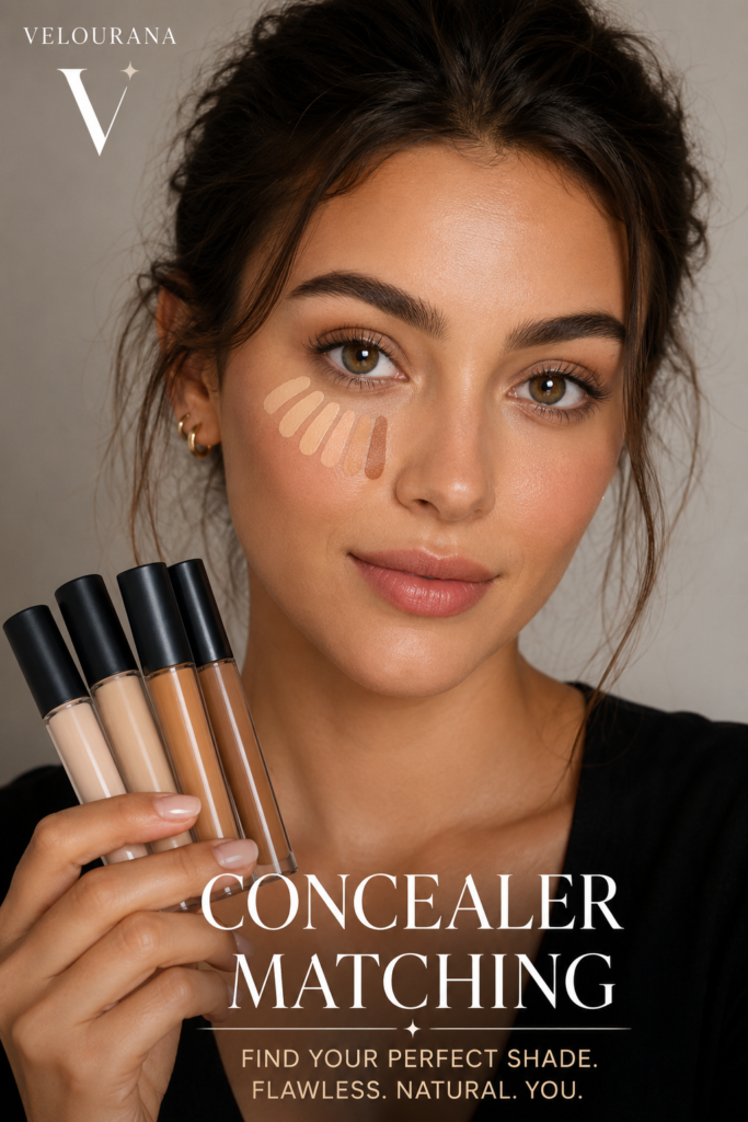
CATEGORY: Concealer Matching
Concealer may occupy only a small amount of space in a makeup bag, but finding the right shade can be surprisingly complicated. A concealer that matches beautifully can seem almost invisible on the skin, quietly softening discoloration and creating a more even complexion. Choose the wrong shade, however, and the product intended to conceal may actually draw attention to the very area you wanted to disguise.
The difficulty begins with a simple misunderstanding: there is not necessarily one perfect concealer shade for every purpose.
The shade that works beautifully over a blemish may not be the shade you want beneath your eyes. A concealer chosen for brightening may look conspicuous when placed over pigmentation. A peach-toned formula that transforms blue-purple shadows beneath the eyes could look completely wrong when applied across the rest of the face.
Successful concealer matching therefore requires more than finding something that appears approximately similar to your skin.
You need to consider skin depth, undertone, the color of the area being concealed, the purpose of the concealer and even how the formula changes after it has been sitting on your skin.
Once these elements are separated, concealer matching becomes considerably easier.
Start by Deciding What You Want the Concealer to Do
Before looking at shade names, undertones or color charts, decide what you actually want to conceal.
This is one of the most important steps because different makeup goals require different matching strategies.
If you are covering a small blemish, pigmentation mark or scar, your objective is usually camouflage. You want the concealed area to disappear into the surrounding complexion. In that situation, a concealer that closely matches your actual skin depth is generally the most natural choice.
If you are concealing beneath the eyes, your objective may be different. You might want to neutralize dark discoloration, brighten shadows created by facial structure or create a slightly more illuminated appearance.
Those are three different objectives.
And if you are using concealer strategically to highlight areas of the face, you are no longer attempting to conceal something at all. You are deliberately manipulating light and contrast.
This explains why makeup artists frequently work with more than one concealer shade.
Instead of asking, “What is my concealer shade?” it is more useful to ask:
“What is the correct concealer shade for what I am trying to accomplish?”
Understand Skin Depth Before Undertone
Concealer matching begins with skin depth.
Depth describes how light or deep your complexion appears rather than whether it looks warm, cool or neutral.
Cosmetic brands use different terminology, but shade ranges are commonly divided into descriptions such as fair, light, light-medium, medium, tan, deep and rich.
These categories are useful starting points rather than universal measurements.
One brand’s medium may resemble another brand’s light-medium. A shade called tan in one range might sit considerably deeper than a shade carrying the same description elsewhere.
For that reason, shade names should never be treated as standardized measurements.
Look at the actual color.
Your ideal depth can also vary slightly across your face. The forehead may naturally appear deeper than the center of the face. The eye area can contain pigmentation or shadow. The jaw may be lighter than areas regularly exposed to sunlight.
This variation is normal.
The goal is not to find a concealer that matches every individual patch of color on your face simultaneously. Instead, identify the overall complexion into which the concealer needs to blend.
Undertone Is the Second Half of the Match
Two people can have almost identical skin depth and still require completely different concealers.
The reason is undertone.
Undertone refers to the subtle underlying color character of the complexion. Although terminology varies among brands, the most familiar categories are warm, cool and neutral. Olive undertones are also increasingly recognized because they do not always fit comfortably into the traditional three-category system.
Warm complexions may have golden, yellow or peach characteristics.
Cool complexions may appear more pink, rosy or reddish.
Neutral complexions contain a more balanced combination without an obviously dominant warm or cool direction.
Olive complexions often have a muted greenish, golden-green or neutral quality that can make conventional foundation and concealer shades appear unexpectedly orange, peach or pink.
Undertone matters because a concealer can have approximately the correct depth while still looking obviously incorrect.
A shade may be light enough but too yellow.
Another may have the correct depth but appear pink.
A concealer may disappear perfectly in terms of lightness and darkness yet leave an orange patch because its undertone does not harmonize with the surrounding skin.
When people say that a complexion product is “almost the right shade but somehow looks wrong,” undertone is frequently responsible.
Surface Color and Undertone Are Not the Same Thing
One reason undertone can be difficult to identify is that the color visible on the surface of the skin is not necessarily the same as the underlying tone.
Temporary redness, tanning, pigmentation, acne, irritation and sun exposure can all influence surface appearance.
Someone may have warm undertones while experiencing noticeable redness across the cheeks. Another person may have an olive undertone but appear temporarily golden after tanning.
This is why judging undertone from one small area of the face can be misleading.
Look at the complexion as a whole.
Consider the face, neck and upper chest rather than concentrating exclusively on the cheeks.
Traditional tricks involving wrist veins or whether gold or silver jewelry looks better can provide clues, but they should not be treated as infallible tests. Human complexions are far more nuanced than a single vein or piece of jewelry can reveal.
The most useful evidence is ultimately the way actual complexion shades behave on your skin.
Your Foundation Can Be an Excellent Starting Point
If you already own a foundation that genuinely matches your complexion, you have solved a large part of the concealer-matching puzzle.
Your foundation gives you a reference for both depth and undertone.
For blemishes and localized pigmentation, begin by looking for concealers that sit close to that foundation shade.
This does not mean buying a concealer with the same shade number. Shade numbering systems frequently differ even within the same brand.
Instead, compare the actual colors.
If your foundation is medium with a neutral-golden undertone, begin your concealer search within approximately the same depth and undertone family.
For under-eye brightening, you can then move slightly lighter while maintaining an undertone that complements your complexion and the discoloration you are trying to address.
This is much more reliable than randomly selecting a concealer simply because its packaging describes it as “medium.”
Matching Concealer for Blemishes
Spot concealing works best when the product does not announce its presence.
Imagine placing a very light dot onto a dark blemish. Instead of disappearing, the blemish becomes a pale spot surrounded by normal skin.
This is why dramatically lighter concealer is generally unsuitable for precise blemish coverage.
For ordinary spot concealing, aim for a shade that blends convincingly into the surrounding complexion.
Undertone matters here too.
If the concealer is too pink against golden skin, the concealed blemish can become a small rosy patch. If it is excessively yellow against a cooler complexion, the area may look strangely warm.
Application technique reinforces the match.
Use only enough product to cover the discoloration, concentrate pigment where it is required and soften the perimeter into the surrounding skin.
The center should retain coverage while the edges disappear.
When the shade and application are both correct, you should notice the blemish less rather than noticing the concealer more.
Matching Concealer for Dark Spots and Hyperpigmentation
Dark pigmentation presents another challenge because the discoloration beneath the concealer can influence the final visible result.
A thin layer of perfectly skin-matched concealer may not completely neutralize a significantly darker mark.
The instinctive response is often to use a lighter concealer.
That can make matters worse.
A pale product placed over deep pigmentation may combine visually with the darker color underneath and create a gray or ashy result.
The solution is often not greater lightness but better neutralization.
Depending on the color and depth of the pigmentation, a subtle corrective tone beneath the concealer can reduce the contrast before a skin-matching shade is applied.
The key word is subtle.
Color correction is most effective when it neutralizes rather than creates a new patch of obvious color.
Under-Eye Concealer Requires a Different Strategy
The eye area is where concealer matching becomes particularly interesting.
Under-eye darkness is not always simply “darker skin.”
It can contain blue, violet, brown, gray, red or greenish qualities. Shadows created by facial anatomy can also make the area appear dark even when there is relatively little pigmentation.
This means that simply choosing a very light beige concealer may not solve the problem.
In some cases, it exaggerates it.
A concealer slightly lighter than the complexion can create a fresh, brightened effect when the underlying discoloration is relatively mild.
But the greater the contrast between concealer and skin, the greater the possibility of creating an obvious pale area around the eyes.
The familiar extremely bright under-eye effect seen in some makeup styles is intentional. It should not be confused with naturalistic concealing.
For a seamless everyday result, restraint is usually more convincing.
Why Extremely Light Concealer Can Look Gray
One of the most frustrating concealer problems occurs when a seemingly bright shade makes dark circles look gray.
This is often a color interaction problem.
If blue, purple or brown discoloration remains visible beneath a concealer that is considerably lighter than the skin, the two colors visually combine. Instead of producing clean brightness, the result can become dull or ashy.
Adding another layer of the same pale concealer may simply make the makeup thicker without correcting the underlying color.
This is where color correction becomes useful.
Rather than attempting to overpower discoloration with increasingly opaque beige pigment, a carefully selected corrective shade can neutralize part of the unwanted color first.
The skin-toned concealer then has much less work to do.
The Logic Behind Color Correction
Color correction sounds complicated until you remember one basic principle: contrasting colors can visually neutralize one another.
Green is commonly used against redness.
Peach and orange families can help counter blue-toned discoloration.
Yellow can help soften certain purple tones.
Lavender or purple products can counter pronounced yellow or sallow areas.
But these categories are only starting points.
The depth of the corrective shade matters just as much as its color family.
A vivid orange corrector that works beautifully against pronounced blue discoloration on deeper skin could be far too strong on very fair skin. Conversely, a delicate pale peach corrector may not provide sufficient neutralization on a rich complexion.
Color correction should therefore be proportional both to the discoloration and to the depth of the surrounding skin.
Peach, Salmon and Orange Correctors Are Not Interchangeable
These shades belong to related color families, but their depth and intensity can differ significantly.
A soft pink-peach may be sufficient for subtle blue-purple darkness on a fair complexion.
Peach or salmon tones can work effectively across many light-to-medium complexions depending on the precise color of the darkness.
Richer orange and red-orange tones may provide more effective correction where both the complexion and discoloration are deeper.
The objective is not to make the under-eye area visibly orange.
The corrector should reduce the unwanted blue, purple or gray quality so that the concealer placed over it can appear more natural.
If you can clearly see a bright patch of corrector before applying concealer, you may be using too much product or too intense a shade.
Concealer for Redness Needs Precision
Redness around a blemish can sometimes be covered successfully with an ordinary high-pigment concealer that matches the skin.
More pronounced redness may benefit from a small amount of corrective color.
Green sits opposite red in traditional color theory, which is why green-toned correctors are commonly associated with redness.
However, covering the face with visibly green makeup is rarely necessary for localized redness.
Use correction where the color actually exists.
Then apply your complexion product over it.
The purpose is not to replace red with green. It is to reduce the visual intensity of the redness until a relatively small amount of skin-toned product can complete the camouflage.
Olive Skin Can Make Concealer Matching Particularly Difficult
Olive complexions deserve special attention because many traditional shade ranges have historically been dominated by pink, peach and golden undertones.
An olive complexion can therefore encounter a peculiar problem: several concealers may appear to be the correct depth, yet every one seems either too orange or too pink.
Mutedness is often part of the equation.
Olive skin does not necessarily mean medium or tan skin either. Olive undertones can occur across different complexion depths.
If products routinely become orange on you even when their depth seems correct, or neutral shades appear strangely pink, consider whether an olive undertone may explain the mismatch.
Look for ranges that explicitly include olive or neutral-olive undertones rather than continually compensating with the wrong color family.
Do Not Judge a Concealer Only from the Tube
Packaging can distort color.
Frosted containers, thick plastic, artificial store lighting and the concentration of pigment inside the tube can all affect how a shade appears.
A concealer that looks perfect through the packaging may behave differently when spread into a thin layer across skin.
The reverse can also happen.
A shade that appears slightly dark in the tube may become almost invisible when blended.
Concealer should therefore be judged as makeup rather than as a color sample.
What matters is how it looks after application.
Swatching Is Useful Only When You Swatch Intelligently
A quick swipe on the hand can help compare several shades, but your hand is not necessarily the same color as your face.
Hands often receive different amounts of sun exposure, and their skin can have different surface characteristics.
If you are choosing concealer for facial blemishes, testing close to the jaw or another representative area of the face provides more useful information.
For an under-eye product, the most meaningful test is ultimately beneath the eye itself because that is where the interaction between skin color, discoloration and facial shadow occurs.
When testing several shades, place them separately rather than blending all of them together.
Give yourself enough space to see which shade genuinely disappears and which only appeared promising in the container.
Natural Light Is One of Your Best Matching Tools
Artificial lighting can dramatically change your perception of complexion products.
Warm indoor lighting may disguise an excessively yellow concealer. Cool fluorescent lighting can alter how pink or gray a shade appears.
Whenever possible, inspect the match in indirect natural daylight.
You do not need intense direct sunlight. In fact, harsh sun can create strong shadows that make comparison more difficult.
Stand near a window or move into soft daylight and examine the transition between the concealer and bare skin.
A good spot-concealing shade should not create an obvious boundary.
For an under-eye brightener, some difference is intentional, but it should still look harmonious with the rest of the complexion.
Give the Formula Time Before Making Your Decision
Some complexion formulas change after application.
The shade you see immediately after swatching is not always the shade you will see later.
A product may dry slightly deeper, warmer or otherwise different from its initial appearance. This is commonly described as oxidation, although not every visible dry-down color change necessarily comes from exactly the same chemical process.
The practical lesson is simple.
Do not immediately purchase a concealer solely because a fresh swatch disappears perfectly.
Apply it, allow it to settle and check again.
If a seemingly perfect shade becomes noticeably darker or warmer after wearing, the final shade—not the initial swipe—is what matters.
Texture Can Change Your Perception of Color
Concealer matching is usually discussed as if color exists independently of formula, but texture and finish influence how a shade looks.
A highly opaque matte concealer creates a more definite block of pigment. Even a small mismatch can therefore become noticeable.
A sheer, flexible formula allows more natural skin tone to remain visible underneath, which can make a slightly imperfect match more forgiving.
A radiant finish reflects light and may make an area appear visually brighter.
A very matte finish can make the same depth seem flatter or more prominent against luminous surrounding skin.
Coverage matters too.
The more opaque the product, the more accurately its color usually needs to coordinate with the skin when the goal is invisible spot concealing.
Your Perfect Summer Concealer May Fail in Winter
Skin depth changes for many people throughout the year.
Sun exposure can deepen the complexion during warmer months, while winter skin may become noticeably lighter.
Undertone generally remains more stable than surface depth, although tanning can change how strongly certain tones appear.
This explains why a concealer purchased in August can suddenly look obviously dark in January.
You do not necessarily need an enormous concealer collection.
Two strategically selected shades can provide considerable flexibility. If the formulas are compatible, neighboring shades can sometimes be mixed during transitional periods.
The important point is recognizing when your skin has changed rather than assuming your application technique has suddenly become poor.
Face, Neck and Chest Can Be Different Colors
Complexion matching becomes more complicated when the face does not perfectly match the neck or chest.
Sun exposure, skincare, redness and pigmentation can create visible differences between these areas.
When spot concealing, you usually want the result to integrate with whatever base makeup you are wearing.
If you wear foundation that harmonizes your face with your neck and chest, your concealer should generally coordinate with that finished complexion rather than an isolated patch of untreated facial redness.
If you wear no foundation, the concealer needs to disappear convincingly into your bare facial skin.
Context changes the match.
Concealer Matching Without Foundation
Many people wear concealer alone.
In this situation, accurate shade matching becomes especially important because there is no foundation surrounding the concealer to create a uniform base.
For blemishes, choose a shade extremely close to the skin around the area.
Apply a tiny amount precisely and soften only the edges.
For under-eyes, avoid creating an isolated bright semicircle beneath each eye. A subtle transition into the surrounding complexion usually looks more natural.
Strategic placement can help.
Instead of coating the entire under-eye area, place concealer primarily where darkness is most visible and blend outward with decreasing coverage.
This preserves more natural skin and makes minor shade differences less noticeable.
One Concealer Versus a Concealer Wardrobe
You certainly can use one concealer for several purposes if your needs are simple and the shade is versatile.
But expecting one shade to provide exact spot camouflage, strong under-eye color correction and dramatic highlighting is unrealistic.
A practical concealer wardrobe does not need to be excessive.
One accurate skin match can handle blemishes and localized pigmentation.
A second slightly brighter shade can serve the eye area and subtle highlighting.
If you have pronounced discoloration, a dedicated corrector may be more effective than buying increasingly opaque concealers.
Three carefully chosen products can often accomplish more than a drawer filled with near-matches.
Common Concealer Matching Mistakes
Perhaps the most common mistake is assuming concealer should always be lighter than foundation.
That advice makes sense only for certain applications.
Another mistake is focusing entirely on depth while ignoring undertone.
People also frequently compensate for dark circles by choosing increasingly pale shades instead of addressing the underlying discoloration.
Testing only on the hand can produce misleading results.
Judging a wet swatch immediately can overlook dry-down changes.
Choosing concealer under highly artificial lighting can distort your perception of the shade.
And purchasing a color because an influencer with a vaguely similar complexion wears it ignores the enormous variation in undertone, pigmentation, lighting and camera processing.
Use recommendations to create a shortlist.
Let your own skin make the final decision.
How to Tell When Your Concealer Is Too Light
A concealer is probably too light for natural spot coverage if the concealed area remains visible as a pale patch after blending.
Under the eyes, excessive lightness may create a stark contrast with the cheeks.
It can also emphasize texture because the bright area attracts visual attention.
If discoloration begins looking gray rather than neutralized, the shade may be too pale or insufficiently corrective.
Remember that brightness does not automatically equal freshness.
The most flattering under-eye result is often achieved through subtle correction and moderate brightening rather than maximum lightness.
How to Tell When Your Concealer Is Too Dark
A concealer that is too dark can create shadows where you were attempting to remove them.
This is particularly noticeable beneath the eyes.
For spot concealing, a slightly deeper product may sometimes be used strategically as part of a layered correction technique, but an obviously dark patch will still attract attention if it is not blended into an appropriate complexion shade.
Always evaluate the final appearance from normal conversational distance as well as close to the mirror.
Makeup that seems imperfect from ten centimeters away may be completely seamless at normal distance—and the reverse can also be true.
How to Tell When the Undertone Is Wrong
An undertone mismatch often reveals itself through an unexpected color cast.
The concealer may look orange even though it is not too dark.
It may appear pink even though the depth is correct.
It may turn yellow against the surrounding complexion.
On olive skin, it may appear unusually peachy or saturated.
Compare the concealed area with adjacent bare skin or foundation.
Ask whether the difference is primarily brightness or whether you can actually identify a separate color.
If you see a color boundary, undertone deserves investigation.
Build a Personal Concealer Reference
Once you discover a genuinely good match, record it.
Keep the brand, product, shade and purpose somewhere accessible.
For example, note that one shade is your winter blemish match while another is your summer under-eye shade.
This becomes particularly useful when shopping across brands because you now possess a physical reference point.
Shade-matching tools and brand comparison systems can help narrow future searches, but they should be treated as starting points rather than guarantees. Formulas, undertone classifications and shade systems vary too much for cross-brand matching to be perfectly predictable.
Your successful products provide evidence about what actually works on your complexion.
The Best Match Is the One That Works on Your Skin
Concealer matching becomes easier once you stop searching for a mythical universal shade.
Your complexion has depth.
It has an undertone.
The area you want to conceal has its own color.
Your chosen formula has coverage, texture and finish.
Your purpose determines whether you want the product to disappear, correct discoloration or deliberately brighten.
All of these factors contribute to the final match.
For blemishes and spot coverage, prioritize seamless integration with the surrounding complexion. For under-eye brightening, move cautiously lighter rather than automatically reaching for the palest possible option. When strong discoloration remains visible through beige concealer, consider whether color correction would solve the problem more elegantly than additional layers.
Test on the area where the product will actually be worn. Examine it in natural light. Allow it to settle. Compare the undertone as carefully as the depth.
Most importantly, judge the finished result rather than the shade name printed on the package.
When concealer is matched well, you should not be thinking about the concealer.
You should simply notice that the complexion looks more even, rested and balanced while still looking recognizably like skin.
That quiet disappearance is ultimately what a perfect concealer match is designed to achieve.
The End
Velourana
 Discover More From Our Family of Websites
 ZodiacBearing (Astrology, Tarot, Numerology, Angel Numbers & Spiritual Guidance)
 Velourana (Beauty, Makeup, Hair Care, Skincare & Beauty Tips)
 HavenBearing (Home, Living, Organization, Décor & Everyday Inspiration)
 PawBearing (Pet Care, Dog Breeds, Animal Health, Training & Pet Products)
 PsyCatherine (Notes From the Journal of a Psychologist on Real Life)

