
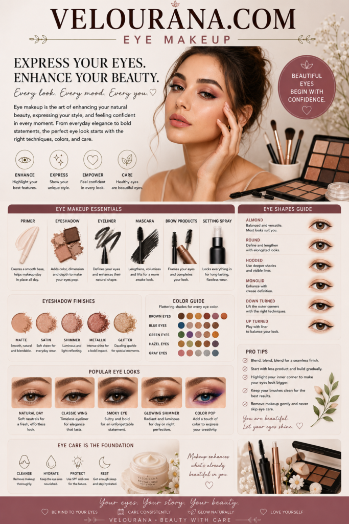
CATEGORY: Eyeshadow Palettes
An eyeshadow palette is more than a convenient arrangement of colors inside a single compact. At its best, it is a carefully edited visual system in which shades, depths, undertones and finishes are designed to communicate with one another. A successful palette can move from barely visible daytime definition to polished evening depth without feeling as though the wearer has changed products entirely. Its value lies not simply in the number of pans it contains, but in the relationships between them.
This distinction matters because a large palette is not automatically a versatile one. Twenty shades occupying almost the same depth can offer less creative range than a thoughtfully designed collection of eight. Similarly, a palette filled with spectacular metallics may look irresistible when opened but prove surprisingly dependent on external matte shadows when used on the eyes. The most functional palettes create contrast as well as harmony. They provide enough variation to build dimension while maintaining a coherent identity.
Modern eyeshadow palettes have also become objects of visual desire. Packaging, embossing, color stories and shade arrangements can turn them into miniature design pieces. Yet the true test begins after the palette leaves the dressing table and reaches the eyelid. Colors that look beautiful beside one another in their pans must still blend, layer and maintain enough distinction to create purposeful eye makeup.
Understanding palettes therefore requires looking beyond individual shades. The deeper question is how an entire collection has been constructed and what kind of beauty language it makes possible.
The Color Story as the Identity of a Palette
Every memorable eyeshadow palette has a color story, even when that story appears extremely simple. A collection of beige, taupe, chocolate and cream may seem less conceptually dramatic than one filled with emerald, violet and gold, but both communicate a specific visual direction.
Neutral palettes often derive their sophistication from subtle differences in undertone. A cool taupe behaves differently from a warm caramel even when both occupy a similar depth. Rose-brown introduces a muted romantic quality, while olive-brown creates an earthier atmosphere. Charcoal can shift a neutral collection toward smoke, whereas deep espresso maintains warmth.
The success of these palettes depends on whether the shades remain distinguishable once applied. If every medium brown blends into essentially the same result, the apparent variety inside the compact becomes less meaningful. A well-developed neutral palette contains enough tonal separation to create genuine structure.
Colorful palettes face another challenge. Their shades need some form of relationship if the collection is intended to function cohesively. That relationship may come from a shared undertone, a recurring level of saturation or a deliberate contrast between complementary families.
A jewel-toned palette might combine sapphire, emerald, amethyst and rich metallic gold because all possess comparable depth and visual richness. A pastel collection may unite lavender, mint, pale blue and soft peach through their lightness rather than through hue. A sunset-inspired palette can move through yellow, orange, terracotta, burgundy and plum because the progression feels chromatically connected.
Some palettes deliberately reject harmony. They combine apparently unrelated shades to encourage experimentation. In these cases, cohesion may come from finish or intensity rather than conventional color theory.
The important point is that a palette should offer more than a random assortment of attractive pans. Its shades need a reason to coexist.
Depth Is What Turns Color Into Structure
One of the most overlooked qualities of an eyeshadow palette is its range of depth.
Eye makeup becomes dimensional when light, medium and deep values interact. A palette containing only medium shades may provide beautiful color but struggle to create contrast. The wearer can blend several pans together and still find that the finished eye appears surprisingly flat.
Lighter shades can preserve openness, brighten particular areas or create transitions into surrounding skin. Medium shades often establish the principal color story and provide much of the visible shaping. Deeper shades introduce definition around the lash line, outer eye or crease.
These roles are flexible rather than mandatory. A dramatic eye can be created almost entirely from deep shades, while a luminous minimalist look may never require a dark outer corner. Nevertheless, variation in depth increases the number of visual structures available.
This is especially important in monochromatic palettes. A collection containing several versions of brown becomes genuinely useful when those browns range from pale beige through caramel and chocolate to near-black espresso. If every shade sits within the same medium range, the palette may appear diverse in the pans while producing very similar results on the eye.
The deepest shade does not necessarily need to be black. Deep brown, navy, burgundy, forest green or charcoal can provide sufficient anchoring while preserving the character of the color story.
Likewise, the lightest shade does not need to be white or cream. A pale peach, champagne, lavender or muted gold may serve as the luminous end of the palette.
Depth creates hierarchy. Without it, color can become decorative but structurally weak.
Matte, Satin, Shimmer and Metallic Finishes
Finish determines how an eyeshadow palette interacts with light.
Matte shadows absorb light and therefore provide visual stability. They are particularly effective for creating shape because their appearance changes relatively little as the face moves. A matte crease shade can establish depth without introducing additional reflection.
Satin shadows sit between matte and obvious shimmer. Their restrained luminosity can make the eyelid appear smoother and more dimensional without producing a strongly sparkling surface. They are often exceptionally useful for polished everyday makeup because they bring life to the eye while remaining understated.
Shimmer introduces more visible reflection. Depending on particle size and formulation, it can range from a soft sheen to obvious sparkle. Shimmer shades can make the center of the lid appear more prominent or bring light into the inner eye.
Metallic shadows create stronger continuous reflection. Gold, bronze, copper and silver are familiar examples, but modern palettes frequently include metallic jewel tones and complex multicolored finishes. These shades can become focal points because they react dramatically to movement and lighting.
A balanced palette does not necessarily require equal quantities of every finish. Its ideal composition depends on purpose.
A professional neutral palette may prioritize mattes and satins because these finishes support controlled sculpting. A glamorous evening palette may contain several metallics. An editorial collection may deliberately focus on unusual reflective textures.
The important consideration is whether the finishes provide meaningful choices rather than superficial variety.
A palette containing six metallic shades that appear almost identical on the eye offers less functional diversity than one containing a matte, satin and metallic version of related colors.
Undertone and the Hidden Complexity of Neutral Palettes
Neutral palettes are sometimes treated as simple because their colors are familiar. In reality, undertone can make them remarkably complex.
Warm neutral palettes contain shades influenced by yellow, orange, red or golden undertones. Caramel, copper-brown, terracotta and warm chocolate create an inviting, sunlit quality.
Cool neutral palettes move toward gray, mauve, cool taupe and charcoal. They can produce more shadow-like sculpting and often feel restrained or smoky.
Neutral-neutral palettes attempt to sit between these extremes, combining balanced beige and brown shades that do not lean dramatically warm or cool.
The distinction becomes particularly visible when shadows are blended across the skin. A brown that appears relatively neutral in the pan may reveal considerable orange warmth once diffused. A taupe may become surprisingly purple.
This is partly because eyeshadow is not viewed independently after application. The wearer's complexion, eyelid pigmentation, surrounding makeup and lighting all influence perception.
A versatile palette often includes subtle undertone variation without becoming incoherent. A cool taupe may sit beside neutral brown and a slightly warmer bronze, allowing the wearer to adjust the mood rather than commit to one temperature.
This tonal flexibility is one reason thoughtfully designed neutral palettes remain useful even when more adventurous colors are available.
Their complexity lies in nuance rather than obvious saturation.
Why Transition Shades Are About Blending, Not Rules
The phrase transition shade has become deeply embedded in eyeshadow vocabulary, but the concept is sometimes treated too rigidly.
A transition shade is essentially a color that helps create a visual bridge between deeper pigment and surrounding skin or between two contrasting shadows. It does not need to be one predetermined beige-brown.
In a warm eye look, muted caramel may provide the transition. In a purple look, dusty mauve can perform the same function. A green eye might use soft olive. A smoky gray eye may transition through taupe.
The purpose is continuity.
A palette becomes more versatile when it contains shades capable of softening its deeper colors without muddying them.
However, not every eye look needs a visible transition shade. Modern graphic makeup may intentionally maintain sharp boundaries. A simple one-shadow look can fade naturally through reduced product density.
The presence of useful midtones still matters because they expand the palette's blending possibilities.
A thoughtfully constructed palette allows gradients to emerge without forcing the wearer to reach for another product.
The Importance of a Deep Anchoring Shade
A palette's darkest shade can dramatically increase its versatility.
Deep pigment creates contrast close to the lashes, strengthens the outer corner and allows lighter colors to appear more luminous by comparison.
Black offers maximum intensity, but it is not always the most harmonious choice.
Espresso can anchor warm neutrals while remaining softer than black. Charcoal supports cool palettes. Deep aubergine can strengthen purple and rose color stories. Navy adds depth to blue collections, while forest green performs the same function in earthy palettes.
A dark shade can also transform other colors through layering.
Applied beneath metallic shadow, it can deepen the reflective finish. Blended with medium shades, it creates intermediate tones. Used with a small brush, it can function as soft eyeliner.
The deepest pan may occupy only a small portion of the finished makeup, yet its presence increases the structural range of the entire palette.
Palettes Built Around Everyday Wear
An everyday eyeshadow palette succeeds when it offers meaningful variation without demanding elaborate makeup.
Such palettes often rely on sophisticated neutrals because these colors can be intensified or softened easily.
A pale neutral can create barely visible brightness. A medium taupe or brown establishes shape. A deeper shade adds definition. A restrained shimmer or satin introduces light.
From these relationships, many different eyes can emerge.
The same palette might create an almost bare wash in the morning and a deeper smoky eye in the evening. The transition does not require a completely different color story; it requires greater contrast and intensity.
This adaptability is more valuable than simply having many shades.
A compact palette that contains everything needed for several levels of definition can become more practical than a huge collection filled with colors that rarely cooperate.
Everyday versatility is ultimately about proportion.
Palettes Designed for Drama
Dramatic palettes operate under different priorities.
They may contain richer depths, stronger metallics and more saturated colors because their purpose is not necessarily to disappear into everyday makeup.
A smoky palette might move from pewter and charcoal through deep brown and black. A jewel-toned collection could combine emerald, sapphire, plum and metallic gold. A warm dramatic palette might focus on copper, burgundy, burnt orange and deep chocolate.
These palettes benefit from strong contrast.
A brilliant metallic becomes more striking beside deep matte pigment. A saturated jewel tone gains sophistication when it can be blended into a darker related shade.
The best dramatic palettes still need transitions, but those transitions do not have to resemble traditional beige neutrals. A muted burgundy can soften a deeper wine shadow. A medium olive can bridge emerald and skin.
The internal logic remains the same even when the colors become more adventurous.
Large Palettes and the Illusion of Endless Choice
Large eyeshadow palettes can be visually spectacular. Rows of color create an immediate impression of possibility.
Yet more choice does not always produce greater creativity.
When dozens of shades are available simultaneously, similar colors can become redundant. Several beige tones may perform nearly identical functions. Multiple bronzes may differ in the pan but merge into almost indistinguishable finishes once applied.
This does not make large palettes undesirable. Their strength lies in breadth when the shade selection genuinely covers multiple color families, depths and textures.
A successful large palette can function almost like a complete eyeshadow library.
The challenge is editing during application.
Rather than attempting to use many shades simply because they are available, the wearer can treat the large palette as a collection of smaller color stories. A few related shades are selected for one look while the remainder stay untouched.
This preserves clarity.
The number of pans used has no relationship with the sophistication of the finished eye.
Small Palettes and the Power of Editing
Small palettes reveal the importance of curation because every shade occupies valuable space.
A four-, five- or six-pan collection must make deliberate choices. There is less room for redundancy, which can make a well-designed compact palette remarkably efficient.
The shades may form one complete gradient or provide contrasting textures within a limited color family.
A small neutral palette might contain a light satin, medium matte, deep matte and metallic accent. Those four colors can produce considerable variety because each performs a distinct visual role.
The limitation can actually encourage creativity.
Instead of constantly searching for another shade, the wearer explores different densities, placements and combinations of the same colors.
This creates familiarity with the palette and often leads to more confident application.
Reading a Palette Before Applying It
A useful habit is to look at an eyeshadow palette as a complete composition before focusing on individual pans.
The lightest and darkest colors reveal its contrast range. The proportion of mattes to reflective shades suggests how easily it can create structure. Repeated undertones reveal whether the collection leans warm, cool or balanced.
The brightest or most unusual shade often reveals the palette's personality.
A neutral collection containing one deep olive may encourage subtle experimentation. A mostly matte palette with one brilliant gold metallic clearly positions that gold as an accent.
Seeing these relationships makes application more intentional.
Instead of selecting shades randomly because they look attractive individually, the wearer begins to understand how they can support one another.
Creating a Complete Look Without Using Half the Palette
Complexity is not measured by the number of eyeshadows applied.
Many sophisticated eye looks use only two or three shades.
A medium matte can establish the shape. A deeper color strengthens the lashes and outer corner. A reflective shade introduces light.
The visual complexity comes from placement, blending and texture.
Using too many similar shadows can actually reduce dimension because repeated blending merges them into one indistinct tone.
A palette should therefore be understood as a source of options rather than an instruction to use everything.
The most elegant use of a large collection may involve selecting only the few pans necessary for the desired result.
Mixing Shades Within the Palette
Eyeshadow pans do not need to remain visually separate.
Two matte shades can be blended together to create an intermediate tone. A metallic can be layered over a matte to change both depth and finish. A deep color can transform a bright shade into something smokier.
This effectively expands the palette beyond its physical number of pans.
Mixing is particularly useful when a transition shade is slightly too warm or cool. Combining it with another neutral can create a more suitable balance.
Metallic shades can also be layered. Gold over bronze creates a different reflection from either shade alone.
The palette becomes a working color system rather than a fixed menu.
Coordinating the Palette With Eyeliner and Mascara
Eyeshadow palettes do not exist independently from other eye makeup.
Black eyeliner can increase contrast in almost any palette, but it is not always the most harmonious option.
Brown liner can preserve softness in warm neutrals. Navy can enrich blue and cool palettes. Plum can complement rose, mauve and burgundy shadows.
The deepest matte within the palette itself can often be used as liner for a softer result.
Mascara provides another layer of structure. Dark lashes can make pale or pastel palettes feel more grounded. Brown mascara can maintain the gentleness of soft neutral looks.
The final eye is therefore created by relationships extending beyond the palette.
The Role of Skin Tone in How Palette Colors Appear
Eyeshadow is transparent to varying degrees, which means the natural eyelid influences the finished color.
A pale beige may create visible brightness on one complexion and blend almost completely into another. A medium brown may function as a transition shade for one wearer and a highlight for someone else.
This is why the functional roles printed or implied by palette arrangements should never be treated as universal.
A shade intended by the manufacturer as a crease color can become a lid shade. A supposed highlight may function as a transition. A deep shade may be used only as liner.
The palette should adapt to the wearer rather than requiring the wearer to reproduce one predetermined diagram.
When a Beautiful Palette Is Not a Functional Palette
Some palettes are extraordinarily attractive as objects but less successful as working collections.
This often occurs when the shades lack sufficient depth variation or when too many pans perform the same function.
A palette filled almost entirely with medium shimmers may look spectacular in packaging yet require external mattes for structured eye makeup.
A collection containing many pale colors but no anchoring shade may struggle to create dramatic contrast.
Conversely, a palette dominated by deep shades may produce beautiful smoky looks while offering limited options for softer makeup.
Functionality depends on the intended purpose.
A specialized metallic palette does not need to contain every matte if it openly exists as a companion product. Problems arise only when a supposedly complete palette lacks the relationships necessary to fulfill that role.
Palette Cohesion Without Repetition
Cohesion means that shades can communicate with one another. It does not mean that they must all look alike.
The strongest palettes balance familiarity with surprise.
Most shades may belong to a recognizable neutral family while one or two colors introduce contrast. A jewel palette may contain several saturated tones but unite them through comparable depth and finish.
This balance allows experimentation without making the collection feel random.
A palette should create possibilities the wearer can understand visually even before touching a brush.
Eyeshadow Palettes as Creative Libraries
A well-designed eyeshadow palette becomes more valuable with familiarity.
Repeated use reveals combinations that may not have been obvious initially. A muted matte that seemed unremarkable may become indispensable for blending. A metallic originally reserved for evening makeup may work beautifully as a tiny daytime accent.
The wearer begins to understand which shades deepen others, which disappear into the skin and which transform under different bases.
This relationship turns the palette from a collection of products into a personal creative library.
The best palettes invite this exploration because their shades possess enough individuality to remain interesting while sharing enough visual language to work together.
The Difference Between Owning More and Having More Possibility
Eyeshadow culture can encourage constant accumulation because every new palette appears to offer a new world of color.
Sometimes it does.
At other times, the new collection repeats shades already owned in slightly different packaging.
A thoughtful approach to palettes considers what genuinely changes. A new undertone family, an unusual finish, a missing depth or a distinctive color story can expand creative possibilities.
Simply increasing the number of pans does not necessarily do so.
A compact collection of well-chosen palettes can contain enormous range when each occupies a distinct role.
Why the Best Palette Feels Complete
The strongest eyeshadow palettes create a sense of internal completeness.
This does not mean they contain every imaginable shade. It means their color story feels resolved.
There is enough contrast to create structure. The finishes contribute different effects. The undertones make sense together. The light and dark values allow the wearer to control intensity.
Most importantly, the palette inspires combinations rather than merely presenting attractive individual colors.
When that balance is achieved, the compact becomes more than storage.
It becomes a complete environment for eye makeup.
A single palette can produce quiet neutral definition, luminous lids, smoky depth or unexpected color depending on how its shades are interpreted. Its versatility emerges not from excess but from relationships.
That is the enduring appeal of a beautifully constructed eyeshadow palette: opening it does not simply reveal a row of colors.
It reveals possibilities.
THE END VELOURANA
 Discover More From Our Family of Websites
 ZodiacBearing (Astrology, Tarot, Numerology, Angel Numbers & Spiritual Guidance)
 Velourana (Beauty, Makeup, Hair Care, Skincare & Beauty Tips)
 HavenBearing (Home, Living, Organization, Décor & Everyday Inspiration)
 PawBearing (Pet Care, Dog Breeds, Animal Health, Training & Pet Products)
 PsyCatherine (Notes From the Journal of a Psychologist on Real Life)

