
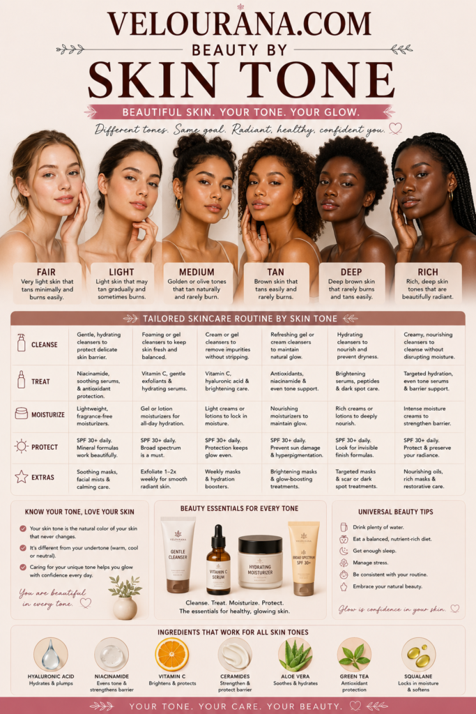
CATEGORY: Deep Skin Colors
Color takes on a distinctive character against deep skin. Shades that appear subdued in isolation can become luminous, colors that seem overwhelmingly bright can settle into remarkable balance, and seemingly simple neutrals can reveal complex red, golden, violet, gray, or olive undertones once they are placed beside a richly pigmented complexion.
This interaction makes deep skin color particularly fascinating.
The objective of understanding color harmony is not to establish rigid rules about which shades someone should or should not wear. Beauty is too individual for that approach. Instead, color knowledge provides a vocabulary for understanding why certain combinations create softness, others create contrast, and still others seem to illuminate the complexion.
Deep skin itself is multidimensional. Even within a single face, the forehead may have a different depth from the cheeks, the area around the mouth may contain stronger pigmentation, and the center of the face may naturally appear lighter. The lips can have their own distinctive pigmentation, while the neck and chest may differ subtly from the face.
These variations affect every color placed nearby.
Rather than trying to force the complexion into a simplified shade category, modern color selection works best when it begins with observation.
Reading the Natural Colors Within Deep Skin
Looking carefully at deep skin reveals considerably more than brown.
Depending on the individual, the complexion may contain traces of gold, amber, copper, red, rose, burgundy, violet, blue, olive, or muted neutral tones. These colors are not necessarily obvious when the face is viewed alone. Comparison often makes them easier to recognize.
A strongly yellow foundation can reveal that the complexion is less golden than expected. A cool berry lipstick may suddenly emphasize warm undertones in the skin. Silver jewelry can highlight cool characteristics, while yellow gold may amplify warmth.
None of these comparisons functions as an infallible undertone test. Human skin is too complex for a single test to provide a definitive answer.
Instead, patterns matter.
If warm colors consistently appear integrated and cool colors consistently create stronger contrast, warmth may be an important characteristic of the complexion. If the reverse occurs, cool undertones may be more prominent. When both groups work without either appearing particularly disconnected, the complexion may sit closer to neutral.
Olive undertones complicate the picture further because they can combine muted warmth with subtle green or gray characteristics.
Deep skin therefore rewards observation more than classification.
The Relationship Between Undertone and Surface Tone
Surface tone and undertone are related but not identical.
Surface tone describes what is immediately visible. It can change because of sun exposure, pigmentation, irritation, environmental conditions, or other temporary influences. Undertone is the more persistent color quality beneath that surface appearance.
A deep complexion may look reddish at the surface while still having neutral undertones. Another may appear strongly brown but reveal considerable golden warmth when compared with a cool foundation.
This distinction is particularly important when choosing complexion products.
Matching foundation exclusively to a temporary surface characteristic can produce an inaccurate result. Someone with pigmentation around the mouth, for example, may choose a foundation based on that deeper area and find that the rest of the face becomes too dark.
Similarly, matching only the brightest center of the face may result in a shade that looks pale against the neck and perimeter.
The goal is usually visual continuity rather than mathematical uniformity.
A successful complexion product should look believable across the face and in relation to nearby skin. This often requires considering depth and undertone simultaneously.
Warmth Across the Deep Spectrum
Warm deep skin can range from golden brown to copper-rich mahogany and intensely deep complexions with subtle amber or red warmth.
Because the overall depth is substantial, warmth may reveal itself differently than it does on lighter skin. It may appear as a golden reflection in sunlight rather than an obvious yellow undertone indoors. It may emerge through red or copper qualities rather than classic gold.
Colors that echo these characteristics can create tonal harmony.
Burnished gold, bronze, copper, rust, cinnamon, burnt orange, warm burgundy, terracotta, coral, mustard, and warm forest greens can interact beautifully with warm deep skin.
However, harmony is only one aesthetic option.
A cool cobalt blue or violet placed beside warm deep skin can create dramatic contrast precisely because it does not repeat the complexion's temperature. This contrast can make both the color and the skin appear more vivid.
Understanding undertone therefore expands choices rather than restricting them.
It allows someone to decide whether a color should blend, complement, or deliberately oppose the natural warmth of the complexion.
Coolness in Rich Complexions
Cool undertones in deep skin are sometimes underestimated because older beauty systems frequently assumed that deeper complexions were automatically warm.
In reality, deep skin can carry pronounced cool qualities.
Red-blue, wine, berry, plum, violet, and cool brown undertones may be visible. On extremely deep skin, these qualities can be subtle until the complexion is placed beside strongly warm pigments.
Foundation provides a revealing example. A deep shade with excessive orange may appear superficially close in depth yet remain visibly separate from cool skin. The face can look warmer than the neck even when the darkness of the product seems correct.
A cooler or neutral foundation at the same depth may disappear much more convincingly.
Decorative colors can amplify these characteristics beautifully. Blue-red lipstick, blackberry, plum, cool burgundy, violet, sapphire, cobalt, and certain emerald greens can create sophisticated relationships with cool deep complexions.
Silver and gunmetal can provide crisp luminosity, while cool rose and berry blushes can create a flush that feels connected to the underlying skin rather than sitting on top of it.
Yet warm gold, copper, and orange remain available as contrast colors. The distinction is aesthetic, not prohibitive.
Neutral Deep Skin and Color Flexibility
Neutral deep skin contains a relatively balanced mixture of warm and cool characteristics.
This balance can make undertone difficult to identify because the complexion may seem to change according to surrounding colors. Warm clothing may draw forward golden qualities. Cool makeup may reveal subtle red or blue dimensions.
This responsiveness can provide exceptional color flexibility.
Neutral deep skin can often move between warm bronze and cool silver, between brick red and blue-red, or between golden brown and mauve-brown without creating obvious dissonance.
The challenge is that cosmetic brands do not always use "neutral" consistently. One company's neutral foundation may lean golden, while another may contain noticeably red or olive pigment.
Shade labels should therefore be treated as guidance rather than objective standards.
The skin itself remains the reference.
Swatching a product directly and observing it after it has settled is far more informative than trusting the undertone description alone.
Olive Characteristics in Deep Skin
Deep olive skin deserves particular attention because it has historically been poorly represented in many shade systems.
Olive undertones may combine muted golden, greenish, gray, or neutral qualities. In deep complexions, these characteristics can be difficult to recognize until an incompatible product is applied.
A foundation that looks correct in depth may become strikingly orange. Another may appear excessively red. A strongly golden shade may turn yellow against the skin.
When several conventional warm and cool options all seem slightly wrong, an olive or muted undertone may explain the difficulty.
Color cosmetics behave differently as well.
Muted earth tones can appear exceptionally harmonious, while certain pinks become more vivid than expected. Purple can create an interesting complementary relationship with olive characteristics. Bronze and antique gold may feel integrated, while highly yellow metallics produce stronger contrast.
Again, individual variation is substantial. Olive is not one exact color any more than deep is one exact depth.
Recognizing its existence simply provides another way to understand why conventional shade categories sometimes fail.
The Power of Saturation
Saturation describes the intensity or purity of a color.
Deep skin often interacts exceptionally well with saturated shades because both possess significant visual presence. Jewel tones such as emerald, ruby, sapphire, amethyst, and deep turquoise can maintain their richness without overwhelming the complexion.
Highly saturated makeup can behave similarly.
A vivid berry blush can be blended into a soft flush while retaining clarity. An intense cobalt liner can remain unmistakably blue. A richly pigmented red lipstick can create definition without requiring excessive product.
Muted colors create a different effect.
Dusty rose, muted plum, soft terracotta, taupe, cocoa, and subdued olive can produce understated sophistication when their depth is sufficient. If a muted shade contains too much pale base, however, it may become chalky.
This is particularly relevant to makeup formulation.
The issue is not simply whether a color is bright or muted. It is whether its pigment structure works effectively over deeper skin.
White-Based Pigments and Chalkiness
Many pale cosmetics obtain their lightness from white pigments.
Against deep skin, these pigments create strong contrast. Sometimes that is exactly the desired effect. A crisp white eyeliner or intentionally pale eyeshadow can produce striking graphic beauty.
Problems arise when the pale base is unintended.
A translucent powder may leave a gray-white cast. A blush may appear dusty rather than colorful. An eyeshadow can lose its intended hue and become chalky. Sunscreen or complexion products can similarly leave visible residue depending on their formulation.
This phenomenon has historically contributed to misleading advice suggesting that certain colors cannot be worn on deep skin.
Often the color itself is not the problem.
A better-formulated version with richer pigmentation, greater transparency, or a more compatible base may produce an entirely different result.
Distinguishing color from formulation is therefore crucial.
Deep skin can wear pale colors, pastels, and high-contrast shades beautifully. What matters is whether the product creates the intended finish.
Blush as an Expression of Deep Skin Color
Blush demonstrates the relationship between skin depth and pigment concentration particularly clearly.
A shade that appears extremely intense in its packaging may become beautifully subtle once blended over deep skin. Deep rose, berry, plum, burnt coral, red-brown, terracotta, raisin, and warm brick can create remarkably natural-looking warmth or flush.
The appropriate depth depends on the complexion.
On very deep skin, a pale blush may contain insufficient pigment to remain visible. This does not mean softness is impossible. A highly pigmented deep shade applied sparingly can create a softer result than a pale shade applied heavily.
Undertone changes the effect further.
Warm terracotta can echo golden or copper characteristics. Berry can emphasize cool red undertones. Neutral rose can bridge multiple temperature families.
Blush placement and finish also influence perception. Matte color can appear sculptural and refined. Satin finishes introduce subtle luminosity. Reflective blushes combine color with highlight, allowing light to emphasize the cheeks.
Deep skin provides a rich background against which all of these variations can become particularly expressive.
Lip Color and Natural Pigmentation
The natural pigmentation of the lips is an essential part of deep skin color.
Many people with deep complexions have lips that contain more than one visible tone. The upper lip may be deeper than the lower lip, the perimeter may be darker, or areas of brown, rose, mauve, or purple pigmentation may coexist.
Lip products interact with this existing color.
A sheer lipstick allows natural pigmentation to remain part of the final shade. An opaque lipstick replaces more of it. Gloss adds reflection while preserving much of the underlying tone.
This is why identical lip products can look dramatically different on different people.
Nude lipstick requires particular nuance. A nude does not need to be pale beige. On deep skin, a natural-looking nude may be chocolate, caramel, cinnamon, rose-brown, mauve-brown, coffee, or espresso.
Lip liner can alter the relationship further. A deeper brown liner can create transition between the natural lip perimeter and a lighter central color, allowing shades that might otherwise appear disconnected to integrate more smoothly.
Deep reds, berries, burgundies, plums, oranges, and vivid pinks can also retain extraordinary richness.
The complexion does not merely support these colors. It changes them.
Eyeshadow and the Deep-Skin Canvas
Eye color becomes especially interesting against deep skin because the surrounding complexion influences both contrast and saturation.
Gold and bronze can create warmth and reflection. Copper introduces richer red-orange luminosity. Plum and burgundy can produce depth without defaulting to black or brown. Emerald, cobalt, turquoise, violet, and magenta can create strong chromatic statements.
Neutral eye makeup is equally varied.
Instead of assuming beige and light taupe are universal neutrals, deep complexions can draw from caramel, cocoa, mahogany, espresso, deep olive, warm chestnut, muted plum, and charcoal.
A neutral is ultimately a color that behaves quietly in relation to the wearer.
That definition changes according to skin depth.
A rich chocolate shadow may create soft definition on deep skin even though the same shade would appear dramatically smoky on a lighter complexion.
This relativity is one of the most important principles in understanding deep skin colors.
Clothing Colors and Facial Contrast
Clothing occupies a much larger visual field than makeup, which means its relationship with skin can strongly influence overall appearance.
Deep skin can create spectacular contrast with white, cream, bright yellow, vivid pink, turquoise, cobalt, and other high-value or saturated colors. Dark shades such as black, navy, chocolate, burgundy, and forest green create a more tonal relationship.
Neither approach is universally more flattering.
High contrast can emphasize the outline of the face and make the complexion appear especially luminous. Low contrast can produce continuity, depth, and understated elegance.
Undertone adds another layer.
Warm cream may harmonize differently than optical white. Burgundy can lean warm or cool. Green ranges from yellow-based olive to cool emerald. Even black can vary subtly according to fabric, sheen, and surrounding colors.
Fabric texture matters as well. Satin reflects light and creates highlights. Velvet absorbs more light and produces depth. Metallic textiles introduce direct reflection.
Color harmony therefore involves more than the nominal shade printed on a label.
Metallics and Light Reflection
Metallic colors have a special relationship with deep skin because they introduce concentrated reflected light.
Gold against deep skin can range from subtle warmth to dramatic brilliance depending on its tone. Yellow gold feels different from antique gold, champagne, bronze, copper, or rose gold.
Cool metallics create equally interesting possibilities.
Silver can produce sharp contrast. Pewter offers a softer, darker alternative. Gunmetal can behave almost like a reflective neutral. Metallic violet, blue, or green combines color saturation with luminosity.
Highlighter operates through the same principle.
A successful highlight does not necessarily need to be extremely light. Bronze, copper, deep gold, rose bronze, and other rich reflective tones can create luminosity without producing a pale stripe.
The deeper the complexion, the more important the base color of a reflective product can become. Once the reflective particles are no longer catching direct light, the underlying pigment remains visible.
A highlighter with an incompatible pale base may therefore appear natural from one angle and noticeably ashy from another.
Seasonal Changes in Deep Skin Color
Deep skin is not necessarily identical throughout the year.
Sun exposure can deepen surface pigmentation and shift the apparent balance between face, neck, and chest. Some people experience noticeable seasonal changes, while others remain relatively consistent.
These shifts can affect foundation matching.
A shade that integrates beautifully during one season may become too light or too dark later. Undertone can also appear somewhat different as the surface depth changes.
This does not mean an entirely new beauty palette is required whenever the complexion changes.
Instead, it reinforces the importance of observing the skin as it currently appears rather than relying indefinitely on an old shade designation.
The same principle applies to hair color, clothing, and makeup intensity. Changes in complexion depth can subtly alter contrast relationships.
Color is relational, and when one element changes, the visual relationship changes with it.
The Importance of Individual Contrast
Two people can share similar skin depth and undertone while looking completely different in the same colors because their overall contrast levels differ.
Hair color, eye color, eyebrow depth, lip pigmentation, and facial features all contribute.
Someone with deep skin and very dark hair may have a relatively continuous tonal appearance. Another person with the same complexion but brightly colored hair may have much greater contrast.
Makeup can either reinforce or modify this natural pattern.
A deep monochromatic look may emphasize continuity. Bright lipstick can create a focal point. Metallic eyeshadow can introduce concentrated light. Graphic white liner can create extreme contrast.
There is no ideal contrast level.
The concept simply explains why color recommendations based exclusively on skin tone are incomplete.
Beauty is perceived as a composition rather than a collection of isolated shades.
Moving Beyond Restrictive Color Rules
Traditional beauty advice often relied on statements declaring that certain skin tones should avoid particular colors.
Deep skin was frequently subjected to especially narrow assumptions.
Pale colors were described as unsuitable because they created contrast. Dark colors were sometimes dismissed because they supposedly disappeared. Bright colors were treated as inherently dramatic. Nude shades were defined using colors that did not resemble deep complexions at all.
A more sophisticated understanding recognizes that each of these effects can be used intentionally.
A pale color can create elegant contrast.
A dark color can create subtle tonal depth.
A bright shade can harmonize beautifully when its saturation is balanced by the richness of the complexion.
A nude can be any color that creates a natural relationship with the individual's skin and lips.
The question is therefore not whether deep skin is "allowed" to wear a color.
The useful question is what that color will do.
Will it blend? Will it brighten? Will it create contrast? Will it emphasize warmth? Will it reveal cool undertones? Will it become a focal point? Will it create continuity?
Once color is approached this way, restrictions become unnecessary.
Deep Skin as a Complete Color Spectrum
Deep skin colors deserve to be understood with the same precision applied to every other area of color theory.
Depth matters, but depth alone is insufficient.
Undertone matters, but undertone is not always easily categorized.
Surface pigmentation matters. Natural facial variation matters. Lip pigmentation matters. Saturation matters. Contrast matters. Lighting matters. Cosmetic formulation matters.
Most importantly, individuality matters.
A deep complexion can contain warmth and coolness simultaneously. It can appear neutral in one environment and reveal golden or berry characteristics in another. It can transform a familiar lipstick into an entirely different color and make saturated pigments appear unexpectedly balanced.
The beauty of deep skin lies partly in this complexity.
Rather than reducing richly pigmented complexions to a handful of conventional shade names, color can be approached as an expansive field of possibilities. Gold can glow, silver can contrast, brown can become nuanced, berry can appear natural, orange can become sophisticated, and jewel tones can reveal extraordinary saturation.
There is no single deep-skin palette because there is no single deep skin color.
There is a spectrum of depths, undertones, surface tones, contrasts, and individual characteristics, each interacting differently with the colors around it.
Recognizing that spectrum creates a far more useful foundation for beauty than any collection of rigid rules.
Deep skin does not require color to be simplified.
It deserves color to be understood in all its complexity.
THE END VELOURANA
 Discover More From Our Family of Websites
 ZodiacBearing (Astrology, Tarot, Numerology, Angel Numbers & Spiritual Guidance)
 Velourana (Beauty, Makeup, Hair Care, Skincare & Beauty Tips)
 HavenBearing (Home, Living, Organization, Décor & Everyday Inspiration)
 PawBearing (Pet Care, Dog Breeds, Animal Health, Training & Pet Products)
 PsyCatherine (Notes From the Journal of a Psychologist on Real Life)

