
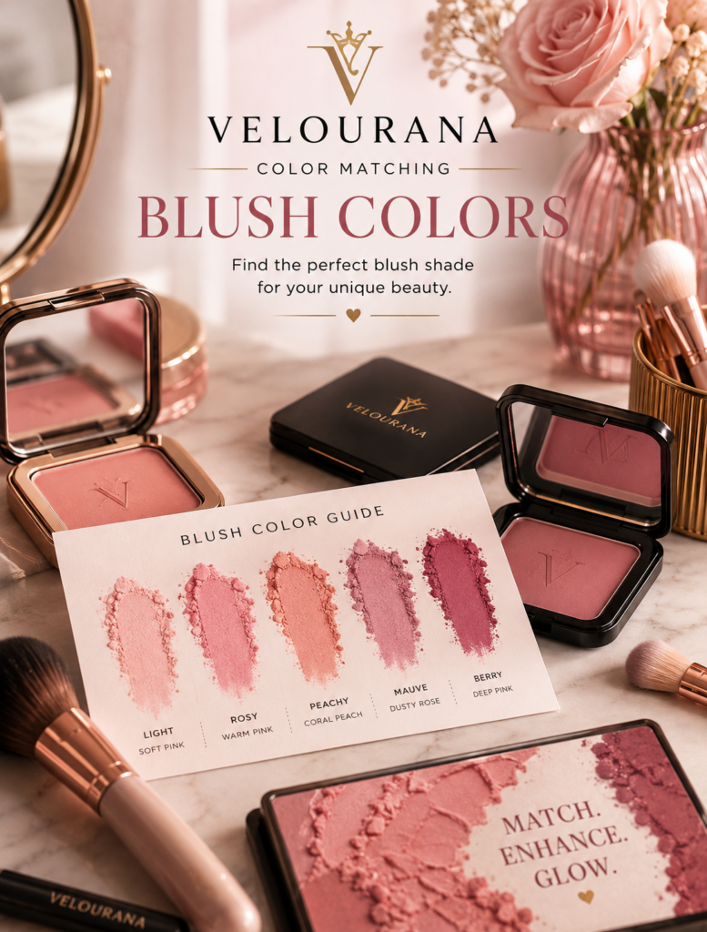
CATEGORY: Blush Colors
Coral blush lives in one of the most interesting areas of the color spectrum.
It is not quite pink.
It is not simply peach.
It is not purely orange or red.
Instead, coral combines these colors in different proportions, creating shades that can range from delicate pink-coral to vivid tropical orange-red. This complexity is exactly what makes coral so versatile—and why two blushes both labelled “coral” can produce completely different results on the same complexion.
A soft pink coral may look fresh and almost natural. A golden coral can create noticeable warmth. A saturated red-coral can bring extraordinary energy to deeper skin. A pastel coral may look beautiful against one complexion yet pale or chalky against another.
Color matching helps separate these possibilities.
Rather than asking whether coral is appropriate for your skin tone, it is more useful to identify what kind of coral you are looking at, how it relates to your skin depth and undertone, and what visual effect you want it to create.
Once these relationships become clear, coral becomes far easier to understand.
What Actually Makes a Blush Coral?
Coral generally exists where pink, red, peach, and orange meet.
Change the proportions and the character changes.
Increase the pink and you create pink-coral.
Increase the orange and the shade becomes warmer and more tropical.
Add red and coral becomes richer and more intense.
Add yellow and it moves toward golden coral.
Mix in brown and the color becomes muted, earthy, or burnt.
Add white and you create a pastel coral.
This is why the word “coral” alone provides only limited information.
When evaluating a coral blush, look beyond the shade name and ask what colors you actually see inside it.
Coral Is Usually Warmer Than Classic Pink
Most coral blushes contain noticeable warmth.
That warmth often comes from orange, yellow, peach, or warm red pigments.
Against warm skin, coral can therefore create natural color harmony.
Against cool skin, the warmth becomes more noticeable and creates contrast.
On neutral skin, coral can actively shift the complexion toward a warmer appearance.
Understanding this temperature relationship is more useful than assuming that coral belongs exclusively to people with warm undertones.
Cool complexions can wear coral beautifully.
The result simply has a different character.
Fair Warm Skin and Soft Coral
Fair warm skin often works naturally with softer coral shades.
Pink-coral, peach-coral, and light warm coral can echo the golden or peach characteristics already present in the complexion.
Because fair skin provides strong contrast with saturated pigment, the coral does not need to be extremely intense to remain visible.
A small amount can create considerable color.
The most natural result often comes from a coral that contains enough pink or peach to connect with natural flushing rather than appearing purely orange.
Fair Cool Skin and Coral Contrast
Coral against fair cool skin can create a striking temperature contrast.
The complexion provides the cool background.
The coral introduces warmth.
If the coral is strongly orange, the contrast becomes obvious.
If it contains more pink or red, the transition becomes softer.
Someone with fair cool skin who finds traditional coral too warm might therefore prefer pink-coral or watermelon coral rather than a golden orange version.
This does not mean correcting something that is wrong.
It means choosing the degree of contrast you prefer.
Fair Neutral Skin Can Move in Either Direction
Neutral fair complexions often have considerable flexibility.
A pink-coral can create balanced freshness.
A peach-coral introduces more warmth.
A vivid coral becomes a stronger statement.
A muted coral creates understated color.
Because the complexion itself does not lean strongly toward one temperature, the blush can determine much of the overall warmth of the finished makeup.
This makes coral particularly useful when you want to deliberately warm a neutral complexion.
Medium Skin Can Support Stronger Coral
Medium complexions can often carry more saturated coral without the blush immediately becoming dominant.
Watermelon.
Salmon-coral.
Warm coral.
Red-coral.
Rich peach-coral.
These shades retain enough pigment to remain lively while interacting naturally with greater skin depth.
Very pale coral can still work, but formulas with a strong white base may begin to look less integrated.
Increasing saturation rather than simply increasing application is often the better solution.
Medium Warm Skin and Classic Coral
Classic warm coral can look particularly harmonious on medium golden skin.
The orange and yellow components relate to the complexion’s warmth, while the pink-red element introduces the appearance of a flush.
This combination can make coral appear almost effortless.
Pair it with warm bronzer and the transition becomes even smoother.
The cheek color adds energy without necessarily appearing separate from the rest of the complexion.
Medium Cool Skin and Pink-Coral
Medium cool skin may find pink-coral especially useful.
The pink or red component connects with the cooler complexion while the peach-orange component introduces warmth.
This creates a bridge between temperatures.
A strongly golden coral produces more obvious contrast.
A pink-heavy coral creates a softer transition.
Both can work, but they communicate different moods.
Coral on Olive Skin
Olive complexions can interact beautifully with coral because both colors often contain considerable complexity.
The yellow, golden, green, or muted qualities of olive skin can change the way coral appears.
A shade that seems strongly orange in the compact may become more balanced once applied.
Pink-coral can become surprisingly fresh.
Burnt coral can create rich warmth.
Muted coral can integrate beautifully with the earthy quality often present in olive complexions.
The specific result depends strongly on skin depth.
Fair Olive Skin and Muted Coral
On fair olive skin, extremely bright coral can sometimes appear more vivid than expected.
A slightly muted coral may create greater harmony.
Look for coral mixed with rose, beige, soft brown, or muted peach.
These colors reduce the sharpness without eliminating warmth.
A dusty coral can provide the liveliness of coral with the sophistication of a muted blush.
Medium and Deep Olive Skin
As olive skin becomes deeper, coral can become richer.
Burnt coral.
Deep salmon.
Terracotta-coral.
Warm red-coral.
These shades contain enough depth to remain visible while still relating naturally to the warmth in the complexion.
A pale pastel coral may contain too much white pigment and appear disconnected.
A more saturated shade often creates a smoother result.
Deep Skin and Saturated Coral
Deep complexions can make saturated coral look spectacular.
A coral that appears extremely bright in the compact may become beautifully balanced against deep skin.
Rich orange-coral, red-coral, deep salmon, and vivid tropical coral can all create noticeable color without relying on pale pigment.
This is important because many traditional pale blush formulas achieve brightness by adding white.
Against deep skin, that white base can become visible and produce ashiness.
A richer coral provides brightness through saturation instead.
Deep Warm Skin and Orange-Coral
Orange-coral can harmonize beautifully with deep warm complexions.
The orange and golden characteristics relate naturally to the warmth of the skin.
The red or pink component prevents the blush from behaving simply like an orange powder.
A saturated orange-coral can create extraordinary vitality, particularly when paired with golden, bronze, or warm brown makeup.
Deep Cool Skin and Red-Coral
For deep cool complexions, red-coral can create an effective bridge.
The red connects more naturally with the cool complexion while the orange-peach component adds warmth.
A strongly yellow coral creates greater contrast.
A red-heavy coral often feels more integrated.
This demonstrates how changing only one component of the coral mixture can completely alter its relationship with the skin.
Pink-Coral Is the Softest Introduction
If traditional coral feels too orange, pink-coral is often the easiest version to explore.
It maintains the warmth associated with coral while retaining enough pink to resemble conventional blush.
On fair skin, pink-coral can create delicate freshness.
On medium skin, it becomes an easy everyday shade.
On deep skin, choose a saturated version with enough depth to remain visible.
The family stays consistent while its intensity adapts.
Peach-Coral Creates Gentle Warmth
Peach-coral sits between peach and classic coral.
It contains less obvious red than many traditional corals and often appears softer.
This makes it especially useful for warm, neutral, and olive complexions.
On cool skin, peach-coral becomes more visibly warm and can create a deliberate sunlit effect.
It is an excellent option when pure peach feels too subtle but bright coral feels too intense.
Watermelon Coral Adds Freshness
Watermelon shades usually combine pink-red freshness with warm coral characteristics.
They are livelier than muted coral but often less orange than traditional tropical coral.
This balance can make watermelon blush surprisingly versatile.
On fair skin, use it lightly.
On medium complexions, it can create vibrant everyday color.
On deeper skin, look for highly saturated versions that retain their richness after blending.
Salmon Coral Bridges Warm and Cool
Salmon sits between pink, red, peach, and orange.
Because of this balance, it can be particularly useful for people who want coral warmth without a strongly orange appearance.
A pink salmon works beautifully with cooler palettes.
A warmer salmon can complement golden complexions.
Deeper salmon shades can provide sophisticated color on medium-deep and deep skin.
The name may sound subtle, but salmon can range from delicate to intensely saturated.
Red-Coral Creates Greater Intensity
Red-coral contains a stronger red component.
This gives it more depth and drama than soft peach-coral.
It can be especially effective on medium-deep and deep complexions because the red pigment remains visible.
On fair skin, a sheer red-coral can imitate a warm natural flush.
Applied heavily, the same shade becomes much more dramatic.
Intensity changes the character considerably.
Orange-Coral Is the Warmest Direction
When coral moves strongly toward orange, it creates unmistakable warmth.
Golden and warm complexions often harmonize naturally with this family.
Cool complexions experience greater contrast.
Olive skin can sometimes neutralize part of the orange appearance, making the shade look more balanced than expected.
Because orange-coral can be visually powerful, testing it on the face is especially important.
Pastel Coral Depends Heavily on Skin Depth
Pastel coral contains white pigment that reduces depth and saturation.
On fair skin, this can create a soft springlike effect.
As the complexion becomes deeper, the white base may become increasingly visible.
This does not mean deeper skin cannot wear light-looking coral.
Instead of relying on white pigment, a sheer saturated coral can create the impression of lightness while allowing the natural complexion to remain visible underneath.
Muted Coral Creates Sophistication
Bright coral is energetic.
Muted coral is quieter.
Adding brown, beige, rose, or grey reduces saturation and creates a more subdued color.
Muted coral can be particularly useful for everyday makeup, professional looks, and autumn palettes.
It can also work beautifully on olive skin, where highly clean or bright pigments sometimes create stronger contrast than desired.
On deeper complexions, choose a muted coral with sufficient depth so that “muted” does not become invisible.
Burnt Coral Moves Toward Terracotta
Burnt coral contains brown, red, and deeper orange characteristics.
It sits somewhere between traditional coral and terracotta.
This makes it an excellent option for medium, olive, medium-deep, and deep complexions.
It creates warmth without the sweetness associated with bright pink-coral.
On fair skin, burnt coral can still work when applied lightly, producing an earthy, sophisticated cheek rather than a tropical one.
Coral Versus Peach
Peach and coral are closely related, but they do not create exactly the same impression.
Peach generally feels softer and more yellow-orange.
Coral usually introduces more pink or red.
As a result, coral tends to look livelier.
If peach disappears into your complexion, coral may provide greater definition.
If coral feels too bright, peach may offer a softer alternative.
Coral Versus Pink
Pink emphasizes the rosy quality of blush.
Coral adds warmth.
A cool pink may make the complexion appear fresher and cooler.
Coral can make the same complexion appear warmer and more sunlit.
This makes switching between pink and coral an easy way to change the entire temperature of a makeup look without altering the foundation.
Coral Versus Terracotta
Terracotta is generally deeper, browner, and more muted.
Coral is brighter and more colorful.
If you enjoy coral during spring and summer but want a related shade for autumn, terracotta or burnt coral creates a natural transition.
The underlying warmth remains while the saturation and depth change.
Natural Redness Can Influence Coral
If your complexion already contains noticeable pink or red surface color, coral can change the balance by introducing orange or peach warmth.
This may make the face appear less uniformly pink.
However, if the coral itself contains strong red pigment, it can also intensify visible redness.
The exact formula matters.
Color matching must consider what is already visible on the skin, not only theoretical undertone.
Foundation Creates a Different Background
Full-coverage foundation can neutralize much of the natural color in the complexion.
Coral then appears against a cleaner, more uniform background.
It may look stronger than it does on bare skin.
With sheer foundation or skin tint, natural redness, pigmentation, and undertone remain visible and mix visually with the blush.
This can make coral appear more integrated.
Coral and Bronzer Are Natural Partners
Warm bronzer and coral blush often work beautifully together.
Bronzer adds depth and warmth around the perimeter of the face.
Coral adds fresher color to the cheeks.
If both share similar warmth, the transition can become almost seamless.
This is one reason coral is so strongly associated with summer makeup.
Cool Bronzer Changes the Relationship
Not every bronzer is strongly orange or golden.
A more neutral or cool bronzer paired with coral creates greater temperature contrast.
The coral becomes more noticeable.
This can prevent an entirely warm makeup look from becoming visually flat.
Harmony is useful, but a small amount of contrast can create dimension.
Coral and Highlighter
Golden and champagne highlighters naturally reinforce coral’s warmth.
Pearl or icy highlighters create contrast.
A peach-gold highlight can almost merge into coral blush, producing a luminous gradient.
The right choice depends on whether you want the cheek products to blend visually or remain distinct.
Coral Blush With Nude Lips
Coral blush can bring life to neutral lip colors.
A warm beige nude paired with coral creates a cohesive warm palette.
A pink nude creates a softer connection.
A cool mauve nude introduces contrast.
Because the lip remains relatively understated, the coral cheek can become the primary source of facial color.
Coral Blush With Coral Lips
Matching coral cheeks and lips can create an attractive monochromatic look.
They do not need to be identical.
A soft coral blush can pair with a stronger coral lipstick.
A burnt coral cheek can work with a lighter peach-coral lip.
Variation prevents the face from looking overly uniform while maintaining color harmony.
Coral Blush With Red Lipstick
Warm orange-red lipstick naturally coordinates with coral.
Blue-red lipstick creates more contrast.
If the lipstick is extremely strong, use coral more lightly so that the two colors do not compete unnecessarily.
The blush can support the lip rather than becoming a second focal point.
Coral With Bronze and Gold Eyes
Bronze, copper, gold, caramel, and warm brown eye makeup creates an obvious relationship with coral blush.
The warmth repeats across the face.
This can produce a cohesive sunlit palette.
For greater sophistication, choose a muted or burnt coral rather than the brightest possible version.
Coral With Cool Eye Makeup
Grey, taupe, lavender, silver, navy, and other cooler eye colors create an interesting contrast with coral.
The eyes remain cool.
The cheeks provide warmth.
A pink-coral can soften the difference, while orange-coral makes the contrast more deliberate.
This is color matching used creatively rather than simply harmoniously.
Hair Color Can Change the Impression of Coral
Copper, auburn, golden blonde, caramel, and warm brown hair naturally reinforce coral.
Against ash blonde, silver, cool brunette, or blue-black hair, coral becomes more visibly warm.
Hair does not determine whether the blush works.
It changes the environment surrounding the face.
That can influence whether a coral feels subtle or striking.
Clothing Can Push Coral in Different Directions
Place coral blush beside an orange blouse and it may appear more integrated.
Wear a cool blue top and the coral may become more noticeable because blue and orange sit in contrasting areas of the color wheel.
Green can make red components in coral more visible.
Neutral clothing allows the cheek color to speak more independently.
For important photographs or events, these relationships can be worth considering.
Formula Changes Coral Significantly
A cream coral often looks softer because the skin remains visible through the pigment.
A matte powder can display the color more directly.
A liquid stain may create a translucent flushed effect.
A luminous coral can reflect gold or peach as the light changes.
Two formulas with similar pigment colors may therefore create different impressions.
Sheer Coral Is Excellent for Experimentation
If you are unsure whether a warm coral suits you, start with a sheer formula.
The natural complexion remains visible underneath, reducing the intensity of the contrast.
You can build the color gradually.
This gives you more control over how warm or bright the final result becomes.
Strongly Pigmented Coral Requires Restraint
Highly pigmented coral can deliver considerable color with one touch of the brush.
This is particularly important on fair skin.
Begin with less product than you think you need.
Blend.
Step back.
Then decide whether more color is necessary.
Adding pigment is easier than removing it.
Placement Changes Coral’s Personality
Coral concentrated on the apples of the cheeks creates a fresh, lively appearance.
Swept upward, it can look more polished and sculpted.
Diffused across the cheeks and lightly over the nose, coral creates a warm sun-touched effect.
Applied high toward the temples, it becomes more editorial.
The color does not work independently from placement.
Daylight Is the Best Color-Matching Test
Coral is particularly sensitive to lighting because warm artificial light can exaggerate its golden characteristics.
Cool lighting may emphasize its pink or red components.
Natural daylight gives a more balanced impression.
After applying a new coral, check the face near a window.
Do not inspect only the cheek.
Look at how the complexion behaves as a whole.
When Coral Looks Too Orange
If a coral looks too orange, do not immediately conclude that coral is wrong for you.
Move toward pink-coral, salmon, or watermelon.
These retain coral’s warmth while increasing the pink or red component.
Alternatively, apply the original shade more sheerly.
Sometimes concentration exaggerates warmth.
When Coral Looks Too Pink
If the shade appears more pink than you wanted, move toward peach-coral, apricot-coral, or orange-coral.
Pairing the blush with warm bronzer can also emphasize its warmer characteristics.
Remember that the surrounding colors influence how the coral itself is perceived.
When Coral Looks Chalky
Chalkiness usually suggests that the blush contains too much pale or white pigment relative to the complexion.
Increasing saturation and depth can solve the problem.
Instead of pastel coral, try vivid coral applied lightly.
Instead of pale peach-coral, try deeper salmon.
The blush can still look fresh without needing to be physically pale.
When Coral Disappears
If coral disappears into the complexion, increasing the amount is not always the best solution.
A deeper or more saturated coral may create better definition with less product.
This is particularly relevant for medium-deep and deep skin.
Choose stronger pigment rather than building layer after layer of a shade that is too close to the complexion.
Coral Can Be Natural or Dramatic
The same color family can serve completely different purposes.
A sheer pink-coral can imitate a natural warm flush.
A muted coral can create quiet sophistication.
A bright tropical coral can energize the entire face.
A burnt coral can add earthy definition.
A red-coral can create rich evening intensity.
The correct coral therefore depends partly on what you want the blush to accomplish.
Color Matching Should Expand Your Coral Options
The purpose of color matching is not to reduce coral to a rule such as “warm undertones only.”
That ignores the creative power of contrast.
Instead, understand the components.
Pink makes coral cooler and softer.
Orange increases warmth.
Red adds richness.
Brown creates earthiness.
White creates pastel lightness.
Greater saturation increases visibility.
Then compare those characteristics with your complexion.
Finding Your Best Coral
Start with skin depth.
Choose enough saturation for the blush to remain visible without relying excessively on white pigment.
Then consider undertone.
For harmony, relate the temperature of the coral to the temperature of your complexion.
For contrast, deliberately move in the opposite direction.
Finally, consider your bronzer, lipstick, eye makeup, hair, clothing, formula, and lighting.
The result may be a coral that you would never have selected by looking at the compact alone.
That is the advantage of understanding color matching.
A blush shade stops being judged as an isolated object.
It becomes part of a complete palette.
Coral is particularly rewarding because its balance of pink, red, peach, and orange gives you so many ways to adjust that palette.
From delicate pink-coral to deep burnt coral, there is no single coral effect.
There are dozens.
The right one is the version whose temperature, depth, and saturation create the relationship with your complexion that you actually want.
The End
Velourana
 Discover More From Our Family of Websites
 ZodiacBearing (Astrology, Tarot, Numerology, Angel Numbers & Spiritual Guidance)
 Velourana (Beauty, Makeup, Hair Care, Skincare & Beauty Tips)
 HavenBearing (Home, Living, Organization, Décor & Everyday Inspiration)
 PawBearing (Pet Care, Dog Breeds, Animal Health, Training & Pet Products)
 PsyCatherine (Notes From the Journal of a Psychologist on Real Life)

