
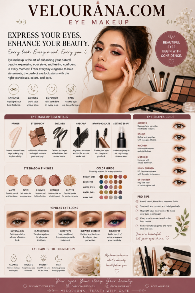
CATEGORY: Eyeshadow Palettes
An eyeshadow palette offers something individual shadows cannot provide in quite the same way: immediate visual context. Every color is seen beside another color. A muted brown appears warmer beside gray, cooler beside orange and deeper beside cream. Metallic gold changes character when surrounded by burgundy rather than beige. Even before a brush touches the product, the arrangement begins suggesting relationships.
This is why palettes can be such powerful creative tools. They do not simply supply pigment. They encourage the eye to recognize harmony, contrast, depth and texture.
Yet the presence of many coordinated shades can also make eye makeup unnecessarily complicated. The temptation to use several colors at once can lead to excessive blending until the distinctions that made the palette attractive have disappeared. A beautiful palette does not require every pan to participate in every look.
The more useful approach is to understand the visual roles available within the collection and then choose only those needed for a particular result.
Some eye looks depend almost entirely on depth. Others depend on contrast between finishes. Some use neighboring colors for seamless harmony, while others deliberately combine opposites. Once these relationships are understood, an eyeshadow palette becomes far more flexible than any diagram printed beside it.
Beginning With Mood Rather Than Individual Shades
A successful eye look often begins with deciding how the finished makeup should feel.
Soft, polished, smoky, luminous, romantic, earthy, graphic and dramatic are all different visual intentions. Each one changes which areas of a palette become relevant.
A soft eye may depend primarily on light and medium mattes with restrained satin reflection. A smoky look needs greater depth and stronger concentration near the lashes. A luminous eye may allow one metallic shade to dominate while supporting colors remain understated.
Beginning with mood prevents the palette from dictating the makeup simply because certain shades appear exciting in the pan.
The wearer selects from the palette rather than attempting to reproduce the palette itself.
This distinction is important.
An eyeshadow palette is a library of possibilities, not a single predetermined look.
Understanding Color Families Within a Larger Palette
Large palettes become easier to navigate when they are mentally divided into smaller families.
A collection containing thirty shades may actually contain several compact stories: warm browns and golds, cool taupes and silvers, roses and plums, olives and bronzes.
Each group can function almost like a separate mini-palette.
This approach reduces visual overload and makes combinations more coherent.
The groups do not need to remain isolated. Once a basic color story is established, a shade from another family can be introduced deliberately as contrast.
A bronze eye may receive a plum outer corner. Cool taupe can be paired with warm gold. Olive can be combined with muted rose.
The difference between intentional contrast and random combination is that the relationship has a visible purpose.
Analogous Color and Seamless Harmony
Colors positioned near one another within the spectrum often create smooth, harmonious eye makeup.
Yellow-gold can move into orange and copper. Red can progress toward burgundy and plum. Blue can merge into teal and green.
These analogous relationships are particularly useful when building colorful gradients because each shade shares something with the next.
The transitions can appear sophisticated even when the colors themselves are saturated.
A sunset palette demonstrates this beautifully. Golden yellow can blend through orange into burnt red and deep wine without requiring a neutral brown between every stage.
A cool aquatic palette can move from blue through turquoise into green.
Harmony does not require subtle color.
It requires understandable relationships.
Contrast and the Power of Unexpected Pairings
Some of the most memorable palette combinations come from contrast rather than harmony.
Warm metallic gold beside cool violet creates tension. Copper beside teal produces a strong temperature difference. Rose beside olive can feel sophisticated because the colors oppose one another without necessarily becoming overwhelmingly bright.
Contrast can occur through depth as well.
A pale matte lid beside an intensely dark outer corner creates drama even when both shades are neutral.
Texture creates another form of contrast. A completely matte crease surrounding a brilliant metallic center makes the reflection appear stronger.
The palette becomes interesting when these different forms of contrast can be combined without losing clarity.
Creating a Gradient Through Depth
A gradient is one of the fundamental structures of eyeshadow.
The darkest pigment is concentrated in one region and gradually transitions into lighter values.
This does not require several different colors.
A palette containing multiple depths within one family can create an exceptionally smooth gradient because hue remains relatively stable while value changes.
Brown can move from cream through caramel and chocolate into espresso. Purple can progress from lavender through mauve into aubergine.
The eye perceives depth without being distracted by abrupt color changes.
This approach is especially useful for sophisticated monochromatic makeup.
The darkest shade establishes structure. Medium values provide transition. The lightest area preserves brightness.
The gradient can travel vertically, horizontally or around the eye depending on the desired shape.
Horizontal Versus Vertical Color Placement
Palettes allow eye makeup to be structured directionally.
A traditional gradient often moves vertically from deeper lashes toward a lighter upper crease. This creates depth close to the eye while allowing pigment to dissolve toward the brow.
Horizontal placement moves color from inner to outer eye.
A lighter inner lid can transition into medium color through the center and deeper pigment at the outer corner, emphasizing length.
The reverse can also be used intentionally, placing greater depth toward the inner eye for a more unconventional structure.
The palette provides the values; placement determines the architecture.
This is why the same three shades can produce dramatically different looks.
The Center-Lid Focal Point
Reflective shades often become most effective when they are treated as focal points rather than spread indiscriminately.
A metallic or shimmer shadow placed through the center of the mobile lid catches light as the eye moves.
Surrounding it with deeper matte color increases contrast and can make the reflective pigment appear brighter.
This structure works with neutrals and vivid colors alike.
Bronze surrounded by deep brown creates classic warmth. Silver framed by charcoal produces a cooler dramatic effect. Emerald metallic within deep forest and black becomes intensely jewel-like.
The palette supplies both light and shadow, allowing the reflective center to emerge through comparison.
Inner-Corner Light Without Automatic White
The inner corner is often brightened, but the lightest shade in the palette does not need to be white.
Champagne can create warmth. Pale gold introduces richness. Soft pink produces a delicate effect. Lavender can add cool luminosity.
Even a light matte shade can brighten without reflection.
Choosing the inner-corner color according to the rest of the palette creates greater cohesion than automatically reaching for the palest shimmer available.
The area is small, but its undertone can influence the entire eye.
Deepening the Lash Line With Palette Shadows
The darkest shadows in a palette can often replace conventional eyeliner.
Applied with a small controlled brush, espresso, charcoal, navy or deep plum can define the lashes while maintaining the softness of powder.
The edge can remain diffused or become relatively precise depending on technique.
This is particularly useful when black liquid eyeliner would feel too severe within the color story.
A deep burgundy shadow used as liner keeps a plum eye cohesive. Dark olive reinforces green and bronze makeup. Espresso maintains warmth in neutral looks.
The palette effectively supplies its own eyeliner.
Transforming Daytime Makeup Into Evening Depth
A versatile palette allows intensity to change without requiring a completely new eye.
A soft daytime look may begin with medium neutral shadow and subtle satin across the lid.
Greater evening depth can be introduced by strengthening the outer corner, lash line and lower lashes with the palette's deeper shades.
Metallic pigment can be concentrated more strongly across the lid.
The original structure remains visible beneath the transformation.
This is one of the greatest practical strengths of a coherent palette: the color story can remain consistent while the contrast increases.
The face feels more dramatic without appearing unrelated to the earlier makeup.
The Lower Lash Line as Part of the Palette Story
The lower eye can connect upper-lid colors and make the makeup feel complete.
Repeating a medium shade beneath the lower lashes creates continuity. Concentrating deeper pigment toward the outer portion can reinforce elongation.
A contrasting color beneath the eye can create a more experimental effect.
For example, neutral bronze lids can be paired with muted blue or green beneath the lashes when the palette contains those shades.
The lower lash line becomes an opportunity to introduce color without changing the entire upper lid.
The amount of pigment determines whether the effect remains subtle or becomes a major design feature.
Monochromatic Looks From Multi-Color Palettes
A palette containing many colors does not require multicolored makeup.
Choosing several shades from one family can produce sophisticated monochromatic eyes.
The variation comes from depth and finish rather than hue.
A rose palette may provide pale pink satin, dusty rose matte, deep berry and metallic rose-gold. Together they create complexity while remaining chromatically unified.
The same principle works with browns, greens, blues and purples.
Monochromatic makeup often appears polished because the transitions are naturally harmonious.
When One Shadow Is Enough
Perhaps the most overlooked possibility within a large palette is using only one pan.
A well-chosen medium shade can be concentrated near the lashes and diffused upward until it creates its own gradient.
A metallic shadow can cover the mobile lid while mascara provides the remaining structure.
A deep matte can create a smoky eye through varying pressure and density.
The existence of many shades should not create an obligation to use them.
Sometimes the strongest demonstration of a palette's quality is that individual colors are compelling enough to stand alone.
Texture Layering Without Muddying Color
Mixing finishes can create dimensional makeup, but excessive layering can obscure the qualities of individual shadows.
A matte base provides shape. Satin can soften transitions. Metallic pigment creates focal reflection.
Each texture benefits from having a visible purpose.
When several reflective shades are layered indiscriminately, their differences may disappear. Likewise, repeatedly blending many mattes together can create one muddy intermediate color.
Preserving some separation allows the palette's complexity to remain visible on the eye.
The objective is integration without erasure.
Using the Palette According to Personal Eye Structure
Palette diagrams frequently imply fixed locations for particular shades, but eye anatomy varies too much for those instructions to be universal.
A color intended for the crease may need to sit above the natural fold on hooded eyes to remain visible.
A deep outer shade may require a more horizontal extension when elongation is desired.
Someone with substantial visible lid space can accommodate several distinct colors, while another person may achieve greater clarity with fewer shades.
The palette provides materials rather than anatomical rules.
The finished makeup should be judged with the eyes open and the face relaxed.
How Finish Changes With Age and Texture
Eyelid texture influences how shadows appear, but it should not lead to rigid restrictions.
Matte shades can create elegant structure on textured lids, while finely milled satin and shimmer can introduce beautiful luminosity.
The idea that mature eyelids must avoid all reflective shadow is unnecessarily absolute.
Particle size, placement and desired effect matter more.
A smooth satin across the mobile lid may create brightness without emphasizing texture excessively. Strong glitter may be reserved for areas where greater reflection is intentionally desired.
Palettes containing several finishes allow these choices to be personalized.
Creating a Signature Eye From One Palette
Repeated use of the same palette often leads to a signature combination.
One medium shade becomes the preferred sculpting color. A particular deep pan defines the lashes. One metallic repeatedly appears on the center of the lid.
This familiarity can make application faster and more confident.
The palette becomes associated with a recognizable personal style rather than endless experimentation.
There is value in this repetition.
Creativity does not always require inventing a completely new combination. Refining a successful one can produce increasingly sophisticated results.
Moving Beyond the Suggested Shade Arrangement
The physical placement of pans inside a palette can subtly influence how people combine them.
Adjacent colors may appear intended to work together. Rows may suggest coordinated groups.
These arrangements can be useful, but they are not binding.
A shade from one corner of the palette may pair beautifully with another located far away.
Once the wearer understands depth, undertone and finish, the printed arrangement becomes less important.
The palette can be interpreted freely.
The Emotional Character of Color Stories
Color carries atmosphere.
Warm browns and golds can feel rich and familiar. Cool taupes and grays create quiet sophistication. Rose and mauve can appear romantic or melancholic depending on depth.
Jewel tones feel luxurious when saturated and deep. Pastels can appear delicate, playful or surreal. Bright primaries introduce graphic energy.
An eyeshadow palette packages these emotional associations into a portable collection.
Choosing a palette for a particular look is therefore partly about choosing a mood.
When Contrast Should Stop
One of the more difficult aspects of palette use is knowing when the eye already contains enough information.
A strong metallic lid, deep outer corner and colorful lower lash line may already create substantial complexity.
Adding another contrasting shade simply because it exists in the palette can weaken the composition.
Restraint allows focal points to remain focal.
The unused shades are not wasted. They belong to another look.
From Palette to Complete Eye Composition
The final eye should feel like a composition rather than evidence that several products were applied.
Individual colors may remain visible, but they need a relationship.
Depth should have direction. Reflection should have purpose. Strong color should either harmonize with or intentionally challenge its surroundings.
The palette makes these relationships easier by presenting the colors together before application.
Its greatest value is therefore not quantity.
It is context.
Why Eyeshadow Palettes Remain Central to Creative Makeup
The enduring appeal of eyeshadow palettes comes from their ability to place possibility in a single object.
Opening a well-designed palette reveals light and shadow, warmth and coolness, matte surfaces and reflection. Each pan has its own identity, yet its meaning changes according to what is placed beside it.
A taupe can become the quiet foundation of an everyday eye or the transition surrounding a dramatic charcoal smoke. Gold can appear subtle when lightly washed across the lid or spectacular when layered densely against deep pigment.
The palette does not determine which version must exist.
It provides the vocabulary.
The artistry comes from deciding how much of that vocabulary is needed.
Sometimes the answer is one shade. Sometimes it is a carefully controlled gradient. Sometimes an unexpected contrast between colors creates the entire personality of the makeup.
The strongest palette does not pressure the wearer to use everything.
It makes many different ideas possible while allowing each finished eye to remain clear.
That is what transforms an arrangement of eyeshadow pans into a genuine creative tool: not the sheer number of colors inside, but the number of distinct, coherent and beautiful ways those colors can become part of the eye.
THE END VELOURANA
 Discover More From Our Family of Websites
 ZodiacBearing (Astrology, Tarot, Numerology, Angel Numbers & Spiritual Guidance)
 Velourana (Beauty, Makeup, Hair Care, Skincare & Beauty Tips)
 HavenBearing (Home, Living, Organization, Décor & Everyday Inspiration)
 PawBearing (Pet Care, Dog Breeds, Animal Health, Training & Pet Products)
 PsyCatherine (Notes From the Journal of a Psychologist on Real Life)

