
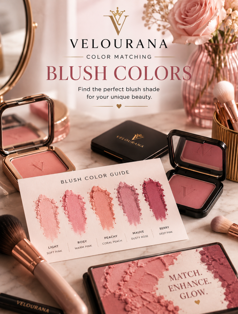
CATEGORY: Blush Colors
Warm undertones naturally interact with some of the most familiar colors in the blush spectrum: peach, apricot, coral, terracotta, warm rose, cinnamon, and brick.
Because these shades contain yellow, orange, golden, peach, or warm red characteristics, they can echo colors already present beneath the complexion. The result is often described as harmonious because the blush appears connected to the skin rather than sharply contrasting with it.
But “warm undertone” is not a complete blush prescription.
Warm skin can be fair, medium, olive, deep, or very deep. It can appear golden, peachy, yellow, bronze, or subtly warm rather than obviously so. A delicate peach that creates beautiful color on fair warm skin may disappear completely on a deep warm complexion. A rich terracotta that looks effortless on medium-deep golden skin may become extremely dramatic on fair skin.
There is another important point.
Having warm undertones does not mean you must wear warm blush.
Cool pink, mauve, berry, and plum can create striking contrast against warm skin. Understanding color matching should therefore give you more choices, not fewer.
The useful question is not simply, “Which blush is correct for warm undertones?”
It is: “Which blush creates the effect I want against my particular warm complexion?”
What Makes an Undertone Warm?
Warm undertones generally contain a greater impression of yellow, gold, peach, or related warmth beneath the visible surface of the skin.
This warmth can be subtle.
Someone does not need to look obviously golden to have warm undertones.
Surface color can also complicate the picture. A warm complexion may have facial redness, pigmentation, freckles, tanning, or other visible colors that partially disguise the undertone.
This is why undertone should be treated as one element of color matching rather than the only element.
Skin depth, surface color, contrast, and saturation matter too.
Warm Undertones Exist at Every Skin Depth
Warm skin is sometimes represented in makeup advice as medium golden or bronzed skin.
That ignores an enormous range of complexions.
Very fair skin can have warm peach or yellow undertones.
Medium skin can be golden.
Olive skin can lean warm.
Deep skin can contain rich golden, red-golden, or warm brown characteristics.
The appropriate blush must therefore change in depth even when the underlying temperature remains similar.
The principle is simple: preserve enough saturation and depth for the blush to remain visible against the complexion.
Fair Warm Skin and Soft Peach
Soft peach is one of the most intuitive matches for fair warm skin.
The yellow-orange-pink mixture in peach can echo the warmth already present in the complexion without creating excessive contrast.
A delicate peach may therefore look less like an obvious cosmetic color and more like warmth emerging naturally through the skin.
Pink-peach creates slightly more visible flushing.
Golden peach emphasizes warmth.
Soft apricot moves further toward orange.
The difference between these shades may seem small in the compact, but against fair skin it can become quite noticeable.
Avoid Excessively White-Based Peach
Fair skin can wear pastel blush more easily than deeper complexions, but even fair skin can encounter a blush that is too pale.
If peach contains a large amount of white pigment, it may lighten the cheek instead of simply adding color.
The result can look powdery.
A slightly clearer peach often works better.
Rather than choosing the palest possible shade, look for enough saturation to create life in the complexion.
Apricot Creates Stronger Warmth
Apricot pushes peach further toward yellow and orange.
On warm skin, this can create a beautifully sunlit effect.
Fair warm skin usually needs a softer apricot or sheer application.
Medium warm skin can carry greater saturation.
Deep warm skin can support rich burnt apricot.
The family remains consistent while its depth changes.
Apricot is particularly useful when ordinary peach looks too pink or too subtle.
Medium Warm Skin and Classic Coral
Medium warm complexions often interact beautifully with coral.
Coral combines pink or red with peach and orange, giving it more vitality than traditional peach while maintaining warmth.
A classic coral can create noticeable cheek color without appearing disconnected from golden skin.
Peach-coral produces a softer effect.
Red-coral adds greater intensity.
Orange-coral emphasizes warmth.
This flexibility makes coral one of the most useful blush families for medium warm complexions.
Why Coral Can Look Different From Peach
Peach generally contains softer yellow-orange characteristics.
Coral introduces stronger pink or red.
That additional red makes coral more energetic.
If peach seems to disappear into a warm complexion, coral may provide the additional contrast needed to define the cheeks.
If coral looks too vivid, moving back toward peach can soften the result.
Color matching often involves these small movements between neighboring families.
Medium-Deep Warm Skin Needs Richer Pigment
As complexion depth increases, pale warm blush may lose visibility.
The answer is not necessarily applying more.
A deeper shade usually works better.
Burnt peach.
Rich coral.
Terracotta.
Brick.
Warm red.
Cinnamon.
These colors provide enough saturation to remain visible while retaining warmth.
Using a stronger pigment lightly can create a cleaner result than repeatedly layering a pale blush.
Deep Warm Skin and Saturated Color
Deep warm skin can carry extraordinarily rich blush colors.
Bright orange-coral can become beautifully balanced.
Burnt terracotta can create sophisticated warmth.
Warm red can produce a convincing flush.
Deep brick can add both color and definition.
Highly saturated pigment works because it creates visibility through color strength rather than through pale white bases.
This distinction is particularly important when selecting blush for deep complexions.
Peach on Deep Warm Skin
Peach is still an option, but the peach itself needs to change.
A pale pastel peach may disappear or create ashiness.
Deep peach, burnt peach, orange-peach, and rich apricot provide more effective alternatives.
They preserve the essential peach character while increasing saturation.
The concept of “peach blush” therefore needs to expand with skin depth.
Terracotta and Warm Undertones
Terracotta is one of the most natural partners for many warm complexions because it combines orange, red, and brown.
The brown grounds the warmth.
The orange relates to golden undertones.
The red provides cheek color.
On medium and deeper warm skin, terracotta can look exceptionally integrated.
On fair warm skin, a lighter clay or peach-terracotta creates a softer version of the same relationship.
Cinnamon for Earthy Warmth
Cinnamon blush introduces warm brown with muted red or orange.
It is less obviously colorful than coral and often more subdued than terracotta.
This makes cinnamon useful for understated makeup.
On medium and deep warm complexions, it can create subtle cheek definition while maintaining warmth.
On fair skin, a sheer cinnamon can provide an elegant alternative to conventional pink.
Brick Adds More Red
Brick blush contains brown and red, often with a subtle orange influence.
Compared with terracotta, brick generally reads more red.
This can make it useful when an earthy blush needs more visible flushing.
Medium-deep and deep warm skin can carry rich brick exceptionally well.
On lighter complexions, the same color becomes more dramatic and should usually be applied with greater restraint.
Warm Rose Is More Versatile Than It Sounds
Warm undertones do not require every blush to be orange.
Warm rose can be an excellent everyday choice.
Rose naturally contains red or pink, while a warm version introduces subtle brown, peach, or golden characteristics.
This creates traditional cheek color without the coolness of blue-pink.
Warm rose is particularly useful for someone who finds peach too orange but mauve too cool.
Rosewood Creates Greater Sophistication
Rosewood combines rose with brown and muted depth.
It can function almost like a neutral blush.
On warm skin, the brown component helps integrate the rosy pigment.
On medium and olive complexions, rosewood can look especially sophisticated.
Deep rosewood provides an understated option for deeper skin without relying on pale pigment.
It is an excellent example of a blush that adds color without becoming bright.
Warm Red Can Look Extremely Natural
Red may seem stronger than peach or coral, but sheer warm red can imitate natural flushing beautifully.
A red containing subtle orange, brick, or warm rose characteristics can integrate naturally with warm undertones.
Fair skin requires only a tiny amount.
Medium skin can carry more saturation.
Deep warm skin can wear rich red without the shade appearing excessive.
The compact color is not the final cheek color.
Diffusion changes it dramatically.
Tomato Red Creates Deliberate Heat
Tomato red contains noticeable orange.
This makes it one of the warmest red blush directions.
On golden and warm complexions, tomato red can create energetic, sun-warmed color.
On fair skin it can be striking.
On deeper warm skin it may appear considerably more balanced than expected.
If tomato becomes too orange, move toward warm rose-red or brick.
Warm Olive Skin Requires Its Own Consideration
Warm olive complexions combine warmth with olive characteristics, which may include yellow, golden, green, or muted tones.
This complexity can make some extremely clean warm colors appear brighter than expected.
Muted peach, burnt coral, terracotta, cinnamon, brick, and rosewood can be particularly effective because their brown or muted components relate naturally to the complexity of olive skin.
Bright coral and orange can still work, but they create a more vivid effect.
Fair Warm Olive Skin
Fair warm olive skin may find extremely pale peach less effective than expected.
The problem is sometimes insufficient complexity.
A muted peach or soft terracotta can integrate better because it contains brown or earthy characteristics.
Warm rose is another useful option when orange-based blush seems too strong.
The best shade often contains warmth without being excessively clean or pastel.
Medium Warm Olive Skin
Medium warm olive complexions can often carry richer earth tones beautifully.
Rust.
Terracotta.
Burnt coral.
Cinnamon.
Brick.
These colors relate naturally to the golden and muted qualities of the complexion.
For greater brightness, coral or warm red can create stronger contrast.
The choice depends on whether the goal is earthy harmony or energetic color.
Blush Does Not Need to Match the Undertone
This principle is worth emphasizing.
Warm undertones explain why peach, coral, apricot, and terracotta may create easy harmony.
They do not establish a rule.
A cool blush can be beautiful precisely because it does not match.
Cool pink introduces freshness.
Mauve creates sophistication.
Berry adds richness.
Plum creates dramatic depth.
The contrast between a golden complexion and a cool blush can make both colors more noticeable.
Cool Pink Against Warm Skin
Blue-based pink creates obvious temperature contrast against warm skin.
On fair warm complexions, it can produce a doll-like or bright rosy effect depending on intensity.
On medium warm skin, stronger pink can create vivid freshness.
On deep warm skin, saturated fuchsia or magenta may create spectacular contrast.
If the effect feels too cool, move toward neutral pink or warm rose rather than abandoning pink entirely.
Mauve Against Warm Skin
Mauve introduces purple, pink, grey, and sometimes brown.
Against golden skin, its cool character becomes more visible.
A rose-mauve can create a softer transition.
A brown-mauve can feel almost neutral.
A strongly purple mauve creates greater contrast.
Warm complexions that usually wear terracotta may find mauve particularly effective when they want an entirely different mood.
Berry Against Warm Skin
Berry creates richer cool contrast.
Cranberry is often easier to integrate because it contains substantial red.
Raspberry becomes brighter.
Blackberry creates deeper purple contrast.
Warm berry or berry-rose can provide a middle ground.
On deep warm skin, saturated berry can remain exceptionally clear and vibrant.
Plum Creates Dramatic Contrast
Plum is one of the strongest cool directions for warm skin.
The purple-red pigment stands distinctly against golden undertones.
This can be sophisticated rather than unnatural.
A sheer plum can create a rich flush.
A deeper application becomes dramatic.
For a softer transition, choose plum with more red or brown.
Harmony Can Create an Effortless Look
When blush temperature relates closely to the complexion, the result often appears seamless.
Warm skin with peach.
Golden skin with apricot.
Warm olive skin with terracotta.
Deep warm skin with brick.
These combinations allow the blush to blend visually into the existing color environment.
This is particularly useful for natural and understated makeup.
Contrast Can Create Greater Freshness
Too much harmony can sometimes make a makeup palette feel visually flat.
Warm foundation, warm bronzer, golden eyeshadow, warm blush, and warm lipstick may create so much repetition that individual features lose distinction.
Introducing cool rose, berry, or mauve can break the pattern.
Contrast creates visual separation.
This is why the most harmonious shade is not automatically the most interesting shade.
Bronzer and Warm Blush
Warm bronzer naturally coordinates with peach, coral, terracotta, and brick.
The transition can become almost seamless.
This creates a sun-warmed effect.
However, if bronzer and blush are nearly identical in color, the cheek can lose dimension.
Choose enough difference in red, peach, or saturation to distinguish the blush.
Neutral Bronzer With Warm Blush
A neutral bronzer can allow warm blush to become more visible.
Instead of creating warmth everywhere, the bronzer supplies depth while the blush supplies temperature.
This is useful when coral or apricot is intended to be a noticeable part of the makeup.
Cool Blush With Warm Bronzer
This is one of the most effective contrast combinations for warm complexions.
Warm bronzer preserves the natural warmth of the face.
Cool rose, berry, or mauve introduces a different temperature at the cheek.
The result can appear balanced and dimensional.
It demonstrates why individual products should not be matched in isolation.
Foundation Changes the Background
A warm complexion may look considerably less warm after full-coverage foundation.
If the base is highly neutral, the blush no longer interacts with exactly the same visible colors as it would on bare skin.
Peach may appear stronger.
Terracotta may look more orange.
Mauve may look cooler.
Always evaluate blush over the base products you actually use.
Bare Skin Creates More Complex Color
On bare or lightly covered skin, freckles, redness, pigmentation, and natural warmth remain visible.
These colors mix visually with the blush.
A peach cream may appear extremely natural.
A berry stain may become warmer.
Terracotta can blend into pigmentation and warmth.
The natural complexion participates in the final result.
Surface Redness Can Change Warm Blush
Warm skin can still have visible surface redness.
If a coral or warm red blush is placed over that redness, the finished color may appear redder than expected.
Peach or terracotta may shift the overall impression toward orange or brown warmth.
Foundation can reduce these interactions when more precise color placement is desired.
Warm Highlighter Reinforces Harmony
Gold, champagne, bronze, and peach-gold highlighters naturally complement warm blush.
Golden highlighter with apricot can create a sunlit effect.
Champagne with warm rose is more subtle.
Bronze highlight with terracotta can create rich depth on deeper complexions.
The entire cheek remains within a related temperature family.
Cool Highlighter Introduces Contrast
Pearl, icy champagne, or cool pink highlighter can create contrast against warm blush.
This can prevent a strongly warm palette from becoming monotonous.
The effect is particularly interesting with coral or warm rose, where enough pink exists to connect the temperatures.
Matching Peach Blush With Lips
Peach blush naturally coordinates with peach nude, warm beige, coral, orange-red, and warm rose lips.
For a softer look, keep the lip neutral.
For a monochromatic effect, repeat peach or coral.
For contrast, pair peach cheeks with mauve or berry lips.
The relationship should be considered across the entire face.
Terracotta With Lip Color
Terracotta pairs naturally with brown nude, cinnamon, caramel, brick, warm red, and rosewood lips.
These combinations create earthy cohesion.
A cool berry lip introduces stronger contrast and can make the terracotta cheek appear warmer.
This can be especially attractive when the eye makeup remains neutral.
Warm Blush and Bronze Eyes
Bronze, copper, gold, caramel, and warm brown eye makeup naturally reinforce peach, coral, apricot, and terracotta blush.
The result is strongly harmonious.
To preserve dimension, vary the depth.
For example, a rich bronze eye can be paired with softer peach cheeks rather than equally strong terracotta everywhere.
Cool Eyes With Warm Blush
Grey, taupe, silver, lavender, navy, and cool brown eye makeup create contrast with warm cheeks.
A neutral lip can connect the two.
Alternatively, a lipstick related to the blush can deliberately divide the face into warm cheeks and lips against cooler eyes.
Color matching becomes creative composition rather than simple undertone matching.
Hair Color Influences Warm Blush
Golden blonde, copper, auburn, caramel, and warm brunette hair naturally reinforce warm blush.
Peach and terracotta may therefore look especially integrated.
Ash blonde, silver, cool brunette, and blue-black hair create more contrast.
This can make warm blush appear warmer than it does in isolation.
Hair does not dictate the choice, but it contributes significantly to the colors surrounding the face.
Clothing Changes the Appearance of Warm Blush
Camel, cream, chocolate, rust, olive, mustard, and warm beige clothing can reinforce earthy blush.
Blue and teal create contrast with orange and peach characteristics.
Green can make red components more noticeable.
Cool grey can make warm blush appear warmer.
This becomes particularly relevant when planning makeup for photographs or events.
Formula Can Make Warm Blush More or Less Intense
A sheer peach cream allows the complexion to show through, creating subtle warmth.
An opaque matte apricot displays more of the pigment’s true orange character.
A luminous coral can look softer because reflected light breaks up the visual density.
A terracotta stain may appear almost like naturally warmed skin.
Formula is therefore part of color matching.
Sheer Formulas Make Contrast Easier
If you have warm skin and want to experiment with mauve, berry, or cool pink, a sheer formula is particularly useful.
The natural warmth of the complexion remains visible beneath the cool pigment.
This visually mixes the temperatures.
The result can be far softer than the shade appears in the compact.
Skin Depth Determines Saturation
This principle matters regardless of undertone.
Fair warm skin can often use softer peach, coral, and rose.
Medium warm skin may need stronger apricot, coral, and terracotta.
Deep warm skin can benefit from saturated burnt peach, brick, warm red, deep coral, and rich terracotta.
As skin depth increases, pale pigment becomes less useful.
Saturation becomes more important.
When Peach Looks Too Orange
Move toward pink-peach, warm rose, or peach-rose.
These shades retain warmth while introducing more red or pink.
You can also reduce application intensity.
Sometimes the shade itself is appropriate but has simply been built too strongly.
When Coral Looks Too Bright
Choose muted coral, burnt coral, or terracotta-coral.
Adding brown reduces saturation and creates greater earthiness.
A softer formula can also help.
The goal is not necessarily to abandon coral but to adjust its intensity.
When Terracotta Looks Muddy
Terracotta may become muddy when its brown component is too similar to the complexion or when there is insufficient red or orange to create visible cheek color.
Move toward brick, burnt peach, or rose-terracotta.
These introduce more chromatic contrast.
The face gains color without losing the earthy character.
When Warm Rose Looks Too Pink
Move toward peach-rose, cinnamon-rose, or terracotta.
These variations reduce obvious pinkness.
Alternatively, pair the warm rose with bronzer to create a more integrated transition.
The surrounding cheek colors influence how pink the blush appears.
When Cool Blush Looks Too Purple
If mauve, berry, or plum becomes excessively purple against warm skin, choose a version containing more red or brown.
Rose-mauve.
Cranberry.
Berry-rose.
Brown-plum.
These shades preserve cool contrast while creating a bridge toward the complexion.
Natural Light Is Essential
Warm artificial lighting can make peach and terracotta appear more harmonious than they actually look in daylight.
Cool lighting can exaggerate orange.
Natural daylight provides a more balanced environment for judging the final result.
Look at the whole face rather than examining the blush at close range.
Color matching is about relationships, and those relationships are easier to judge from a normal viewing distance.
Build a Warm-Toned Blush Wardrobe by Purpose
Instead of buying several nearly identical peaches, consider giving each blush a different role.
A soft peach for natural everyday warmth.
A coral for brighter color.
A terracotta or cinnamon for earthy definition.
A berry or mauve for cool contrast.
This creates a more useful collection because each shade changes the makeup in a meaningful way.
Your Best Blush May Change With the Rest of Your Makeup
The perfect peach with warm bronze eyes may not be the most interesting choice with copper lipstick.
A mauve cheek might create better balance.
Terracotta may work beautifully with a nude lip but feel too uniformly warm with an orange-red lip.
Blush should therefore be selected as part of a complete palette rather than according to undertone alone.
Warm Undertones Give You a Starting Point, Not a Boundary
Peach, apricot, coral, terracotta, cinnamon, brick, and warm rose are logical starting points because their warmth can echo the golden, peach, or yellow characteristics of warm skin.
That creates harmony.
But harmony is only one tool.
Cool pink can create freshness.
Mauve can introduce sophistication.
Berry can create rich contrast.
Plum can produce drama.
The more clearly you understand your undertone, the easier it becomes to use both sides of the color spectrum deliberately.
The Best Warm-Skin Blush Is the One That Creates the Intended Relationship
Color matching becomes much more useful when the objective is defined before the shade is chosen.
For natural warmth, choose peach, apricot, warm rose, or coral appropriate to your skin depth.
For earthiness, explore terracotta, cinnamon, brick, and rosewood.
For brightness, increase coral, orange-red, or saturated warm pink.
For contrast, move toward mauve, berry, cool pink, or plum.
Then adjust saturation according to complexion depth and opacity according to the strength of the effect you want.
This approach removes the need for rigid rules.
Warm undertones do not imprison the complexion inside an orange and peach palette.
They simply provide a reference point.
Once you understand that reference point, every blush color becomes easier to interpret.
You can see which colors echo your complexion, which oppose it, which brighten it, which deepen it, and which change its overall temperature.
That is the real purpose of color matching.
It is not about finding the one blush you are allowed to wear.
It is about understanding what different blush colors will do—so that peach, coral, terracotta, rose, berry, mauve, and every shade between them become deliberate choices rather than guesses.
The End
Velourana
 Discover More From Our Family of Websites
 ZodiacBearing (Astrology, Tarot, Numerology, Angel Numbers & Spiritual Guidance)
 Velourana (Beauty, Makeup, Hair Care, Skincare & Beauty Tips)
 HavenBearing (Home, Living, Organization, Décor & Everyday Inspiration)
 PawBearing (Pet Care, Dog Breeds, Animal Health, Training & Pet Products)
 PsyCatherine (Notes From the Journal of a Psychologist on Real Life)

