
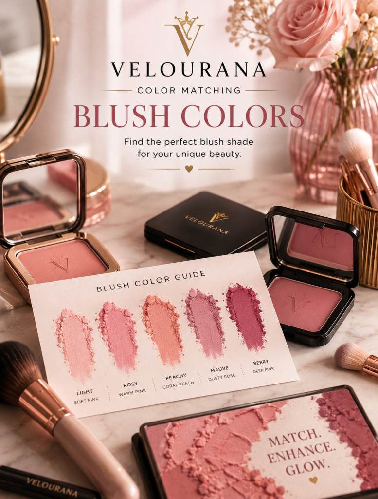
CATEGORY: Blush Colors
Cool undertones are often described too simply.
Many makeup guides reduce the entire subject to one rule: cool skin should wear cool blush.
That advice can be useful as a starting point, but it leaves out most of what actually determines whether a blush looks beautiful.
Cool undertones can appear beneath fair, medium, olive, tan, deep, and very deep complexions. Some cool skin has visible pink or rosy qualities. Other cool complexions appear more neutral on the surface. Some people have cool undertones but significant facial redness. Others have very little visible natural flush.
A blush therefore needs to be matched not only to undertone but also to skin depth, saturation, formula, and the effect you want to create.
A cool pink can create harmony.
A mauve can add sophistication.
Berry can provide richer depth.
Plum can become beautifully dramatic.
But warm peach, coral, or terracotta can also work on cool skin when the goal is deliberate contrast.
Understanding color matching does not reduce your blush choices.
It explains what each choice is likely to do.
What Does a Cool Undertone Actually Mean?
A cool undertone generally means that the underlying color character of the complexion leans more toward pink, red, blue, or violet than toward obvious yellow, golden, peach, or orange warmth.
This does not mean the skin itself looks blue.
Undertone is subtle.
It sits beneath the visible surface color of the complexion and influences how other colors interact with the face.
Two people can have equally fair skin while one is warm and one is cool.
The same blush may therefore look noticeably different on each person.
On the cool complexion, a blue-based pink may merge naturally.
On the warm complexion, the same pink may look brighter because of the temperature contrast.
Cool Undertone Does Not Mean Pale Skin
One of the biggest misconceptions in color matching is treating cool undertone as though it automatically means fair skin.
Cool undertones exist across the entire depth spectrum.
A deep complexion can be cool.
A medium olive complexion can lean cool.
A tan complexion can have cool red or blue undertones.
This matters because skin depth changes how much pigment a blush needs.
A pale cool pink that works beautifully on fair cool skin may disappear or become chalky on deep cool skin.
The undertone still matches.
The depth does not.
Fair Cool Skin and Soft Pink
Fair cool complexions often create natural harmony with soft blue-based pinks.
Ballet pink.
Rose pink.
Cool baby pink.
Light raspberry.
These shades echo the pink or rosy character already present in the skin.
The result can look fresh rather than obviously made up.
Because fair skin creates strong contrast with deep pigment, even a delicate amount of blush may be enough.
The challenge is not always finding a cool enough color.
It is controlling intensity.
When Pale Pink Becomes Too Pale
Even on fair cool skin, an extremely white-based pastel pink can sometimes appear powdery.
The blush may lighten the cheek rather than simply add color.
If this happens, increase saturation slightly.
Move from baby pink toward rose.
From pastel pink toward raspberry-pink.
From almost-white cool pink toward a clearer rosy shade.
The blush can remain cool without becoming pale.
Medium Cool Skin Needs More Presence
Medium cool complexions can usually carry stronger pinks and roses than fair cool skin.
Classic rose.
Raspberry.
Cool strawberry.
Dusty rose.
Mauve-pink.
These colors remain connected to the undertone but provide enough saturation to remain visible.
An extremely pale blush may need repeated layering, which can eventually create a powdery appearance rather than richer color.
Choosing a more saturated shade often gives a cleaner result with less product.
Deep Cool Skin and Rich Pigment
Deep cool skin can carry extraordinarily rich blush colors.
Fuchsia.
Magenta.
Deep raspberry.
Berry.
Plum.
Wine.
Burgundy.
Cool red.
These shades contain enough saturation and depth to remain visible without depending on white pigment.
This is important because pale formulas can become ashy on deep skin even when their undertone is technically correct.
A richer blush applied lightly can look far more natural than a pale blush applied heavily.
Why Pink Works So Naturally
Pink is one of the easiest families for cool undertones because it can reflect the same rosy characteristics already present in the complexion.
But not every pink is equally cool.
Some pinks contain peach or coral warmth.
Others lean almost violet.
The more blue or purple influence a pink contains, the cooler it usually appears.
For harmony, choose a pink related to your undertone.
For contrast, choose a warmer pink.
The decision depends on the final effect you want.
Cool Rose Is an Excellent Everyday Choice
Rose sits between pink and red and often feels more sophisticated than very pale pink.
Cool rose can work particularly well on medium and deep cool complexions because it provides greater depth.
It can also help fair cool skin achieve a natural flush without the youthful effect sometimes associated with baby pink.
Rose is one of the most versatile blush families because small shifts in temperature produce very different results.
Dusty Rose Adds Muted Sophistication
Dusty rose introduces grey, brown, or mauve into traditional rose.
The result is softer and less saturated.
This can create an understated, polished effect.
On fair and medium cool skin, dusty rose may become an excellent everyday neutral.
On deep cool skin, however, the shade needs enough richness to avoid becoming grey.
A deep rosewood or berry-dusty rose may work better than a pale muted pink.
Mauve and Cool Undertones
Mauve naturally complements many cool complexions because it contains pink, purple, blue, and often muted grey characteristics.
On fair cool skin, soft mauve can look delicate and refined.
On medium cool skin, a richer rose-mauve provides greater definition.
On deep cool skin, plum-mauve and berry-mauve can create sophisticated cheek color.
The main danger is excessive grey.
If mauve makes the complexion look tired, choose one containing more rose or berry.
Plum Creates Depth
Plum moves further into purple-red territory.
It can look intimidating in the pan because the pigment appears dark.
But once blended, plum can become extremely wearable.
On fair cool skin, use it sparingly for a translucent stain.
On medium cool skin, plum can create elegant evening color.
On deep cool skin, rich plum may look almost naturally harmonious.
Its depth becomes an advantage.
Berry Is One of the Strongest Cool-Toned Families
Berry shades are especially useful for cool undertones because they combine red with pink, blue, or purple characteristics.
Raspberry creates brightness.
Cranberry provides more red.
Blackberry introduces deeper purple.
Wine creates greater sophistication.
Berry can work across all skin depths because intensity can be adjusted.
The family itself is flexible.
Fuchsia Can Be Surprisingly Wearable
Fuchsia is vivid, cool, and highly saturated.
On fair cool skin, a very small amount can create a bright rosy effect.
On medium skin, it becomes more balanced.
On deep cool complexions, fuchsia can produce exceptional vibrancy without looking chalky.
The lesson is important:
A bright pan color is not automatically a dramatic cheek color.
Blending changes everything.
Magenta on Deep Cool Skin
Magenta contains strong pink and purple characteristics.
Against deep cool skin, it can create vivid harmony.
Because the complexion has enough depth, the pigment does not automatically appear excessive.
A saturated magenta can look fresher than a pale pink because it remains chromatically clear.
This is another example of why skin depth is as important as undertone.
Cool Red Can Mimic Natural Flushing
Blue-based cherry and cool red blush can look extremely natural on cool skin.
Natural flushing is fundamentally related to red.
Applied sheerly, cool red becomes a translucent rosy veil.
On fair skin, use very little.
On deep skin, choose enough saturation to remain visible.
A clean cool red can sometimes look more believable than a pastel pink because it does not rely on white pigment.
What About Peach on Cool Skin?
Peach creates contrast.
That does not mean it is wrong.
A cool complexion wearing peach can appear warmer and more sunlit.
The stronger the yellow-orange character of the peach, the more obvious the contrast.
For a softer result, choose pink-peach or salmon.
These shades contain enough pink or red to bridge the temperature difference.
If you want a visibly warm effect, move toward apricot.
Coral Can Warm Cool Skin Beautifully
Coral contains pink, red, peach, and orange.
On cool skin, coral introduces warmth while retaining enough red or pink to remain connected with blush.
Pink-coral is usually the easiest version.
Orange-coral creates greater contrast.
Red-coral sits somewhere between harmony and warmth.
Coral can be particularly effective in spring and summer makeup when the goal is a livelier, warmer complexion.
Terracotta Creates the Strongest Warm Contrast
Terracotta contains brown, orange, red, and earthy warmth.
Against cool skin, it can produce a deliberate temperature shift.
This can look sophisticated, especially when the rest of the makeup includes warm browns, bronze, camel, rust, or golden tones.
For a softer transition, rose-terracotta may be easier than strongly orange clay.
The rose component connects the blush back to the cool complexion.
Harmony Versus Contrast
This distinction is central to color matching.
Harmony means choosing colors that share characteristics with the complexion.
Cool skin with cool rose.
Cool skin with raspberry.
Cool skin with mauve.
The colors relate naturally.
Contrast means deliberately introducing warmth.
Cool skin with peach.
Cool skin with coral.
Cool skin with terracotta.
The blush becomes more noticeable because its temperature differs from the complexion.
Both strategies are valid.
The choice depends on whether you want the cheek color to blend or alter the overall impression.
Surface Redness Can Complicate Cool Undertones
Some cool complexions already have considerable visible redness.
This can make pink and red blush appear stronger than expected.
If you enjoy that rosy effect, you can emphasize it.
If you prefer greater balance, muted mauve, rosewood, or even soft peach can provide a different direction.
Foundation coverage also changes how much natural redness remains visible.
Color matching should always consider the surface of the skin, not only the theoretical undertone beneath it.
Rosacea and Visible Redness Are Not the Same as Undertone
Visible facial redness should not automatically be used to determine undertone.
Surface color can come from many causes and may not reflect the underlying temperature of the complexion.
For blush matching, the practical concern is how much redness is visible after your normal base makeup.
If foundation neutralizes it, you may have a much cleaner canvas.
If you wear little or no foundation, the blush will interact with that redness directly.
Foundation Can Make Cool Blush Look Cooler
A full-coverage foundation can remove much of the natural red, yellow, and variation from the face.
A cool mauve or blue-pink then appears against a more neutral background.
Its temperature becomes easier to see.
This can make cool blush look stronger than expected.
Always test the blush with the foundation you actually wear.
Bare Skin Softens Cool Pigment
On bare skin, natural warmth, freckles, redness, and pigmentation participate in the final color.
A cool pink may appear warmer.
Mauve may move toward rose.
Berry may merge with natural flushing.
This often makes sheer cream and liquid blush particularly flattering because they allow the complexion to remain part of the color.
Bronzer Can Keep Cool Blush From Looking Too Cold
Cool blush paired with warm bronzer creates balance.
The blush provides rosy freshness.
The bronzer provides warmth and depth.
This can be particularly useful on cool skin if an entirely cool palette begins to look too monochromatic.
The contrast between warm bronzer and cool blush can create greater dimension.
Neutral Bronzer Creates a Softer Transition
A neutral bronzer avoids adding too much orange warmth.
This can preserve the sophistication of mauve, berry, and cool rose.
For people who want a mostly cool or neutral makeup palette, this combination can feel more cohesive than strongly golden bronzer.
Skipping Bronzer Creates a Pure Cool Palette
Without bronzer, blush becomes the main source of cheek color.
Cool pink, berry, or mauve can then dominate the temperature of the face.
Paired with taupe, grey, silver, or cool brown eye makeup, this creates a polished cool-toned look.
The effect can range from fresh to dramatic depending on blush depth.
Highlighter Temperature Matters Too
Pearl, icy champagne, cool pink, and silver-toned highlighters naturally reinforce cool blush.
They create continuity across the cheek.
Golden highlighter introduces contrast.
On cool skin wearing peach or terracotta blush, a warm highlight may help create a deliberately cohesive warm transformation.
The cheek products can therefore either preserve the undertone or shift away from it.
Matching Cool Blush With Lip Color
Cool blush naturally pairs with rose, mauve, berry, plum, wine, blue-red, and cool pink lip colors.
The repeated temperature creates harmony.
A cool rose cheek with berry lips can feel sophisticated.
Mauve blush with rosewood lipstick can create a muted palette.
Fuchsia cheeks can be balanced by a soft cool nude.
Exact matching is unnecessary.
Warm Lips With Cool Blush
Peach nude, warm beige, coral, and orange-red lips create contrast with cool blush.
This can work beautifully when another element connects the colors.
A neutral eye or bronzer can act as the bridge.
Mixed-temperature makeup often feels more interesting than perfect matching everywhere.
Eye Makeup Can Reinforce Cool Blush
Taupe, slate, charcoal, lavender, plum, cool brown, silver, navy, and grey all pair naturally with cool blush families.
The repeated cool characteristics create harmony.
This can make mauve or berry cheeks look especially intentional.
For a brighter look, cool pink blush can provide contrast against muted taupe eyes.
Warm Eye Makeup Creates Deliberate Contrast
Copper, gold, bronze, and warm brown eye makeup paired with cool blush can create a sophisticated mixed-temperature palette.
A cool rose cheek prevents the whole face from becoming overly warm.
A berry blush can add depth.
A neutral lip can connect the two.
Hair Color Changes the Visual Environment
Ash blonde, silver, cool brunette, and blue-black hair naturally support cool blush.
Golden blonde, auburn, copper, and warm brunette hair create contrast.
This does not determine which blush is wearable.
It simply affects how cool or warm that blush appears within the total palette surrounding the face.
Clothing Can Make Cool Blush Look Different
Blue, violet, cool green, grey, and icy pink clothing can reinforce cool cheek colors.
Camel, orange, mustard, rust, and warm beige can make the blush appear cooler by comparison.
White and black provide relatively neutral surroundings.
These relationships matter most when the makeup is being designed for photographs, events, or a coordinated look.
Formula Changes Cool Blush Significantly
A cool pink in a sheer cream formula may look much softer than the same hue in opaque powder.
The natural warmth of the complexion shows through and modifies the color.
Matte formulas tend to display the pigment more directly.
Luminous formulas soften color through reflected light.
Stains can create a particularly natural berry effect.
When a cool shade feels too strong, changing formula may solve the problem without changing the hue.
Sheer Formulas Are Excellent for Contrast Colors
If you have cool skin and want to experiment with peach, coral, or terracotta, a sheer formula allows the complexion to remain visible underneath.
This makes the warm-cool contrast softer.
The blush introduces warmth without completely covering the natural skin tone.
It is an excellent way to break undertone conventions gradually.
Opaque Formulas Demand More Precise Matching
Opaque powder shows more of the exact pigment.
A pale mauve may look noticeably grey.
A bright cool pink remains clearly cool.
A warm coral becomes obviously warm.
This can be useful when the color itself is intended as a statement.
For natural makeup, however, opacity requires more careful shade selection.
Application Intensity Can Change Temperature Perception
A sheer layer of cool berry may appear rosy.
Build the same product and its purple or blue characteristics become stronger.
A peach blush may look mildly warm in one layer and strongly orange after several.
This means you should test a blush at the intensity you actually intend to wear.
The color at full opacity is not always relevant to everyday application.
When Cool Pink Looks Too Bright
If cool pink appears overly vivid, move toward dusty rose, muted raspberry, or mauve-pink.
These retain coolness but reduce saturation.
Another option is to pair the blush with neutral bronzer or a more muted lip to reduce the overall brightness of the palette.
When Mauve Looks Too Grey
Choose a mauve containing more rose, berry, or red.
The problem is often not the cool undertone.
It is excessive muting.
A small increase in saturation can restore vitality without losing sophistication.
When Berry Looks Too Purple
Move toward cranberry, rose-berry, or cool red.
These shades keep the depth of berry while increasing red.
They are particularly useful if pure blackberry or plum makes the complexion appear overly violet.
When Peach Looks Too Orange
Try pink-peach, salmon, or pink-coral.
These retain warmth but add enough red or pink to bridge the temperature difference.
You can also reduce intensity.
A sheer warm blush may create exactly the contrast you want without looking disconnected.
Cool Undertones Are Not a Restriction
It is useful to know which blush colors naturally harmonize with cool skin.
Pink.
Rose.
Mauve.
Berry.
Plum.
Cool red.
These families provide an easy foundation.
But knowledge of undertone should increase control rather than reduce creativity.
Once you know what harmony looks like, you can intentionally choose contrast.
Peach for warmth.
Coral for energy.
Terracotta for earthiness.
The difference is that you understand why the result changes.
Build a Cool-Toned Blush Wardrobe
A practical blush wardrobe for cool undertones might contain several distinct roles.
A soft rose for everyday makeup.
A mauve for understated sophistication.
A berry for greater depth.
A warmer peach or coral for contrast.
These shades cover a much wider range of moods than purchasing several nearly identical pinks.
The wardrobe becomes flexible rather than repetitive.
Use Skin Depth to Select the Version
The family name alone is not enough.
Fair cool skin might choose soft rose.
Medium cool skin might choose deeper rose or raspberry.
Deep cool skin may prefer berry, magenta, wine, or plum.
The color relationship remains cool.
Its depth increases with the complexion.
This is one of the most important principles in blush color matching.
Your Best Cool Blush May Not Look Cool in the Pan
A shade can appear almost neutral in the compact and become clearly cool on the face because surrounding colors change its perception.
Likewise, a blush that looks strongly purple in the packaging may soften into rose once blended.
Always judge the finished face.
Not the compact.
Not the product name.
Not the online photograph alone.
Natural Daylight Gives the Best Final Judgment
Cool and warm artificial lights can completely change how blush temperature appears.
Warm bathroom lighting may make mauve look more neutral.
Cool fluorescent lighting can exaggerate blue and purple.
Natural daylight provides a more balanced view.
Apply the blush, step toward a window, and look at the entire complexion.
Ask what changed.
What Should the Blush Do?
This is the final and most useful question.
Do you want natural harmony?
Choose cool rose, pink, mauve, berry, or cool red.
Do you want greater depth?
Move toward plum, wine, or deep berry.
Do you want warmth?
Choose peach, coral, or terracotta.
Do you want brightness?
Increase saturation through raspberry, fuchsia, or magenta.
Do you want softness?
Introduce grey, brown, or muted rose.
Cool Skin Can Wear Far More Than Cool Blush
Color matching becomes powerful when it stops behaving like a rulebook.
Cool undertones provide a useful starting point because they explain why certain pinks, roses, mauves, berries, and plums may appear especially harmonious.
But harmony is only one possible goal.
Sometimes the most beautiful blush is the one that deliberately changes the temperature of the face.
A peach can warm cool skin.
A coral can create summer brightness.
Terracotta can create sophisticated earthy contrast.
The key is understanding what you are choosing.
Blush color is always relative.
It changes against your skin depth.
It changes with undertone.
It changes with bronzer, lipstick, foundation, hair, clothing, lighting, and application.
The best blush for cool undertones is therefore not one predetermined shade.
It is the color whose depth, saturation, temperature, and finish create the effect you want.
Once that becomes clear, cool undertones stop being a limitation.
They become the background against which an entire spectrum of blush can be used intentionally.
The End
Velourana
 Discover More From Our Family of Websites
 ZodiacBearing (Astrology, Tarot, Numerology, Angel Numbers & Spiritual Guidance)
 Velourana (Beauty, Makeup, Hair Care, Skincare & Beauty Tips)
 HavenBearing (Home, Living, Organization, Décor & Everyday Inspiration)
 PawBearing (Pet Care, Dog Breeds, Animal Health, Training & Pet Products)
 PsyCatherine (Notes From the Journal of a Psychologist on Real Life)

