
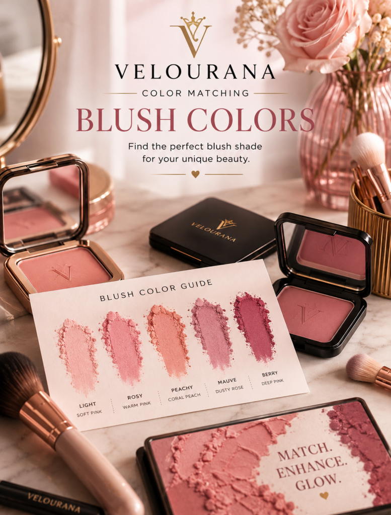
CATEGORY: Blush Colors
Blush can look deceptively simple.
You see a beautiful pink, peach, coral, berry, rose, or mauve shade in a compact and imagine how fresh it will look on your face. Yet once applied, the result can be completely different from what you expected. A delicate pink can suddenly look chalky. A warm peach may turn strangely orange. A sophisticated mauve can make the complexion appear tired, while a bold berry that looked intimidating in the package can become remarkably natural on the skin.
The reason is color interaction.
Blush is not viewed against a neutral white background once it is applied. It sits directly on top of your natural complexion, where skin depth, undertone, surface redness, pigmentation, and even the other colors in your makeup influence how the blush is perceived.
This is why choosing blush according to color matching can be more reliable than simply choosing a shade because it looks attractive in the package.
The objective is not to discover one universally “correct” blush color for every person. It is to understand how different blush families interact with different complexions so that you can deliberately choose harmony, warmth, freshness, contrast, softness, or drama.
Once you understand that relationship, the blush counter becomes much easier to navigate.
Blush Color Starts With Skin Depth
The first part of blush color matching is skin depth.
Skin depth describes how light or deep the complexion appears, independently of whether the undertone is warm, cool, or neutral.
A blush must have enough visual presence to remain visible against that depth.
On very fair skin, a highly saturated berry blush can become intense with only a small amount of product. On deep skin, an extremely pale pastel pink may contain too little pigment—or too much visible white base—to create the same fresh effect.
This does not mean fair complexions cannot wear berry or deep complexions cannot wear pink.
They absolutely can.
The important consideration is the particular version of the color.
A fair complexion might wear a translucent raspberry wash rather than an opaque blackberry.
A deep complexion might wear a rich fuchsia, magenta, deep rose, or saturated hot pink rather than a very pale baby pink.
The color family remains similar.
Its depth and saturation change.
Undertone Changes the Way Blush Behaves
After skin depth, undertone becomes one of the most useful color-matching tools.
Undertone refers to the subtle underlying color character of the complexion.
Common broad categories include warm, cool, and neutral, although real skin is considerably more nuanced. Some complexions have golden, yellow, peach, olive, pink, red, blue, or combinations of these characteristics.
Blush interacts with those underlying tones.
A peach blush contains warmth.
A blue-based pink contains coolness.
A coral combines pink or red with noticeable warmth.
Mauve usually introduces cooler muted purple or rosy characteristics.
Terracotta contains earthy orange, brown, and red influences.
When a blush shares characteristics with the complexion, it often creates harmony.
When it contrasts with the complexion, it can create greater visual impact.
Neither result is inherently better.
The question is what effect you want.
Warm Undertones and Blush Color
Warm complexions often harmonize beautifully with blushes containing peach, apricot, coral, warm rose, terracotta, cinnamon, and warm red influences.
Why?
Because these shades contain yellow, orange, or warm red characteristics that relate naturally to the warmth already present in the skin.
A peach blush on warm skin can therefore look less like an obvious stripe of makeup and more like warmth emerging naturally through the complexion.
For a light warm complexion, soft peach or apricot can create freshness.
On medium warm skin, coral, warm rose, and richer peach shades may provide more presence.
On deeper warm complexions, burnt coral, brick, terracotta, warm berry, and deep reddish shades can become particularly striking.
The principle is not simply “warm skin equals peach.”
The depth of the blush must still correspond appropriately with the depth of the complexion.
Cool Undertones and Blush Color
Cool undertones often work naturally with shades containing blue, pink, mauve, plum, berry, raspberry, and cool rose characteristics.
A cool pink can emphasize the fresh rosy quality already present in a cool complexion.
Soft rose may appear elegant and natural.
Mauve can create understated definition.
Berry and plum can provide greater intensity for deeper skin tones or more dramatic makeup.
Again, depth matters.
A pale cool complexion might be overwhelmed by a dense dark plum if applied heavily, while the same color family in a sheer berry formula could look beautiful.
On deeper cool skin, richer plum, wine, raspberry, and blue-based red blushes can retain enough saturation to remain vivid rather than disappearing into the complexion.
Neutral Undertones Offer Considerable Flexibility
Neutral complexions sit somewhere between clearly warm and clearly cool.
This can create considerable flexibility with blush.
Balanced rose shades are often especially flattering because they contain neither extreme orange warmth nor extreme blue coolness.
Muted peach, neutral pink, dusty rose, soft berry, and rosewood can also work beautifully.
But neutral undertones should not be interpreted as meaning that every blush will look identical.
The surrounding makeup still matters.
A warm bronzed eye look may make a peach blush feel more harmonious.
A cool taupe or silver eye may make a cool rose feel more connected.
Color matching involves the entire visual composition.
Olive Skin Needs Special Consideration
Olive complexions can be particularly interesting because they may contain yellow, green, golden, neutral, or cool characteristics simultaneously.
Some blushes that appear beautiful in the compact can change noticeably once placed against olive skin.
Very pale cool pinks, for example, can sometimes look disconnected or chalky depending on the complexion and formula.
Peach, warm rose, apricot, terracotta, muted coral, rosewood, and certain berry shades can work beautifully because they have enough depth and complexity to interact with olive undertones.
However, olive skin varies enormously.
A fair olive complexion and a deep olive complexion should not automatically be given the same blush recommendation.
Depth remains just as important as undertone.
Pink Blush Is Not One Color
“Pink blush” sounds like a single category, but it contains an enormous range.
Baby pink.
Bubblegum pink.
Rose pink.
Dusty pink.
Hot pink.
Blue pink.
Warm pink.
Muted pink.
Fuchsia.
Each behaves differently.
A pale pastel pink may create a delicate doll-like effect on fair skin but can become visibly ashy on deeper complexions if the formula contains a strong white base.
A saturated fuchsia may look extremely bright in the pan but become beautifully lively on rich skin tones.
A dusty rose can create understated sophistication on medium or neutral complexions.
This is why color matching should go beyond simply asking whether “pink suits me.”
The better question is:
Which pink?
Peach Blush Creates Warmth
Peach is one of the most widely wearable blush families because it sits between pink and orange.
The balance varies from product to product.
Some peaches are nearly pink.
Others lean strongly apricot or orange.
On warm complexions, peach often creates natural-looking harmony.
On neutral complexions, it can introduce gentle warmth.
On cool complexions, peach can create intentional contrast and make the face appear warmer.
This illustrates an important principle of color matching:
A blush does not always need to match your undertone.
Sometimes you deliberately choose a contrasting temperature because you want to change the visual impression of the complexion.
Coral Blush Brings More Energy
Coral generally combines pink, red, and orange characteristics.
Compared with soft peach, it often feels more energetic and saturated.
Coral can be especially attractive in warm-weather makeup because it visually connects with bronzed skin, golden highlights, and warm lip colors.
On fair skin, a soft or sheer coral may provide enough brightness without dominating.
Medium skin can often accommodate more saturated coral.
Deep complexions may benefit from richer coral-red shades that retain their intensity against greater skin depth.
A coral that contains too much pale base can lose vibrancy on deeper skin, which is why pigment quality matters as much as the shade name.
Rose Is the Great Middle Ground
Rose blush occupies an extremely useful position in color matching.
It can be warm or cool.
Bright or muted.
Light or deep.
A balanced rose often resembles the natural flushed color many people want from blush.
For neutral complexions, rose can be particularly easy to integrate.
Warm rose contains subtle peach, brown, or golden influence.
Cool rose moves toward pink, raspberry, or mauve.
Deep rose may incorporate berry or wine tones.
If you are unsure where to begin with blush, exploring the rose family is often more useful than searching for one supposedly universal shade.
Mauve Creates Soft, Cool Sophistication
Mauve usually combines pink, purple, grey, or brown characteristics.
Because it is often muted, it can create a more subdued effect than bright pink or coral.
On cool and neutral complexions, mauve can look particularly harmonious.
On some warm complexions, it creates deliberate contrast and can produce a sophisticated, slightly sculpted appearance.
The danger comes when a mauve is too grey or too pale for the complexion.
Instead of creating elegant definition, it can make the face look dull.
The solution is often not to abandon mauve entirely but to choose a richer or warmer version.
Berry Blush Can Be Surprisingly Natural
Berry shades often look intimidating in the compact.
Raspberry.
Blackberry.
Cranberry.
Mulberry.
Wine.
Yet these colors can create remarkably believable flushes when applied sheerly.
This is particularly true on medium-deep and deep complexions, where pale blushes may lack sufficient depth.
Berry also works on lighter complexions when the formula allows controlled application.
The key is concentration.
A tiny amount of a strong berry can create a translucent stain rather than a dramatic block of color.
Terracotta Adds Earthy Warmth
Terracotta combines orange, red, and brown.
It is warmer and earthier than traditional pink blush.
On golden, warm, olive, and deeper complexions, terracotta can create beautiful warmth while remaining sophisticated.
It can also connect blush and bronzer visually, especially in monochromatic warm makeup.
On very fair cool skin, strong terracotta may appear dramatically warm.
That is not necessarily wrong.
It simply produces a more obvious color contrast.
Red Blush Should Not Be Feared
Red seems extreme because pure red is visually powerful.
But natural flushing contains red.
When applied carefully, red blush can therefore look surprisingly convincing.
The important questions are undertone, saturation, and application.
A warm tomato red behaves differently from a blue-based cherry red.
A deep brick red behaves differently from a bright scarlet.
On deep skin, rich reds can create beautiful dimension because they remain visible without relying on pale pigment.
On fair skin, a sheer red can imitate a natural flush when used sparingly.
Brown and Rosewood Blushes Create Understated Definition
Not everyone wants visibly pink cheeks.
Brown-based blushes, rosewood, cinnamon, and muted earthy tones can create warmth and definition with less obvious color.
These shades can be especially effective in neutral, warm, olive, and deeper complexions.
The distinction between blush and bronzer may become softer, producing a cohesive sculpted effect.
However, if the blush is too close to the skin tone, it may disappear.
There must still be enough difference in color or depth to create visible dimension.
Skin Surface Color Can Affect the Result
Undertone is not the only color already present in the face.
Surface redness, pigmentation, freckles, tanning, and uneven tone can all influence how blush appears.
Someone with naturally rosy cheeks may find that certain pink blushes intensify redness more than expected.
They might prefer peach, rose-brown, or muted neutral shades when they want greater color balance.
Someone with very little visible natural flush may prefer brighter pink or red shades to deliberately introduce vitality.
This is why theoretical color matching should always be confirmed on the actual face.
Foundation Changes Your Blush Canvas
Blush may look different on bare skin than it does over foundation.
A full-coverage foundation can neutralize much of the natural variation in the complexion.
Suddenly the face becomes a more uniform canvas.
The blush must reintroduce dimension and life.
A sheer skin tint leaves more of the natural complexion visible, so the blush interacts with more existing color.
This explains why the same blush can appear different depending on your base makeup.
Bronzer Changes the Color Relationship
Bronzer adds warmth and sometimes depth around the face.
A blush that initially seemed very warm may appear more balanced once bronzer is applied.
Similarly, a cool pink blush can create stronger contrast against golden bronzer.
Think of blush as one part of a color composition rather than an isolated product.
The surrounding shades influence how it is perceived.
Lip Color Matters Too
One of the easiest ways to create cohesive makeup is to consider the relationship between blush and lips.
They do not need to match exactly.
They should simply make visual sense together.
A warm peach blush can pair beautifully with coral, warm nude, peach, or terracotta lips.
A cool rose blush can complement rose, berry, mauve, or cool pink lipstick.
A deep berry blush can connect beautifully with wine or plum lip colors.
Color harmony across the face makes makeup appear more intentional.
Eye Makeup Can Shift the Best Blush Choice
A warm copper eye combined with an icy blue-pink blush creates stronger temperature contrast.
That may be exactly what you want.
If you want harmony instead, a warm rose, peach, or terracotta blush may connect more naturally with the eyes.
Similarly, cool grey, taupe, lavender, or silver eye makeup may feel more integrated with rose, mauve, berry, or cool pink cheeks.
The “best” blush therefore changes depending on the entire look.
Hair Color Can Influence the Overall Palette
Hair surrounds the face and contributes significantly to the colors people perceive.
Golden blonde, copper, warm brunette, ash blonde, cool black, silver, and vivid artificial hair colors all create different visual environments.
This does not mean you need a different blush every time your hair color changes.
But when choosing between two equally flattering shades, considering the warmth or coolness of the hair can help create greater harmony.
Clothing Changes the Context
A coral blouse, blue dress, black suit, ivory sweater, or emerald top can subtly alter the way facial colors are perceived.
For everyday makeup, there is no need to match blush to every outfit.
For important photographs, formal events, or carefully coordinated looks, however, the relationship becomes more noticeable.
Blush is part of the total palette.
Natural Light Is the Best Final Test
Store lighting can be deceptive.
Bathroom lighting can be extremely warm or cool.
Artificial lighting may alter both the complexion and the blush.
Whenever possible, check a new blush in natural daylight.
Look at the entire face rather than staring only at the cheek.
Does the blush make the complexion appear lively?
Does it look disconnected?
Too pale?
Too orange?
Too grey?
Too intense?
The answer becomes clearer when you stop judging the blush as an isolated patch.
Swatching on the Hand Has Limits
Hand swatches are useful for understanding pigment, texture, and general color.
But the hand is not the face.
Its depth, undertone, and surface coloration may differ.
A blush that looks ordinary on your hand may look beautiful on the cheeks.
A shade that looks perfect in a hand swatch may behave differently over foundation.
Whenever possible, facial testing provides better color-matching information.
Intensity Can Be Adjusted
A shade does not need to match perfectly at full strength.
Application changes color.
A dense berry can become translucent.
A bright coral can become a soft wash.
A subtle rose can be layered.
This means color matching includes not only choosing the shade but deciding how much of that shade the complexion needs.
Texture Can Change Color Perception
Powder, cream, liquid, balm, and stain formulas can make similar colors look different.
A sheer cream allows more natural skin tone to show through.
An opaque powder can create a more exact representation of the pigment.
A stain may merge with the complexion.
A luminous formula reflects light and may appear softer.
A matte formula can appear denser.
When comparing blush colors, consider finish and opacity alongside hue.
There Is No Single Perfect Blush
Color matching is sometimes presented as a strict system:
You have this undertone, therefore you must wear this color.
Beauty is more flexible than that.
Understanding color theory gives you control.
It does not create rules you are forbidden to break.
Warm skin can wear cool pink.
Cool skin can wear peach.
Fair skin can wear berry.
Deep skin can wear bright pink.
The important question is what happens when the colors meet.
Harmony and Contrast Are Both Valid
If you want natural harmony, choose colors related to your undertone and complexion.
If you want greater visual impact, experiment with contrast.
A cool pink against warm skin can appear particularly fresh because the temperature difference makes the blush noticeable.
A warm coral against cool skin can create deliberate warmth.
Color matching is therefore not simply about finding shades that disappear naturally into the face.
It is about understanding what each choice will do.
Build a Small Blush Wardrobe
Instead of searching endlessly for one universal blush, consider having several color roles.
A natural everyday shade.
A warm blush.
A cool blush.
A deeper or brighter evening option.
These can create dramatically different effects without changing the rest of your makeup collection.
Blush is one of the easiest ways to alter the emotional character of a makeup look.
Let the Mirror Confirm the Theory
Undertone guides can narrow the options.
Color theory can explain why certain combinations work.
But the final decision belongs to the face in front of you.
Apply the blush.
Step away from the mirror.
Look at the entire complexion.
If your attention immediately goes to the blush rather than the face, decide whether that is intentional.
If the complexion suddenly appears brighter, more balanced, warmer, fresher, or more dimensional, the color is doing useful work.
Blush Color Matching Is About Understanding Relationships
There is no blush color that exists independently of the person wearing it.
Peach changes against cool skin.
Pink changes against olive skin.
Berry changes against deep skin.
Mauve changes against golden skin.
The same compact can produce completely different visual results on different people.
That is what makes blush color matching interesting.
You are not simply choosing a pretty color.
You are choosing a relationship between colors.
Start with skin depth.
Understand your undertone.
Consider the warmth or coolness of the blush.
Look at saturation and depth.
Then consider the rest of the makeup, hair, clothing, and lighting.
Once you begin seeing blush this way, the enormous wall of pinks, peaches, berries, roses, corals, mauves, reds, and terracottas becomes much less confusing.
Each color has a purpose.
The art lies in deciding what you want that color to do.
The End
Velourana
 Discover More From Our Family of Websites
 ZodiacBearing (Astrology, Tarot, Numerology, Angel Numbers & Spiritual Guidance)
 Velourana (Beauty, Makeup, Hair Care, Skincare & Beauty Tips)
 HavenBearing (Home, Living, Organization, Décor & Everyday Inspiration)
 PawBearing (Pet Care, Dog Breeds, Animal Health, Training & Pet Products)
 PsyCatherine (Notes From the Journal of a Psychologist on Real Life)

