
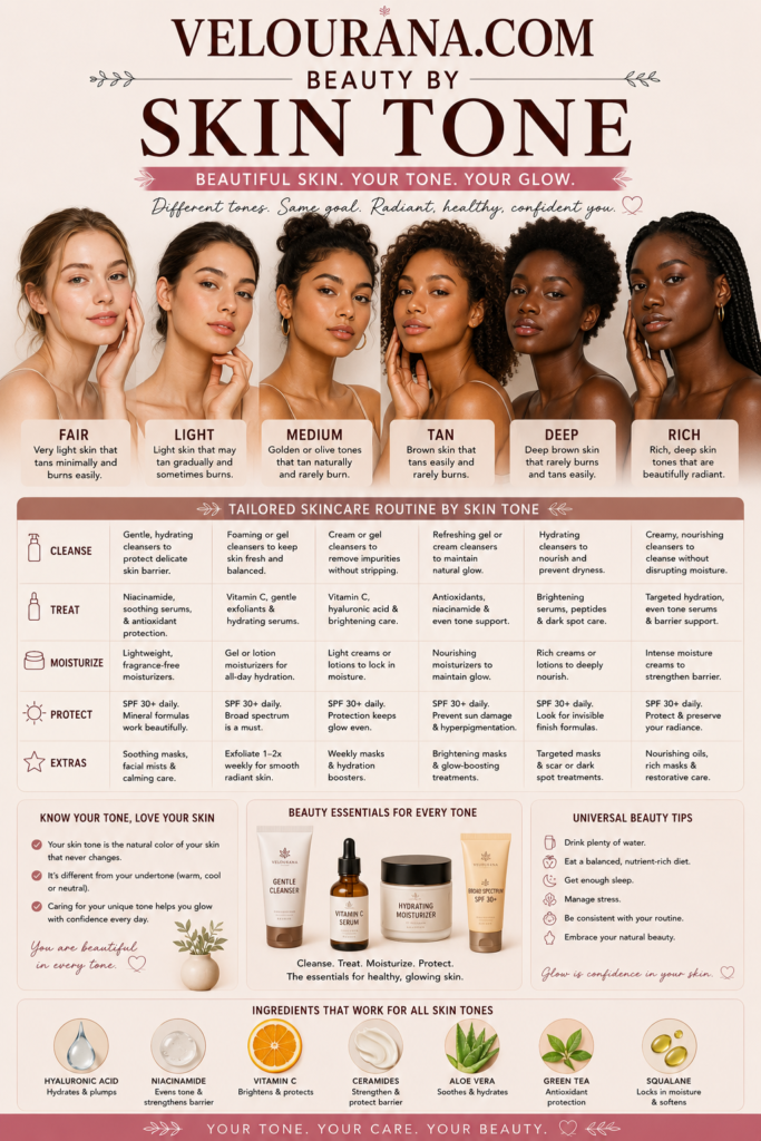
CATEGORY: Fair Skin Colors
Fair skin has a distinctive relationship with color. Because the complexion is light, even relatively subtle pigments can become highly visible, while deeper or more saturated shades can create immediate contrast. A blush that appears delicate in its packaging may become noticeably vivid when applied. A lipstick described as a neutral rose may look considerably richer against fair skin. A foundation that differs only slightly from the natural complexion can suddenly appear unmistakably pink, yellow, peach, or orange.
This sensitivity to color is not a disadvantage. It gives fair skin an exceptionally expressive range. Delicate pastels can appear luminous, muted shades sophisticated, jewel tones dramatic, and deep colors beautifully defined. The important question is not whether a color is universally considered suitable for fair skin, but how its undertone, depth, saturation, and intensity interact with the individual complexion.
Traditional beauty advice has often treated fair skin as though it belongs to one narrow palette. Pale pink, beige, soft peach, and light brown are repeatedly presented as safe choices. Yet fair complexions are far more diverse. They may be cool, warm, neutral, olive, peach, rosy, golden, or combinations that resist simple classification.
Hair color, eye color, eyebrows, natural lip pigmentation, freckles, and personal style further influence the way colors are perceived. Understanding fair skin colors therefore begins with recognizing that fair describes skin depth rather than a complete color identity.
Fair Skin Is a Depth, Not a Single Undertone
Fair skin refers primarily to the lightness of the complexion. It does not automatically indicate whether the skin is warm, cool, neutral, or olive.
Two people can have similarly fair skin while responding completely differently to the same colors. One may have a distinctly rosy quality, another a creamy golden appearance, and another a subtle muted olive undertone.
Cool fair skin often contains pink, rosy, reddish, bluish, or violet influences. Warm fair skin may reveal peach, yellow, cream, or golden characteristics. Neutral fair skin generally has a more balanced mixture of warm and cool elements. Fair olive skin may contain subtle green, gray-green, yellow-green, or muted golden tones.
These distinctions matter because color interacts with undertone.
A cool pink blush may merge naturally with one fair complexion while looking conspicuously blue on another. A peach lipstick may appear beautifully integrated on warm fair skin yet become an obvious warm contrast on cool skin. Neither effect is necessarily undesirable. The difference simply determines whether the result appears harmonious or deliberately contrasting.
Surface color can complicate undertone identification. Fair skin often displays redness easily, particularly around the cheeks, nose, or chin. Visible redness does not automatically mean the underlying skin is cool. Freckles can similarly add warm-looking pigmentation without determining the undertone of the entire complexion.
The most useful approach is to observe how different colors behave directly against the skin rather than relying exclusively on labels.
Why Color Can Look Stronger on Fair Skin
Color is perceived in relationship to its surroundings. Against a light background, medium and dark colors naturally appear more prominent.
This principle explains why cosmetics can develop considerable intensity on fair skin.
Berry lipstick, burgundy blush, navy eyeliner, dark brown eyeshadow, or even a medium bronzer may create substantial contrast. Colors marketed as subtle may appear stronger simply because there is a significant difference between their depth and the natural skin tone.
This does not mean fair skin requires pale cosmetics.
Strong contrast can be elegant, glamorous, modern, romantic, theatrical, or deliberately graphic. The important factor is whether the intensity supports the desired appearance.
A translucent raspberry lip color can create a fresh flush. The same raspberry at full opacity can become the dominant feature of the face. Soft brown eyeliner can provide understated definition, while black can create a sharper frame around the eyes.
Fair skin therefore benefits greatly from control over pigmentation. Sheer and buildable formulas allow stronger colors to be introduced gradually. Highly pigmented products can still be used successfully, but a small amount may create a significant effect.
Understanding this relationship makes color easier to manage without unnecessarily restricting the palette.
Natural Contrast Changes How Colors Behave
Skin color is only one component of personal coloring.
The relationship between the skin, hair, eyes, eyebrows, and lips creates a natural level of contrast. Someone with fair skin, platinum hair, pale eyebrows, and light blue eyes may have relatively low natural contrast. Someone with equally fair skin but black hair, dark eyebrows, and deep brown eyes may have very high contrast.
The same lipstick or garment can behave differently on these two individuals.
Low-contrast coloring often integrates easily with softened shades such as dusty rose, taupe, muted mauve, gentle peach, gray-blue, mushroom brown, soft lavender, and smoky green.
High-contrast coloring can naturally support stronger visual separation. Clear red, black, navy, deep berry, emerald, saturated pink, crisp white, and dark plum may echo contrast that is already present in the person's features.
This is not a rule about what anyone should wear. Low-contrast fair skin can look extraordinary with a dark lipstick precisely because the contrast is dramatic. High-contrast coloring can look sophisticated in a restrained neutral palette.
Natural contrast simply explains why identical colors produce different visual impressions.
Cool Fair Skin and Cooler Color Families
Cool fair complexions often interact naturally with shades containing blue, violet, rosy, or cool red influences.
Mauve, raspberry, cranberry, cool pink, lavender, lilac, plum, blue-red, icy rose, cool taupe, slate, charcoal, navy, and blue-green can create continuity with cool undertones.
However, temperature alone never tells the entire story.
A delicate lavender and a saturated violet are both cool colors, but their visual strength is entirely different. Powder pink and fuchsia belong to related families but create radically different levels of contrast. Navy can behave almost like a neutral, whereas cobalt immediately becomes a focal color.
Blush provides an especially useful example. On some cool fair complexions, strongly orange blush may appear separate from the natural skin, while rose, pink, mauve, or cool berry tones seem more integrated.
That does not mean peach and coral are forbidden. A controlled peach can create attractive warmth against cool skin, particularly when the same warmth is repeated elsewhere in the makeup.
Lip colors behave similarly. Blue-based reds can create crisp definition. Mauves and berries may range from understated to dramatic depending on their depth. Cool rose can provide a natural-looking enhancement when it resembles the pigmentation already present in the lips.
Around the eyes, cool taupes, muted plums, grays, soft charcoals, and cooler browns can add definition without introducing obvious warmth.
The purpose of identifying these relationships is not to confine cool fair skin to a cool palette. It is to understand the natural starting point from which harmony or contrast can be created intentionally.
Warm Fair Skin and Golden Color Relationships
Warm fair skin may have a creamy, peach, yellow, or light golden quality. Colors containing similar warmth can create a cohesive appearance.
Peach, apricot, coral, warm rose, camel, cream, warm beige, terracotta, cinnamon, copper, bronze, olive, moss, tomato red, and golden brown can interact beautifully with warm fair complexions.
Because the skin remains light, however, highly saturated warm colors may still appear intense.
A pale peach blush can blend almost seamlessly, while a saturated coral can become extremely vivid. Both belong to a warm family, but their depth and saturation create different effects.
This distinction is essential. Undertone compatibility does not guarantee subtlety.
Warm neutrals also deserve careful attention. Beige can contain yellow, peach, pink, gray, or brown influences. Cream and ivory may create a softer relationship with warm fair skin than stark white, although bright white can be used intentionally for sharper contrast.
Camel, caramel, warm taupe, and light chocolate can introduce increasing depth while maintaining warmth.
Metallic shades can reinforce this quality. Gold, champagne, bronze, and copper may echo warm undertones, while silver or pewter can create a cooler contrast.
Warm fair skin is therefore not limited to earthy colors. Blues, violets, cool greens, and blue-reds can be equally striking when contrast is part of the desired effect.
Neutral Fair Skin and Flexible Color Direction
Neutral fair skin generally contains a relatively balanced combination of warm and cool characteristics.
This can create considerable flexibility.
Balanced rose, neutral red, taupe, beige, dusty peach, muted berry, champagne, cocoa, sage, navy, soft plum, and many balanced browns may integrate easily.
Neutral complexions can also shift visually depending on surrounding colors. Warm makeup can make the complexion appear comparatively cooler, while cool colors may reveal subtle warmth.
This adaptability sometimes makes undertone identification difficult. Strongly yellow foundations may appear artificial, but strongly pink foundations may be equally unsuitable. Balanced formulas often disappear more naturally.
Neutrality does not mean every color automatically looks harmonious. Depth and saturation remain important.
Very pale colors may reduce definition on some neutral fair complexions. Extremely saturated shades may dominate low-contrast features. Deep colors may create dramatic separation.
The advantage lies in the ability to move between temperature families without one direction consistently conflicting with the skin.
A neutral fair complexion might support warm peach and bronze one day and cool berry with charcoal the next. Both can work because the underlying complexion does not strongly oppose either temperature.
Fair Olive Skin and Its Distinctive Character
Fair olive skin is frequently overlooked because olive coloring is commonly associated with medium or tan complexions.
Yet olive undertones can occur at very light skin depths.
Fair olive skin may contain greenish, gray-green, muted golden, or yellow-green qualities. Because the complexion is light, these characteristics can be subtle and difficult to recognize.
Foundation matching often reveals the issue.
Pink foundations may look conspicuously rosy. Strong yellow foundations can appear too golden. Peach shades may turn orange. Products described as neutral may still look unusually pink or warm.
Once the olive component is recognized, certain color reactions begin to make more sense.
Muted rose, dusty mauve, taupe, sage, olive green, mushroom, burgundy, softened terracotta, antique gold, muted berry, and earthy neutrals can interact beautifully with fair olive skin.
Some very chalky pastels can create substantial contrast with olive undertones. Extremely orange colors may emphasize greenish characteristics, while certain cool pinks can become surprisingly vivid.
None of these effects represents a universal prohibition. Fair olive skin varies considerably. Some complexions lean more golden, others more gray, green, or neutral.
Recognizing olive undertones simply provides a more accurate framework than forcing the complexion into a conventional warm-or-cool category.
Pink, Rose, Peach, and Berry
Blush colors reveal the complexity of fair skin especially clearly because they are applied across an area where natural flushing already occurs.
Pink can range from pale shell pink to vivid magenta. Peach can be nearly beige or strongly orange. Rose can lean warm, cool, mauve, or brown. Berry can range from translucent raspberry to deep wine.
On fair skin, these distinctions become highly visible.
A successful blush often combines a compatible undertone with controllable pigmentation. Buildable formulas are useful because they allow intensity to develop gradually.
Natural facial redness introduces another consideration. Blush does not need to duplicate visible redness. A controlled rose, peach, mauve, or neutral tone can create intentional placement rather than simply increasing existing color.
Deeper blush colors should not automatically be excluded.
Plum, burgundy, brick, deep rose, and berry can become surprisingly elegant when applied lightly or in translucent formulas. A color that appears extremely dark in the compact may produce a sophisticated flush when only a small concentration reaches the skin.
Application therefore matters almost as much as shade selection.
Red Lipstick Against Fair Skin
Red lipstick creates one of the most recognizable high-contrast combinations with fair skin.
Cool blue-reds can appear crisp and dramatic on cooler complexions. Tomato, poppy, and coral reds can reinforce warmth. Neutral reds bridge both directions. Crimson, wine, and burgundy create progressively deeper contrast.
Yet undertone is only one factor.
Opacity changes the character of red dramatically.
A sheer red balm may look relaxed and fresh. A satin red creates polished definition. A fully opaque matte red with sharply defined edges becomes graphic and deliberate.
This means one person can successfully wear several different red families simply by changing texture, intensity, and surrounding makeup.
Fair skin also makes subtle differences among reds easier to observe. Orange-red can visibly warm the complexion. Blue-red may create a cooler impression. Brown-red introduces earthiness. Berry-red can feel romantic or dramatic.
There is rarely a need to search for one supposedly perfect red.
Understanding what different reds do provides far greater freedom.
Nude Shades and the Importance of Natural Pigmentation
Nude is often mistakenly treated as another word for pale beige.
A convincing nude color generally relates to natural pigmentation rather than simply matching the depth of the facial skin.
Fair lips commonly contain visible pink, rose, peach, mauve, red, or brown influences. A lipstick that removes all of this color may make the lips disappear rather than creating a naturally understated effect.
A nude that contains a small amount of rose, peach, mauve, or brown can preserve definition while remaining subtle.
Undertone is particularly important because pale colors sit close to fair skin in depth. When there is little depth contrast, temperature differences become more noticeable.
The same principle applies to clothing.
Ivory, cream, blush beige, oatmeal, mushroom, pale camel, taupe, and soft gray may all be described as neutral, but each interacts differently with the complexion.
A warm ivory can reinforce creaminess. Cool gray can emphasize rosy qualities. Mushroom can complement muted coloring. Pale beige can either harmonize beautifully or appear noticeably yellow depending on the skin.
Neutral colors are therefore active participants in the palette rather than empty backgrounds.
Pastels and Muted Colors
Fair skin is frequently paired with pastel colors because both occupy lighter areas of the color spectrum.
Powder blue, pale lavender, blush pink, mint, soft peach, buttercream, misty gray, and delicate aqua can produce a luminous, airy effect.
However, pastel and muted are not identical concepts.
Pastels generally contain substantial lightness, often created by adding white. Muted colors have reduced saturation and may contain gray, brown, or complementary influences.
Dusty rose, sage, smoky blue, mauve, mushroom, muted teal, and softened burgundy are examples of colors that may be muted without necessarily being extremely pale.
This distinction matters because some fair complexions respond beautifully to pastels while others appear more balanced beside muted medium-depth colors.
Very chalky pastels can sometimes compete with the complexion, particularly when their undertones strongly differ from the skin. Muted colors may provide greater richness while maintaining softness.
Conversely, naturally clear and high-contrast coloring may look more vibrant beside cleaner, more saturated shades.
Softness can therefore be achieved in several different ways.
Dark Colors and Strong Contrast
Black, charcoal, espresso, navy, burgundy, forest green, aubergine, and other deep shades create substantial contrast with fair skin.
This contrast is sometimes described as harsh, but that description depends entirely on the intended aesthetic.
Black can look striking, elegant, minimalist, dramatic, or graphic. It may integrate particularly naturally when dark hair, eyebrows, lashes, or eyes already provide similar depth.
Navy offers strong definition with slightly less severity. Charcoal creates depth without reaching absolute black. Espresso introduces warmth. Burgundy and plum add color while still functioning almost like dark neutrals.
In makeup, deep eyeliner can sharpen the eyes. Dark lipstick can create a dramatic focal point. Smoky shadow can transform a light complexion into part of a deliberately high-contrast composition.
The relevant question is not whether the color is too dark.
The better question is whether the desired appearance calls for that degree of contrast.
Foundation Determines How Other Colors Are Perceived
Foundation color influences every cosmetic shade placed around it.
When foundation accurately matches the complexion, blush, bronzer, lipstick, contour, and eye makeup can be evaluated against a reliable base.
An incorrect undertone can distort those relationships.
A foundation that is too yellow may make pink blush look unusually bright. A base that is too pink can alter the apparent warmth of peach and coral. A foundation that is too dark can reduce the contrast of other cosmetics while creating an obvious difference between the face and neck.
Fair foundation shades are particularly sensitive to small mismatches because relatively minor depth changes can become visible.
Oxidation can complicate the process further. Some formulas become darker or warmer after they settle.
Allowing complexion products time to develop before judging the final color can therefore be useful.
A successful fair-skin palette begins with observing the natural complexion rather than forcing it toward a predetermined undertone.
Personal Expression Matters More Than Color Rules
Color analysis is useful when it explains relationships. It becomes limiting when it turns those relationships into prohibitions.
Warm fair skin can wear lavender. Cool fair skin can wear burnt orange. Fair olive skin can wear bright pink. Low-contrast coloring can wear black lipstick. High-contrast coloring can wear pale beige.
These combinations simply create different effects.
Harmony is one visual goal among many.
Contrast, drama, softness, tension, clarity, nostalgia, minimalism, glamour, and experimentation are equally valid.
Understanding color provides greater control over those effects.
A warm lipstick that feels isolated against a cool complexion can be connected to the rest of the appearance through warm blush, eyeshadow, jewelry, or clothing. A dark eye look can be balanced with a softer lip. A pale outfit can be given structure through stronger eyebrows or a more defined mouth.
Color becomes far more interesting when treated as a flexible visual language rather than a collection of restrictions.
Discovering an Individual Fair-Skin Palette
The most useful palette develops through observation.
Notice which colors make the complexion appear clear, luminous, muted, warm, cool, delicate, or dramatic. Observe whether products become stronger on the skin than expected. Compare similar shades with different undertones. Consider the relationship between the complexion and natural hair, brows, eyes, and lips.
Patterns gradually become visible.
Rose may repeatedly feel more natural than peach. Cream may appear more harmonious than bright white. Navy might provide the desired definition without the intensity of black. Burgundy may become an unexpectedly versatile neutral. Coral might consistently bring warmth and vitality.
These observations are more valuable than generic rules because they describe the individual.
Fair skin does not belong to one predetermined palette. It is a complexion depth capable of interacting with virtually every part of the color spectrum.
Soft colors can appear luminous. Muted colors can become sophisticated. Dark shades can create extraordinary definition. Bright colors can become expressive focal points. Carefully selected neutrals can reveal subtle qualities in the complexion that stronger colors might conceal.
Understanding fair skin colors should therefore expand possibilities rather than reduce them.
The objective is not to discover which colors are permitted.
It is to understand what each color does.
THE END VELOURANA
 Discover More From Our Family of Websites
 ZodiacBearing (Astrology, Tarot, Numerology, Angel Numbers & Spiritual Guidance)
 Velourana (Beauty, Makeup, Hair Care, Skincare & Beauty Tips)
 HavenBearing (Home, Living, Organization, Décor & Everyday Inspiration)
 PawBearing (Pet Care, Dog Breeds, Animal Health, Training & Pet Products)
 PsyCatherine (Notes From the Journal of a Psychologist on Real Life)

